Design for a movement, not a moment

I’ve been quiet for the last week, taking time to step back, check my privilege and ask how the ugliness of racism affects the design world (it does), and how I can work to become actively anti-racist.

People I follow and admire on Instagram asked a simple question - Why don't I know more black designers? And then I reflected on the fact that since the blog has been up and running again, I haven’t featured one designer of colour. Not one.

I must do better, and will be working within the design community to make space for BIPOC creatives, to discover and celebrate new and talented voices, and be part of positive change within the industry I love.

Follow, donate to and support these groups, and hire their talents for your projects -

Black Artists + Designers Guild

Black Interior Designers Network

Black Canadian Designers

And, since it can’t be said enough - #BlackLivesMatter

Cheers, Arren


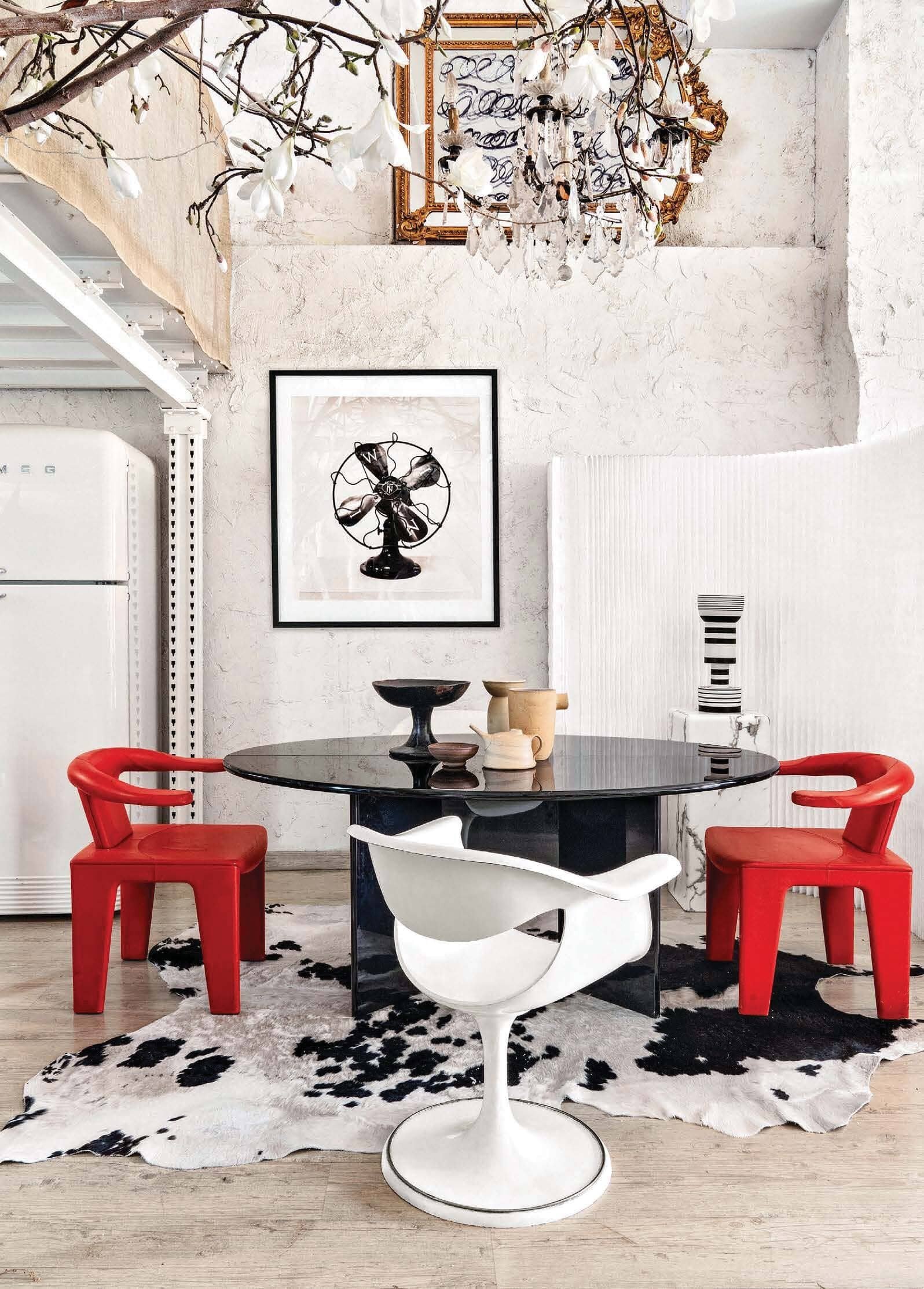
Gobsmacked is such a lovely word, meaning the feeling of intense surprise. To me it’s a good thing, since it means I was stopped in my tracks by something so utterly fab I’m practically speechless.

That word is a perfect fit for this room by interior designer Rodney Lawrence, in a Tribeca loft designed by him for a young collector. While much of the loft is bright and white, the private spaces revel in rich, saturated colours. Here de Gournay’s stunning Whistler Peacocks gold-on-silk wallpaper definitely does the trick, set alongside a low and louche velvet sectional and agate print cushions.

Scroll down and you’ll see Lawrence’s passion for art history and contemporary design blend seamlessly in the space he created for the Brooklyn Heights Designer Showhouse. It’s another showstopper for sure. You’ll note the perfectly placed art by Omar Chacon, Patrick Carrara, Sam Still and Georges Noël is not an afterthought, they carry the same weight and importance as the rest of the furnishings in the room. Love.

Photo: Marili Forastieri

Photo: Marili Forastieri

Photo: Marili Forastieri

Photo: Marili Forastieri


Thanks to Jordan and Russell at 2LG Studio, I discovered the work of young designer, Mac Collins whose award winning Iklwa chair is a definite design classic.

Just. Look. At. It.

Collins describes this standout chair perfectly on his website - “Drawing inspiration from his African Cultural heritage, Mac has created a furniture piece which is in tune with the ideas of Afrocentrism and Afrofuturism. Through a composition of powerful, spear-like forms, an encompassing backrest and a vivid, ultramarine hue, the designer has created a visually intense object designed to dominate and overwhelm its surroundings.”

Up next for Collins? A collab on seating with Benchmark furniture.

Photo: Mac Collins

Photo: Mac Collins

Photo: Mac Collins

Photo: Mac Collins


I love the work of illustrator and animator Aurélia Durand - It’s graphic, direct and political.

Snap up her Black Lives Matter poster here, your walls will thank you.

Plus, I’ve added This Book Is Anti-Racist to my reading list. Written by anti-bias and anti-racist educator Tiffany Jewell, the 20 lessons within are illustrated by Durand. You’ll find it on Amazon, but please do support your independent bookstore to pick up a copy. Speaking of support, through the month of June the publisher, Quarto Group, is donating 100% of their proceeds to Black Lives Matter and Color of Change.

Photo: Aurélia Durand

Photo: Aurélia Durand

Photo: Aurélia Durand

Photo: Aurélia Durand

Photo: Snyder New York

Photo: Snyder New York

Chairs, Shelves, Channels

As I write this, Kate Bush is on the record player, her Lionheart album to be exact. While I collect bits and bobs - more on that later - my husband David collects records. Currently his collection stands at more than 600, housed alphabetically in glossy white Besta cabinets from Ikea.

Music is always so perfect in setting a mood. In fact, I think a touch of Kate Bush would fit perfectly in the Venice Beach home included today.

Cheers, Arren


Call me a heathen, but I don’t usually think of Northern Ireland as a hotbed of modern design. Well, Orior has definitely changed that, especially when AD has proclaimed them ‘The chicest furniture company you’ve never heard of’.

Based in Newry, 40 miles outside of Belfast, the company was founded with a Scandi point of view in the late 70’s by Brian and Rose McGuigan . Now with their son Ciaran as Creative Director that mod tradition continues, with a seriously sizzling collection of upholstery and more.

The Bianca chair is a hot pick. Built for lounging, the seat is a total sensual delight in leather and velvet (just say yes to the Brick colour). Supported by a frame in either oak or walnut, the chair’s wingspan hits wide at 46” - This baby needs room to breathe.

Photo: Bianca in Brick (left) and Flamingo (right)

Photo: Bianca in Brick (left) and Flamingo (right)


Try as I might to curtail my habits, I am an inveterate collector of, well, stuff. Early days was Art Deco objects, that gave way to an obsession with scientific glassware, which waned when I slid into white midcentury vases.

So, there is always something that needs a home, a moment to shine as it were, which is why I’m taken by Amsterdam-based designer Mickey Philips ceramic wall-mounted Shelf. Each is handmade, meaning each is slightly different - ‘wobbly’ explains Philips. But, to my mind at least, that makes them even more perfect.

Currently, I’m veering between that sunny yellow or the murky green to display a favourite Rosenthal vase. What colour would you pick?

Photo: Shelf in yellow

Photo: Shelf in yellow

Photo: Shelf in yellow, mint green and dark green

Photo: Shelf in yellow, mint green and dark green


A good designer feels the soul of a space, and that’s what I love about this Venice Beach project by Electric Bowery, where they preserved the charm of a 1927 Spanish Revival, while layering in special moments that makes it feel very now.

That custom channelled leather sofa, designed for the project by Tess Bethune, is the total cat’s pyjamas. And, I love seeing something that feels so contemporary played against the trad wood millwork and funky vintage finds. Boho, but in the best sense of the word. Scope out the rest of the interior here.

Photo: Douglas Friedman

Photo: Douglas Friedman

Photo: Douglas Friedman

Photo: Douglas Friedman

Makeunders and Patterns

Of course I love design, but I have to admit I am a total geek when it comes to science fiction.

So, I was rather pleased to discover that starting back in 1981 NPR had recorded a 14-hour radio drama of the Star Wars trilogy, and you can still listen to it today! Check all the info here.

I plan on popping on the headphones and taking a trip to a galaxy far, far away.

Cheers, Arren


While I might appear to constantly be blatting about coming through with colour, I still appreciate interiors that take a more subtle approach. This living room by designer Dylan Farrell hits that mark, but each piece in this space is a PIECE and, to make that work definitely takes a deft hand.

Curves are key. Look for languidly fluid lines in the of-the-moment Pierre Augustin Rose sofa, and hello, who’d say no to shearling ball toss cushions? And then things stay softly swirly yet sculptural in the handsome Arp table in brass and marble and in the Lady Leveller chair, both designed by Farrell.

This interior is justifiably up for a Belle Magazine and Coco Republic ‘Reader’s Choice’ interior design award. Scope the rest of it out here.

Photo: Felix Forest

Photo: Felix Forest


Let’s get multicultural. Italian designer Elisa Passino was born in Venice, is based in Brussels, and designs stunning tiles made in a small town in Portugal.

I don’t know about you, but tiles definitely speak to me, and in designing an interior, there’s nothing more fun than sourcing and scheming patterns in tile for kitchens and baths. Of course, I’m totally jonesing to use some of Passino’s tiles in a project. Her work is right on trend, mixing Art Deco forms and architectural shapes with a modern eye for colour (think perfectly sun-bleached pastels). Not to mention the fact that each and every tile is screen printed by hand. Love.

The full collection of nine designs is called Geometrie Componibili and comes in an infinite range of fab colour combos. Plus, for a total lewk, Passino has also designed encaustic concrete tiles in solid complementary colours. Clock them here. Love indeed.

Photo: Abaco and Capitello tiles

Photo: Abaco and Capitello tiles

Photo: Screen printing the Obelsico tile

Photo: Screen printing the Obelsico tile


I do enjoy a good makeover, but how about a makeunder?

Timothy Godbold’s latest is deffo in that category - a Palm Beach villa where the ‘before’ might’ve looked more at home on Mob Wives. But, Godbold’s remit was to work with what was there as much as possible (no demolition!), so instead he carefully subtracted, playing up the space and light, and carefully adding in modern touches. Oh, and did I mention the 4 month window he had to get the entire job done?

While the whole house is now stunning (check it here on Introspective, 1stdibs online mag), I love the changes he wrought in the rather OTT kitchen. Scroll down to see what it looked like before Godbold got his hands on it.

Curlicued corbels were removed, and the faux antiqued cabinetry was freshened up with a coat of Benjamin Moore’s Simply White. Speckled peach granite counters were nixed and replaced with high-contrast white Dolomite marble and black granite trim (the granite also does double-duty as the backsplash). Finally, those tired chandeliers were switched out for a kicky pendant from The Urban Electric Co.

Fab from top to bottom, the interior was shot by Alec Hemer and styled by Michael Walters.

Photo: Alec Hemer

Photo: Alec Hemer

Photo: Palm Beach villa kitchen ‘before’

Photo: Palm Beach villa kitchen ‘before’

More and More and Less

Are we there yet?

Sit tight, we have a ways to go. So let’s stay connected, let’s stay kind, and let’s stay creative.

Cheers, Arren


Architect and interior designer Laurent Buttazzoni recently launched a cookbook with Rizzoli, Diner à la Maison: A Parisian's Guide to Cooking and Entertaining at Home. I only mention that since his Insta is filled with more cooking than interiors, but luckily AD France and Vogue Living can help fill in the gaps with some calorie-free fabulosity.

The top pic - a fab bedroom in his place in Sicily - popped into view because I was on the hunt for info on the French carpet mill, La Manufacture Cogolin (I’m currently obsessed). That’s their Trémourier design, one of many patterns woven in wool on jacquard looms dating from the 1880’s. I don’t know about you, but I am just loving the fire engine red of the bed frame against the grass green of the carpet. To see the rest of the place, featured in 2015 in AD France, click here. Do it!

Gutsy primary colours with a vintage-meets-modern twist also abound in his home in Paris, and obvs, every home needs a hand-beaded throne. Pop on over here to Vogue Living for the lowdown, and to take a peek at the rest of his place.

Photo: Matthieu Salvaing

Photo: Matthieu Salvaing

Photo: Charlotte Hess

Photo: Charlotte Hess


I’m back and forth about wallpaper at the best of times, but is it ever an antidote to the endlessly ubiquitous white walls that have become such a go-to for interiors. Listen, I love ‘em like the rest of you, but every now and then someone has to take a stand!

Thank heavens for the likes of stylist Mary Norden, who recently put this smashing vignette together for Homes & Gardens mag in the UK. That riotous wallpaper - Midnight Garden by artist Flora Roberts for Hamilton Weston Wallpapers - is literally drop dead gorgeous. Add in Bethan Grey’s Nizwa cabinet in Jade, whose work I’ve been such a fan of after seeing it in person at Maison & Objet a few years back. Then, finish up with a perfect mess of vases and pitchers. Is it all too much? Yes, and it’s all the better for it.

For even more floral goodness, snap up a copy of Gathered, co-authored by Norden and photographer Polly Wreford.

Photo: Polly Wreford

Photo: Polly Wreford


We’ve had the windows open and the doors flung wide these last few days. Thankfully in this part of the world warmer weather seems to finally be here.

So, as we start to think about cottage weekends with friends, they’re just around the corner, let’s take inspo from spaces that look like they can handle sandy feet with aplomb. I’m all about this interior by American designer Terri Ricci. It feels perfectly fresh and summery, yet also perfectly pared back.

Shiplap done right. A whitewashed wood ceiling. Worn finishes and just the right amount of modern. And hey, anywhere there’s a bulkhead light is alright by me. Roll on summer…

Photo: Joshua McHugh

Photo: Joshua McHugh

Photo: Joshua McHugh

Photo: Joshua McHugh

Bringing The Looks

I’ve been having a bit of a design moral dilemma on Instagram with the number of fabulous interiors which, once you check in on the details, do not actually exist. Yep, 3D visualizations are the deepfakes of the interior world, and they’re kind of bumming me out.

You see, to me at least, part of the art of interior design is dealing with the reality of clients, budgets, contractors and trades - plus the sourcing of fabulous furnishings - to end up with something that’s real and tangible. That’s where the real beauty is.

Thoughts? Should I just get with the program, double tap and be done with it?

Cheers, Arren


While my accidental fascination with green continues, this particular room is so much more than the wall colour. Truthfully, it has also been given a generous helping hand by those mile high baseboards and that deep panelled window, but I have to tell you, this time I’m going gaga for the furnishings.

The shot is from that design mag marvel, House & Garden UK, which always brings serious LOOKS to the fore. I wish I could tell you the creative minds behind it, but alas the Google machine is no help - Any ideas?

Okay, back to the bits and bobs that make it special. Let’s start with the fab Hepplewhite sofa from Ensembliers London, shall we? The blue and white fabric is TO DIE FOR, but it’s the eye for detail and the fully upholstered legs that are really delivering the goods. This crew is not messing around. That sofa, plus the weird tramp art style table and kooky yellow wrapped frame chair, oh, and the art! It all adds up to perfection.

edward.jpg

While many of you - well, maybe it’s just me - constantly scream, not another Jeanneret chair, when trawling through interior images, help is at hand. This week, I’ve been spotting chairs by designer Mario Milana instead. And I couldn’t be happier.

If the first shot below looks familiar, that’s because Milana’s rather stunning Brooklyn abode was featured in AD, and has just made a reappearance in the pages of Living - Corriere de la Serra. That’s his Rulla Lotto rocker in the foreground, and his Masand lounge in behind, but it’s his fun, fun, fun dePostura dining chairs that seem to be having a bit of a moment. Literally. Chair. Heaven.

Photo: Max Burhalter. Styling: Colin King

Photo: Max Burhalter. Styling: Colin King

dePostura dining chair. Photo: @PalermoUno

dePostura dining chair. Photo: @PalermoUno


Australian designer Chelsea Hing’s latest project is a stunner. Orchard House is the name, and Hing describes it best - “Avant-garde furniture, art & objects were layered to create a deliberate tension in an otherwise monochromatic palette.”

That tension definitely comes to play in the kitchen, with the scene stealing Verde Rameggiato marble slab counter set against the murky blue-green painted cabinetry and that boffo Shogun lamp from Artemide. And hello, that lamp! Designed in 1986 by Mario Botta it has deservedly attained design icon status.

Moving onto the living room, I had a complete, have I died and gone to heaven, moment over the Edra On The Rocks modular sofa and Indian green marble Salute tables from La Chance. Lordy!

You really must check out the complete Orchard House interior on Hing’s website. Styled by Beck Simon, it’s a winner baby.

Photo: Rhiannon Taylor

Photo: Rhiannon Taylor

Photo: Rhiannon Taylor

Photo: Rhiannon Taylor

Way Down South

Australia is amazing. And stylish. And cool. And I have never been.

A visit is definitely on my ever growing bucket list. Until that happens, I thought I’d share some brand new faves from that part of the world.

Cheers, Arren


I’ll never not say no to art with a strong, graphic point of view, so the work of artist Emma Lipscombe is right up my alley.

I love how restrained each piece is, yet bright and playful at the same time. Each is painted in oil on timber board, and sized a diminutive 31cm square, they’re a snap to sneak into a gallery wall.

The shot below, styled by Natalie Johnson and Lisa Burden for Real Living mag, shows how fab Lipscombe’s work looks layered into a contemporary space. Not your thing, perhaps? Well, they can also look equally at home somewhere more relaxed, rumpled and deshabille. Get the vibe here.

Photo: Dave Wheeler

Photo: Dave Wheeler

Photo: You Can’t Take It With You #14

Photo: You Can’t Take It With You #14


While the redoubtable Patsy Stone believes you can never have enough hats, shoes and gloves, I’m of the same mind when it comes to occasional tables. In our living room, we currently have 3 that get dragged hither and yon, just so a cocktail can perch within arm’s reach.

Here’s a perfect little number from architect and interior designer Daniel Boddam. His M-Side Table - part of a series inspired by architectural forms - is both stylish and sturdy, set just-so in this interior he designed in Hunter’s Hill.

I love this look, and how well the table works with Jaime Hayon’s rice paper pendant light for &Tradition. It’s so simple and chic against all of the room’s trad details.

Photo: Pablo Veiga

Photo: Pablo Veiga


I am a longtime fan of Popham Design’s contemporary concrete tiles, made the old fashioned way in Marrakech. The patterns are always spot on, giving a designer just enough leeway to mix it up and create something special.

So, it’s their Squarish On Four tile that drew me to this swish guest bathroom designed by Studio Parker. That off-kilter mod pattern, paired with brushed brass fixtures and a chunky built-in vanity is making it all happen. Yes, to all of it!

Photo: Jacqui Turk

Photo: Jacqui Turk

Feeling Fresh

My mood today is definitely the colour green.

Hopeful and optimistic, with all the promise of Spring and warmer weather just down the road.

Cheers, Arren


Riotous colour and barmy prints! Thank heavens for architect Josef Frank, whose textile and furniture designs for storied Swedish design retailer Svenskt Tenn are an antidote to a grey day, if ever I saw one.

His perfectly curvy and very on trend sofa 968 was actually designed in the late 1930’s, and that gobsmacking fabric? It’s Vegetable Tree, a print Frank designed in the 1950’s inspired by the classic Tree of Life motif.

If you’re looking for something just as stylish, if a little more contemporary, then the cool cats at Svenskt Tenn have collaborated with Swedish architecture firm TAF on their first ever non-Frank designed sofa. Just as curvy as the 968 but with a fresh perspective, the Famna 2020 looks as swish in Frank’s wild 1940’s Hawaii print as it does in plush persimmon velvet. See that stunner here.

Photo: sofa 968, Svenskt Tenn

Photo: sofa 968, Svenskt Tenn

Photo: Famna 2020 sofa and stool, TAF for Svenskt Tenn

Photo: Famna 2020 sofa and stool, TAF for Svenskt Tenn


I love commitment to colour. So when I see the same minty-meets-chalky shade of green popping up in two entirely different rooms, in completely different styles, I’m sold. One, the creative home in Ghent of design duo Muller Van Severen (see more here). The other, a maisonette in Fulham by British interior designers Barlow & Barlow.

That green is a classic Muller Van Severen shade. Spot it in metal frames for lamps and furniture, as well as in Match, a line of Ikea kitchen cabinet doors made of waxily touchable polyethylene for Reform. Ever creative, there’s even a special Music for Kitchens playlist curated by the duo on Spotify.

Colour is key in this Barlow & Barlow interior too, adding oodles of style on a slim budget. For this peppy living room, Farrow & Ball’s Arsenic is the shade in question. The look is amped up further with a chair upholstered in Lasso by Pierre Frey. It’s a fave from their capsule collection with designer Vincent Darré. Yum!

Photo: Alex Profit

Photo: Alex Profit

Photo: Barlow & Barlow

Photo: Barlow & Barlow


Norwegian paint brand Jotun Lady is def where it’s at for modern colour and styling inspo. Exhale, one of their hot picks for 2020 is the soft and misty shade of green in this interior styled by Kråkvik/D'Orazio. And yes, that is a Muller Van Severen Standing Lamp No. 1 in the shot. Couldn’t you just slink right in and never leave?

Check out the rest of Jotun Lady’s totally on the money colour trends for 2020 here.

Photo: Line Klein

Photo: Line Klein

Madrid - Bridgehampton - Muskoka

Sometimes, while on the hunt for something to watch, you can end up finding an odd little gem. So, when my husband David stumbled on Danger: Diabolik on the Kanopy streaming platform, I knew we were in for a treat. Filmed in Italy in 1968 it’s definitely camp, with its fair share of sexy costumes, overdubbed actors, dodgy special effects and some major eye candy from the sets. While it was trounced by critics on its initial release, it somehow ended up on Empire mag’s 500 Greatest Movies of All Time back in ‘08. Take a look at the preview here.

Cheers, Arren


So, we’re in the loft of my latest design crush, photographer Manolo Yllera who, along with shooting fab interiors, definitely has an eye for design himself. Hidden in an old Madrid neighbourhood, between a printer’s and an auto repair shop, it boasts 5 metre high ceilings and is crammed with a wild selection of major design pieces. Lordy.

I’m GAGGED, I tell you. Just look at that chair on the left, it’s a Tre Pezzi by Franco Albini for Cassina. Designed back in 1959, this particular one is a limited edition in Mongolian goat. Could you even?

Styled by Amaya De Toledo, this shoot just popped up in AD China, but you’ll also find more pics on Yllera’s Insta feed.

Photo: Manolo Yllera

Photo: Manolo Yllera

Photo: Manolo Yllera

Photo: Manolo Yllera

Photo: Manolo Yllera

Photo: Manolo Yllera


From Madrid to Bridgehampton, and a veritable design one-two punch, with an interior by Timothy Godbold, styled by Michael Walters.

Godbold’s look is right up my street, always making space for the crazy cool. Ergo, that eye watering Martin & Brockett console moment in the front hall. Pop into the library and you’ll spot a pair of Maralunga chairs by Vico Magistretti upholstered in shearling (it’s deffo a Cassina day). Creep the rest of the interior on Domaine.

Walters’ Instagram (check it out here) is a must follow for interior inspo seekers and midcentury lovers alike. Catch a peek of his projects, plus a slew of fab Palm Springs pics that obvs got me wanting to get back to PS, one of these days.

Photo: Alec Hemer

Photo: Alec Hemer

Photo: Alec Hemer

Photo: Alec Hemer


Having shopped flea markets in Paris with designer Montana Burnett, I know what a good eye she has. Monty just posted this snap; a throwback back to last year’s Muskoka pop-up for her online design shop SALT by The Caza Project. Think textured, natural and handmade, all in a pared-back palette of neutrals, black and white. Love. And I have to say, if this is her take on a lakeside cottage, then I’m there with flip-flops on. Roll on summer.

ACS_0954.JPG

Sit Like Sylvia

I was lucky enough to grow up with an appreciation for vintage finds, heading with my gran Lena to assorted jumble sales and church bazaars, where she would bribe our way in for an early ‘dealer’s view’ of what was on offer. That’s where I caught the collecting bug. In fact, I still have the Art Deco alabaster dressing table mirror I bought at the age of 12. You’ll spot it in this snap on Insta.

What are your favourite vintage and antique finds? Send me a snap, I’d love to see.

Cheers, Arren


I have always, ALWAYS, wanted to own a Peacock Chair. And now, while I might be no closer, I definitely have a new one to top my list - The Melek accent chair. A great piece from the ace new furniture collection for McGuire by San Francisco interior designer Nicole Hollis, this chair is a standout in her line. But wait, there’e even more to see here.

Definitely no shrinking violet, this style of chair has quite the colourful history (take a look at the Vox mini doc below). But for me it’s all a little more louche, sexy and 70’s, since it's the chair made (in)famous by the erotic 1974 film Emanuelle, when star Sylvia Kristal posed topless in one for the movie’s poster.

Photo: McGuire

Photo: McGuire


If you’re in Canada and and fancy easy access to Canadian makers, artisans, artists and food purveyors, then you need to hit up Fabrique 1840.

Started as an online craft-centric offshoot of the Simons department stores, you can source everything from the fab Edwin chair (Coolican & Company’s mod take on a Windsor chair), to Lambert & Fils clean and minimal Dot Line Floor Lamp (in black or white it’s a winner). Currently sitting in my shopping cart? The limited edition ‘Artefact no. 7’ abstract art print below from Montreal’s mpgmb.

The good news is that Fabrique 1840 has become so successful that they’re looking to expand their roster of makers. Drop them a line here if that’s you!

A1_2.jpg

After blatting on about colour last week, I thought it would be fun to delve into something a little, ahem, paler. While we’ve all seen more than our fair share of gorgie all-white Scandi interiors, I thought this more ‘dressed’ space was a sophisticated twist on a monochrome palette.

Designed by Baptiste Bohu, a French interior designer who works mostly in Asia, I’m very much into how layered it all is. That palette of soft tonal shifts in greys and whites, with just enough black to ground everything, and a hit or two of brass? Perfect. The decidedly glam take on a Qing Dynasty style scroll table is, well, rather FAB, and don’t even get me started on that lamp. Check out more of Bohu’s work here.

客厅+1.jpg

Blue-Yellow-Blue

Here’s my simple take on colour theory - You need a good dose of colour in your life, and no, grey definitely doesn’t count.

Cheers, Arren


While cobalt blue has been riding a high, there’s barely another colour I can imagine that can inject as much instant energy into an interior.

Take this stunner of a kitchen by Copenhagen-based firm & Shufl, whose beat is to upgrade basic Ikea kitchen cabinetry by crafting new door and drawer fronts and counters. This peppy little love is actually faced in linoleum, I kid you not, but they also offer a myriad of wood, laminate and painted finishes. I’m getting a Bauhaus vibe, you?

39857d43743bbaa71f01c6176af12da7.jpg

Canary. Acid. Banana.

Yellow can make a room, and if you had a doubt, then take a gander at this GLAM space by fab Spanish firm, Bao. Set in an apartment in Madrid (hello plaster moulding and herringbone floors), the star of the show is deffo the Ava sofa in velvet from Studio Bañon.

The stylist behind the project - see the rest here - is the talented Beatriz Aparicio, whose Insta is worth a follow for her keen eye and some major interior envy.

photo: Montse Garriga Grau

photo: Montse Garriga Grau


Moody and marvellous, this shot styled by Amanda Corston for Elle Decoration UK is giving me life. It also shows all you colour-averse ninnies that using a range of the same tone can totally make a space. IT’S NOT ALL ABOUT MATCHING. In fact, un-matched shows far more brio and sophistication.

Aqua. Sea glass. Robin’s egg. Tiffany. French navy. It’s all here, and it all works.

photo: Ben Anders

photo: Ben Anders

Two Rugs and a Lamp

Some major TEXTURE is what your home needs absolutely right this second. Don’t argue. It just does.

So, let’s dig into a few weird and wonderful faves that have flitted across my screen over the last few days which, to be honest, feel much more like daaaaaays with the way time seems to have become entirely elastic.

In the inspiring words of Inès de La Fressange, “Totally good taste is boring!”

Cheers, Arren


What do you get when you take a pared-back Scandi point of view, and mash it up with the time-honoured craft of handwoven rugs in India? The answer is definitely Cappelen Dimyr, who design their unbleached natural wool rugs in Copenhagen and Stockholm and collaborate with artisans in India on the Good Weave and Care & Fair certified collection.

The results have a shaggy handmade Brutalist vibe that all feels completely perfect and very now. LOVE.

No. 3 rug - Cappelen Dimyr

No. 3 rug - Cappelen Dimyr


The wool flatweave rugs by Oaxaca-based design rrres are certainly worth an ogle. Each is unique, woven on foot-pedal looms by Zapotec weavers, mixing both traditional indigenous knowledge and new techniques. Costa is their latest collection, offering softer forms and rounded edges inspired by the Oaxacan coast.

Respecting the whole #slowcraft vibe is definitely part of the rrres story - Follow the process from washing to weaving and finishing here, then check out founder Javier Reyes’ Insta for more major inspo.

Limited edition Costa 06 rug - rres

Limited edition Costa 06 rug - rres


Well, it’s not all about rugs today. Lamps and chairs are definitely my jam, so let’s feed into that obsession with a little lamp love. Oh, and did I say I like ‘em bossy? After all, what’s the point of bringing something dull home? ECCENTRICITY IS WHERE IT’S AT.

Tero Kuitunen’s Tiki Table lamps are bringing all the HAPPY your interior might need. With a base in slip cast terracotta and a hand-knot paper shade (choose from blue, brown and white), the Finnish designer’s ethos of playfulness and fun really shine through.

Seriously. Your vintage rosewood credenza needs one. Don’t argue. ;)

Tiki Lamps in blue and brown - Tero Kuitunen

Tiki Lamps in blue and brown - Tero Kuitunen

Kelly and The Shapes

How is your creativity? I was reading an interesting post by artist and illustrator Lisa Congdon about what she describes as the ‘Skill Gap’ between our vision and our ability. It totally jibes with how I’ve been feeling under lockdown, thinking about starting a new project and then hitting a wall when I actually give it a try. And I love how she explains that it’s okay to be shitty on the path to greatness. Wise words indeed.

Cheers, Arren


First up, two projects that caught my eye. Both from entirely different parts of the world, both with a different and equally fab point of view, and both using Kelly Wearstler’s Graffito wallpaper. Why do they work??? And what is it about KW’s trademark handpainted pattern that is the boffo touch in both interiors?

Well, if you ask me, it’s the abstract vibe. The theatricality. The DRAMA that this edgy pattern gives. Its become a bit of a classic, no?

Australian designer and stylist Jono Fleming used it to add that oomph on his parent’s place. I’m looooving the modern desert vibe the pattern in Salmon Cream gives, layered against all those soft blushes and naturals in the palette. See the full room shot here, as well as the rather grungy ‘before’.

Design/Styling: Jono Fleming. Photo: Kristina Šoljo

Design/Styling: Jono Fleming. Photo: Kristina Šoljo

Then MONIOMI Design, out of Miami, amped up an already peppy and pattern filled bathroom with a wall in the Onyx Beige colourway. Taking the space from polished Art Deco to something much more current and crush-worthy.

Design/Photo: MONIOMI Design

Design/Photo: MONIOMI Design


I’m such a fan of BTS shots of how a stylist actually lives, playing around with the things they collect themselves, and snapping and sharing the results.

Sania Pell is definitely one to follow on Insta for softly poetic and moody assemblages of things found and collected over time. The shot below is a fave of mine, with its monochrome mix, texture and almost-clutter-but-not thoughtfulness. Not to mention the PATINA!

Styling/Photo: Sonia Pell

Styling/Photo: Sonia Pell


Let’s finish up today with vases. But, ya know, not just any old glass or ceramic vessels. Nope, these ones are knitted. Yes, knitted, by Amsterdam-bases textile wunderkind Charles-Antoine Chappuis. Each of his fantabulous Soft Amphorae series has different coloured sides to max out your hot shelfie lewks, and can be turned upside down, holding water on either end using found glass objects. Knit of linen and recycled yarn sourced from textile factories, the handles are malleable, allowing you to add extra swerves and shapes to a piece as the mood takes you.

Just think how killer a slew of these would be, sitting odd but pretty on a surface. Want your own? Check out the whys and wherefores of where to find them here.

Photo: Charles-Antoine Chappuis

Photo: Charles-Antoine Chappuis

Irregularly Interesting

Here we are again, in another irregular missive from the world of design meant to spur a little creativity. Last week we accidentally ended up entirely in France. C’est la vie, I suppose. So today I wanted to dig a little deeper and post a few faves that caught my eye from from other locales. Let’s grab a pin and burst that design bubble, shall we?

Cheers, Arren


You can’t help but ogle the shots posted by Spanish stylist Pete Bermejo, whose work is lively, layered and FUN, with a healthy dose of insanity - which I totally agree with (see more of his drool-worthy work on his website, here). The particular snap I chose is of an interior by Belgian designer JP Demeyer for AD Spain, styled by Pete and shot by Belen Imaz.

Yes, you can check the current must-haves of tropical plants and white walls off of the list, but it’s all the playful mix of everything else that keeps it fresh. Hello, flokati rug! Why the hell are there rocks hanging from the ceiling? And - thank heavens - there isn’t a Pierre Jeanneret chair in sight.

92642724_630876980803584_2840061563777610038_n (1).jpg

To swipe the Ettore Sottsass quote from Philadelphia-based product designer Carl Durkow’s Insta profile in its entirety - “Design should be sensual and exciting.” Carl’s hand-poured candle series definitely embodies this ethos, not to mention the fact that his work definitely picks up on that Memphis Group vibe. Think of the undulating lines of Sottsass’s iconic Ultrafragola mirror. Anyways, whether you see chess pieces, honey dippers or sex toys when you look at them, a set will certainly up your candle game when next the lights go out. Get yours here.

90214158_1438582702986624_6167413095663033567_n.jpg

Monique Van der Reijden is a Dutch journalist, stylist and trend forecaster who is constantly posting gag worthy shots in Insta, this one included, which was styled by her at Elle Decoration NL’s Fluid Forces showcase at Dutch Design Week. Curves, obvs, are a thing.

BUT, LETS TALK ABOUT THE CHAIR.

It’s the Lana from fab Guatemala-based Agnes Studio, and is upholstered in shaggy Momostenango wool sourced from the Guatemalan highlands. Please note, all your chairaholics out there, that if natural isn’t your thing, it’s also available in a sexy burnt orange colour through AGO Projects. Not comfy enough? Well thank heavens they also make a matching ottoman.

81884930_569995740267553_681973929072295251_n.jpg

We all need a little inspo

Inspiration comes in all shapes and sizes, often completely out the blue. and in these difficult days - well - we could all use a little beauty to get us through…

So, here we go with an occasional series of things that have caught my eye. Yes, many will be via Insta, but who knows what else I can dig up? And of course, if you’d like to send me any recos, please drop me a line here.

Cheers, Arren


@objectsdaffection aka O.D.A. Galerie is a space in storied Paris flea market Marché Paul Bert curated by stylists and set designer Eve Ducroq and Arnaud Dollinger. In the room sets they create, look for an eclectic selection of vintage pieces styled to give the sense that some very chic homeowners have just strolled off screen to live a fantastically creative life. And, speaking of life, the chalky lime and plum combo in this space is definitely giving it to me right now.


@damienlangloismeurinne_studio aka interior architect Damien Langlois-Meurinne has an eye for sculpture within the architecture of an interior, ergo this stunner of a plaster fireplace. That, plus all of the softly curving furniture in this space have me completely swooning. Modern Parisian glamour at it’s best.

69896741_682032118948116_4887596085082300550_n (1).jpg

Let’s finish with a pop of colour. I love a kitchen island that steps it up in something bright so here, in this flat in Marseille by Paris-based designers @novaobiecta, it’s all of that kelly green, plus those cobalt framed stools. Gah!

See you later!

Hey guys, so it's a dual sad/exciting day around here...

On the incredibly exciting side of things, my new job has been announced - I'm the Creative Director of Home Fashions for The Bay. And on the sad side, it's time to say buh-bye for now to the blog. It'll stay up, though I'll probably have to switch off all the comments (boy, those spam commenters are a giant pain!), but I just wanted to thank everyone for all their amazing support over the past few years of my online adventure. And stay tuned, since I'm sure I'll be back online soon with my new gig!

Thanks again, and I'm leaving you with a lovely print by illustrator Wayne Pate. Seeya!

On my hols

Some of my fondest summertime memories are of spending blazing hot days in Brighton as a kid, walking the promenade eating an ice lolly, checking out all the goings-on on the piers (when I was young there were two!), and being amazed by the absolutely bonkers architecture of the Royal Pavilion. So I was excited to discover these giclee prints by illustrator Sean Sims for sale on Brighton POD that basically encapsulate my summer holidays growing up. Sean created a collection of designs - there are 7 in all under the name The Brighton Line - as an homage to vintage travel posters, and all take a look at quintessential Brighton-esque experiences and places. Love his take on the Royal Pavilion, yes, I have fed chips to sea gulls, and I remember an Oyster Bar just like the one pictured, where my Nan would buy cooked winkles that she'd have to pick out with a pin. Check out all of Sean's work on Brighton POD here, and yep, he's lucky enough to call Brighton home!

All this to say I'm taking a holiday (aka a vacation) from blogging for a bit, so I'll see you guys back here on July 19th.

Finding 'Found'

So, some smartypants friends of mine are starting a gorgeous new online store called Found that I wanted to give you guys a sneak peek at. It's not quite open yet (the crew are hoping to have everything live in the next few weeks or so), but by the looks of it you're going to want to stop by regularly and check it out. Once things get going you can expect to find a deliciously curated mix of vintage pieces, art and objects, and plans are even in the works to have Guest Pickers stop by with special selections of gear. In fact I heard a whisper of who'll be the first of the bunch and I have to say, it'll be pretty special! Okay, so without further ado, have a look at the pics below (shot by Michael Graydon and featuring some of the items that'll be on offer) so you can really get a feel for Found.

guest blog / Jenn Hannotte: Magic ice and other kitchen stories

Jenn Hannotte: You know how when you're living with something you can convince yourself it's OKAY? Like the old fridge that was approximately 4 feet high and held a carton of eggs, a jug of milk and a loaf of bread if you packed it intelligently? NOT OKAY. And I only realized this after my Whirlpool appliances arrived and we set up the new side-by-side fridge (I put the other guy out on the curb for recycling, I didn't hold that much of a grudge!). It wasn't *just* that the kids squealed with disbelief when I got them ice and water FROM THE FRONT OF THE FRIDGE like a magician (we're simple people), but the fact that it's totally roomy and still counter-depth sold me. And the new dishwasher? Our old one was likened to a garbage bag with a hose attached by the appliance installer - and he wasn't far off. We had to close all the doors to the kitchen and basically vacate the house when that thing was running. My new dishwasher is quiet, yes, but it also has cool features (like Sheer Clean) and is smartly designed - something I can really appreciate after using our completely inefficient old monster. And, then there's the slide-in range that leaves more room for the birch plywood backsplash to do its thing, and which has a quick-heat convection oven to get those frozen pizzas cooked chop-chop! So why white, instead of the more expected stainless? White is fresh and modern and especially in a small kitchen like mine, it helps to unite rather than divide. 

Once the engine of the kitchen was installed, Angus Fergusson and Arren came over to shoot these stunning photos. My perpetual kitchen reno is all done and what's the verdict? For me (the only client who matters!), I absolutely love the ambience of this room, it's less a kitchen in the traditional sense, and more a cozy retreat. *AND* everything works, works well and looks good doing it.

Here are the deets:

Counter Depth Side-By-Side Refigerator, Whirlpool Gold Tall Tub Dishwasher,  Electric Slide-In Range. All Whirlpool.

Vintage industrial bins, Avril Loreti tea towel, Imm Living cruet. All Russet & Empire.

Lighting Design. Matthew Birch for Russet & Empire.

Kitchen Design. Russet & Empire Interiors.

Ikea kitchen cabinets, butcherblock counter, Ringskar faucet, Tral work lamp. West Elm Tripod Table. Breville Barista Express espresso machine. Areaware Numbers LED Clock.

>>> Catch the rest of Jenn's kitchen reno here, and click here to check out Jenn's take on style.

If I had a hammer

Even without including the family of foxes that recently moved in down the road, I have to say I have some very cool neighbours, one of whom is Graeme Cameron. Graeme was one of the co-founders of Best Made Company and is now the dude behind outdoorsy new brand Base Camp X. So, if you're in need of an axe (and who isn't?) BCX is definitely for you, but what about those times when a double-head Cruiser axe just won't do? Well you're in luck, since the other day Graeme brought over his latest tool for me to check out, a very hefty hammer made in collaboration with the guys at Hardcore Hammers.

Designed with a tough 19oz head, this is one hammer that really means business. Oh, and you've just gotta love the Tennessee hickory handle fire-branded with the BCX logo and smart red or green livery. Now, should you swing it at something or simply hang it on the wall? Pick yours up here.