Make it in pattern

Pattern can really pep up an interior and give it a point of view. For me it’s a must, since a mix of patterns adds depth and sophistication. After all, why should everything be beige?

Cheers, Arren


Monochrome or bright? No matter your mood, artisan Naila Janzen - the creative mind behind Winnipeg’s Rox Textile Art - can hook you up.

Janzen describes her work as ‘functional art’ - Bold patterns show up in cotton quilts that look good both tossed over the arm of a sofa, or hung on the wall to admire. Then, patchwork comes into play in graphic cotton cushion covers, which are totally giving me a naval signal flag vibe. My suggestion is that you snap up two or three of those cushions to wake up your sofa, pronto.

Love. It. All! Shop the whole shebang here.

234E6550-C959-4DD1-BBC3-5FF89617C0F0_1024x1024@2x.jpg
04-produits-image3.png

Australian design powerhouse Sibella Court has just released a collection of tiles with TeraNova that have me going gaga. Honestly, I could probably do with an intervention at some point, because my love of good encaustic tiles knows no bounds, and HELLO, these are marbled!!!

Sirocco is the pattern’s name, and comes in a gorgeous array of tints. That one on the top is a smoky teal called Ocean and the on-the-money shade beneath is Brick. Ink and Ochre round out the Sirocco palette, though the full Tradewinds collection includes other patterns in both encaustic and stone. Shop the lot here.

The question has already been asked as to whether TeraNova ships, and the answer is yes, so keep an eye out - You can bet some of your fave designers will be using it soon…

Photo: William Meppem

Photo: William Meppem

Photo: William Meppem

Photo: William Meppem


Why, WHY, do you have dull white lampshades in your house? Shake it up, people!

Thank heavens Bespoke Binny’s shade collection in standout African wax prints definitely makes the case that adding personality to your lamps is an absolute must. The designer behind the brand, Natalie Manima, has been perfecting her craft over the past 7 years and now kindly shares the wealth with virtual make-your-own-shade classes that include all the bits and bobs you need.

More info on the Virtual Lampshade Class here. Not feeling handy? Don’t sweat it - You can scroll through Manima’s extensive collection here.
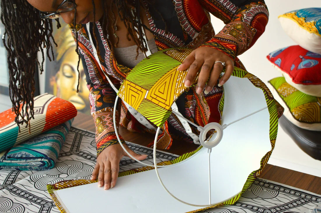
101037519_906227149893541_3497493082251547859_n.jpg
Photo: SR Costello

Photo: SR Costello

Kelly and The Shapes

How is your creativity? I was reading an interesting post by artist and illustrator Lisa Congdon about what she describes as the ‘Skill Gap’ between our vision and our ability. It totally jibes with how I’ve been feeling under lockdown, thinking about starting a new project and then hitting a wall when I actually give it a try. And I love how she explains that it’s okay to be shitty on the path to greatness. Wise words indeed.

Cheers, Arren


First up, two projects that caught my eye. Both from entirely different parts of the world, both with a different and equally fab point of view, and both using Kelly Wearstler’s Graffito wallpaper. Why do they work??? And what is it about KW’s trademark handpainted pattern that is the boffo touch in both interiors?

Well, if you ask me, it’s the abstract vibe. The theatricality. The DRAMA that this edgy pattern gives. Its become a bit of a classic, no?

Australian designer and stylist Jono Fleming used it to add that oomph on his parent’s place. I’m looooving the modern desert vibe the pattern in Salmon Cream gives, layered against all those soft blushes and naturals in the palette. See the full room shot here, as well as the rather grungy ‘before’.

Design/Styling: Jono Fleming. Photo: Kristina Šoljo

Design/Styling: Jono Fleming. Photo: Kristina Šoljo

Then MONIOMI Design, out of Miami, amped up an already peppy and pattern filled bathroom with a wall in the Onyx Beige colourway. Taking the space from polished Art Deco to something much more current and crush-worthy.

Design/Photo: MONIOMI Design

Design/Photo: MONIOMI Design


I’m such a fan of BTS shots of how a stylist actually lives, playing around with the things they collect themselves, and snapping and sharing the results.

Sania Pell is definitely one to follow on Insta for softly poetic and moody assemblages of things found and collected over time. The shot below is a fave of mine, with its monochrome mix, texture and almost-clutter-but-not thoughtfulness. Not to mention the PATINA!

Styling/Photo: Sonia Pell

Styling/Photo: Sonia Pell


Let’s finish up today with vases. But, ya know, not just any old glass or ceramic vessels. Nope, these ones are knitted. Yes, knitted, by Amsterdam-bases textile wunderkind Charles-Antoine Chappuis. Each of his fantabulous Soft Amphorae series has different coloured sides to max out your hot shelfie lewks, and can be turned upside down, holding water on either end using found glass objects. Knit of linen and recycled yarn sourced from textile factories, the handles are malleable, allowing you to add extra swerves and shapes to a piece as the mood takes you.

Just think how killer a slew of these would be, sitting odd but pretty on a surface. Want your own? Check out the whys and wherefores of where to find them here.

Photo: Charles-Antoine Chappuis

Photo: Charles-Antoine Chappuis

Checking out the details

I've already posted here about The House Hotel, a cool Autoban designed spot I'd stayed in in Istanbul a while back. Well, I thought it would be kind of nice to share some of the interesting design details of the hotel with you, snapped by me early one morning before any of the other guests were up and about (otherwise they might've thought me kind of odd, crouching down to capture a snap of the hallway floor, lol).

Here we go then - A closer look at the white and gold chandelier, there were a couple of different variations scattered around, including a lovely gold and beige one in the hotel's front hall. Next up, the enamelled steel and glass wardrobe that was in each room, inside was a small two drawer unit for all your foldable bits and pieces. Outside the rooms, each room number was cut out of brass and then spotlit. Staying in the hallway check out the stone floor (I'm loving the pattern), and then finally, topping it all off, you can see the hexagon pattern of the floor mirrored in a suspended trellis panel at the ceiling.

Brief, colourful and pixelated

Sheesh, I'm having two short weeks in a row, what with the ICFF last week and the just-happened long weekend. At least we got the planting done on our back yard vegetable beds (I can't wait to check out the Tigerella tomatoes!), but other work beckons so I'll keep this brief - What are your thoughts on pixels? And, for that matter, fractal patterns? Have we all had enough, or, is this all still - to quote Martha - a good thing? I don't know about you, but I could totally work the brand spanking new Cristian Zuzunaga for Nanimarquina hand-knotted wool Digit rug into my place at a moment's notice...

Colour correction

Okay, I'm all for good taste, but every now and then I think I might just barf if I have to look at another classic white linen drum shade. Jeez Louise people, let's break out of the beige box and have some fun! Anyhoo, along the lines of that mini rant I want to share the work of Rie Elise Larsen. This Danish stylist stepped out in the Spring of '08 to create her own line of completely gorgeous housewares, paper goods and fashion accessories, all with a light, bright and intensely colourful sensibility. Me likey, especially the be-ribboned paper lampshades and colourful lamp cords shown below. Click here to check out the rest of her beautifully photographed and v. charming collection.

Paper play

Last week I happened to get a sneak peek at the latest Shand Kydd wallpaper collection, and meet the British designer behind the line; John Wilman. This will be the third book released under the Shand Kydd marque by Blue Mountain Wallcoverings (it's expected to hit stores in August), and each book has been a mix of strong patterns, directional colours and designs that you can really sink your teeth into.

Below I wanted to give you a look at a few of my favs from the current collection; Shand Kydd II. The great thing about the line is that John takes inspiration from historical remnants in Blue Mountain's extensive archive and then plays with scale, colour and finish (there's always a fab mix between matte finishes and metallics). Chelsea is a sketchy '40's floral that looks smashing in this intense purple, let alone pairing it with a painted floor and Eames Wire-Base table. Bamboozled hits, for me at least, a swanky 70's vibe. Kew is an over the top riot of flowers in Technicolor. Bloomsbury is painterly and loose with florals and zig-zags. And finally, Chelsea makes a calmer appearance in black printed on a cream ground. You'll find Shand Kydd available by special order at Home Depot, and through specialty paint and wallpaper retailers across the country.


Bookmark and Share