I’ve been having a bit of a design moral dilemma on Instagram with the number of fabulous interiors which, once you check in on the details, do not actually exist. Yep, 3D visualizations are the deepfakes of the interior world, and they’re kind of bumming me out.
You see, to me at least, part of the art of interior design is dealing with the reality of clients, budgets, contractors and trades - plus the sourcing of fabulous furnishings - to end up with something that’s real and tangible. That’s where the real beauty is.
Thoughts? Should I just get with the program, double tap and be done with it?
Cheers, Arren
While my accidental fascination with green continues, this particular room is so much more than the wall colour. Truthfully, it has also been given a generous helping hand by those mile high baseboards and that deep panelled window, but I have to tell you, this time I’m going gaga for the furnishings.
The shot is from that design mag marvel, House & Garden UK, which always brings serious LOOKS to the fore. I wish I could tell you the creative minds behind it, but alas the Google machine is no help - Any ideas?
Okay, back to the bits and bobs that make it special. Let’s start with the fab Hepplewhite sofa from Ensembliers London, shall we? The blue and white fabric is TO DIE FOR, but it’s the eye for detail and the fully upholstered legs that are really delivering the goods. This crew is not messing around. That sofa, plus the weird tramp art style table and kooky yellow wrapped frame chair, oh, and the art! It all adds up to perfection.

While many of you - well, maybe it’s just me - constantly scream, not another Jeanneret chair, when trawling through interior images, help is at hand. This week, I’ve been spotting chairs by designer Mario Milana instead. And I couldn’t be happier.
If the first shot below looks familiar, that’s because Milana’s rather stunning Brooklyn abode was featured in AD, and has just made a reappearance in the pages of Living - Corriere de la Serra. That’s his Rulla Lotto rocker in the foreground, and his Masand lounge in behind, but it’s his fun, fun, fun dePostura dining chairs that seem to be having a bit of a moment. Literally. Chair. Heaven.
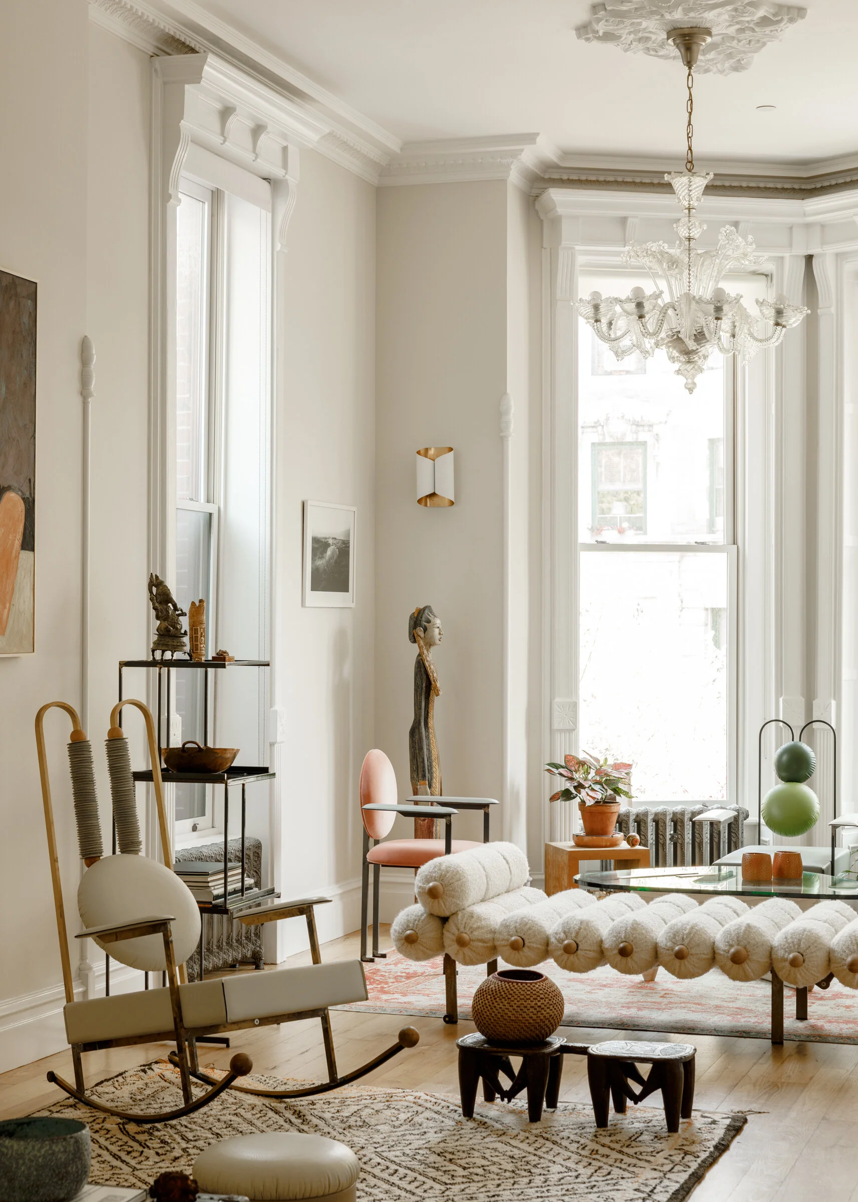
Photo: Max Burhalter. Styling: Colin King

dePostura dining chair. Photo: @PalermoUno
Australian designer Chelsea Hing’s latest project is a stunner. Orchard House is the name, and Hing describes it best - “Avant-garde furniture, art & objects were layered to create a deliberate tension in an otherwise monochromatic palette.”
That tension definitely comes to play in the kitchen, with the scene stealing Verde Rameggiato marble slab counter set against the murky blue-green painted cabinetry and that boffo Shogun lamp from Artemide. And hello, that lamp! Designed in 1986 by Mario Botta it has deservedly attained design icon status.
Moving onto the living room, I had a complete, have I died and gone to heaven, moment over the Edra On The Rocks modular sofa and Indian green marble Salute tables from La Chance. Lordy!
You really must check out the complete Orchard House interior on Hing’s website. Styled by Beck Simon, it’s a winner baby.

Photo: Rhiannon Taylor
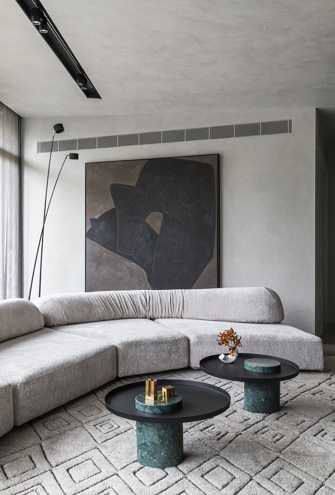
Photo: Rhiannon Taylor


