We all need a little inspo

Inspiration comes in all shapes and sizes, often completely out the blue. and in these difficult days - well - we could all use a little beauty to get us through…

So, here we go with an occasional series of things that have caught my eye. Yes, many will be via Insta, but who knows what else I can dig up? And of course, if you’d like to send me any recos, please drop me a line here.

Cheers, Arren


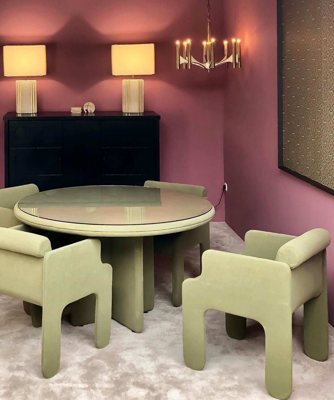
@objectsdaffection aka O.D.A. Galerie is a space in storied Paris flea market Marché Paul Bert curated by stylists and set designer Eve Ducroq and Arnaud Dollinger. In the room sets they create, look for an eclectic selection of vintage pieces styled to give the sense that some very chic homeowners have just strolled off screen to live a fantastically creative life. And, speaking of life, the chalky lime and plum combo in this space is definitely giving it to me right now.


@damienlangloismeurinne_studio aka interior architect Damien Langlois-Meurinne has an eye for sculpture within the architecture of an interior, ergo this stunner of a plaster fireplace. That, plus all of the softly curving furniture in this space have me completely swooning. Modern Parisian glamour at it’s best.

69896741_682032118948116_4887596085082300550_n (1).jpg

Let’s finish with a pop of colour. I love a kitchen island that steps it up in something bright so here, in this flat in Marseille by Paris-based designers @novaobiecta, it’s all of that kelly green, plus those cobalt framed stools. Gah!

Big and squooshy

It's grey and rainy in my neck of the woods. Good for the garden (the heirloom tomatoes are growing gangbusters), but it really makes me want to curl up on the sofa with Spot and take a snooze. From a design perspective I'm in Cloud Cuckoo Land today, dreaming about spectacular houses that I'll never own, filled with furniture that's way beyond my snack bracket. So, Roche Bobois' inspirational interior shots are just the ticket - Up top you have the big and super squooshy new Voyage Immobile sectional designed by Cedric Ragot. Love all the kooky stripes on the sofa, let alone that art installation/giant pickup-sticks game, though the floor lamps are a wee bit alien-ish for my liking. Then there's the stripe-tastic Rythme modular sofa designed by Studio Missoni Home (the rug and tables are by the SMH too), but, what I really want to know is, where the heck did they find that insanely huge hi-gloss orange and khaki spinning top?

Blue mondays

Is Monday your most favourite day of the week? Errr, possibly not. So, to get everyone through the gloom and chill of this particular Monday I thought we could totally do with some inspiring shots by photographer Tom Mannion. I don't even remember how I stumbled across his jaw-dropping work, but as soon as I'd had the chance to have a good rummage through his stunning portfolio I knew I wanted to post this series of shots. A quick e-mail and then Tom said yes. Cool!

Anyways, I love the mix of blues (turquoise is Pantone's colour of the year, btw) and the slightly surreal feel of the shots, all beautifully styled by the v. talented Faye Toogood for Elle Decoration. Time for some dotty paper lanterns, don't you think?

Galliano rocks a tree

Ah yes, time for a bit of glamour. I don't know about you, but a good dose of something spectacular is just the kind of kick in the pants I need. And today's inspirational kick is courtesy of fashion designer extraordinaire John Galliano, who created his version of a Christmas tree without an evergreen twig in sight. Instead Galliano's tree is smothered in orchids, butterflies and a rather chic leopard, all fashioned from papier-mache and inspired by the Orientalist vibe of his Fall/Winter '09 collection for Dior. If you'd like to take a gander at the tree you'll have to stop by Claridge's hotel in London, where it'll be on display until Jan 6th. Looking around for snaps of the project I discovered Galliano's original sketch, which gives a lovely peep inside the creative process, and just had to include too. Oh, and I have to thank Laird for the tip on this! Via Bornrich.

861 or 80?

Are you a square feet or square metre person? Do you count rooms and then add a 1/2 for a bath, and never include a basement? Oh, the strangeness of real estate... This space by Italian firm Poliform revels on the smaller side of things with an 80m squared plan (or 861 feet squared, depending on how you're feeling). Love the look of the place, though their assertion that it's a low budget project might not wash with everyday peeps like you and me. For more, check out the website here to see the rest of the interior, though be warned, the site is rather annoyingly wiggly.


The one that almost got away

The week has just run away with me, and where are we? Thursday? Sheesh... It has been bananas with propping for shoots, deadlines for a few different projects and puppy pre-school for Spot. Our car is crammed full of props including a bunch of bathroom mirrors, a sink and other random bits and pieces, all of which have to be returned before the end of the week. Anyone have a magic wand handy?

I can identify with anyone who descibes herself as a magpie, which is one of the reasons I wanted to share fashion designer Alice Temperley's very eclectic looking studio space. I have a feeling it doesn't always look as beautifully styled as this, lol, but can totally imagine her working away on a collection here. That bombastic rug is one of Temperley's designs too; Ophelia from The Rug Company. For even more inspiration, check out the We Like section of her website, which includes a cool video tour of Portobello Road Market (one of my most favourite places in London). [Image: Rachael Smith. Via the Guardain]

Lemon and vanilla

Mmm-mmm, what a juicy way to start the week. I stumbled across this Heals living room shot and thought it was definitely yummy enough to share. Love the simplicity of the space and the bold citrus yellow and creamy vanilla white; just think how easy-peasy it is to pull a room together using a two colour palette. For more inspirational colour take a look here at a mix of blue and white.

Bathroom-a-palooza

Here we go, in one fell swoop, oodles of bathroom inspiration from the Kohler Design Centre. I wandered around and snapped away since the place is filled with bathrooms by quite the laundry list of top-line designers that include Clodagh, Laura Kirar and Tristan Butterfield (he's in charge of all of the interiors in Kohler's ads). Anyhoo, scroll down and take a look. I love the tiled walls on the dressing area of the Laura Kirar space, and all the panelling detail in tones of cloudy pink in the the secretive and romantic interior by Tristan Butterfield.


A taste of chocolate

Okay, here we go; here's one of the shots from my Hershey's Milk Chocolate inspired bedroom. I know, it doesn't give much away (lol), but I wanted to give you a taste of the room before I post all the pics early next week. Photographer Stefano Barbera took the shot, and yes, I can promise you he and I ate the chocolate once we were finished! Waste not, want not, as my Mum always says...

Marcel in the kitchen

Let's end the week with a bit of kitchen inspiration. The space below is a slice of one of the condo suites at the Mondrian South Beach designed by Marcel Wanders. The hotel/condo is quite the fantasy world, designed to resemble an up to date take on Sleeping Beauty's castle with lots of trademark Wanders witty excess. The kitchen really caught my eye since it feels modern, yet uses those blue and white Delft tiles in a wraparound to stunning effect, all set against white, tangerine and black. Though to keep things running in that Miami vein the tiles picture lifeguards, sharks and bikini clad girls, rather than windmills and tulips, lol. To see more of the over-the-top interiors from the hotel check out travel website Mr & Mrs Smith, and to see Wanders describe his design direction in video click here. It's all quite barmy really, but you have to admire Wanders guts and very singular vision.

Streamlining Louis

My mate Bev Hisey has had the vintage Louis loveseat below kicking around for the last 15 years. In its last incarnation - slipcovered in white denim - it leaned definitely to the Shabby Chic side of things. Then trouble struck, when Aisha, Bev's cute yet troublesome cat, decided to use the loveseat as a litter box one too many times. The slip was dumped and the loveseat was shipped off to collect dust in storage at the upholsterer's.

A while back Bev and I had hit the road to check out a fabric outlet where she discovered a tough as nails and terribly sharp slate grey wool; perfect for a re-do for the loveseat. Bev stuck with the distressed painted finish, had the guts entirely replaced (oh, Aisha...), then went for a severe yet chic upholstery job. I think it looks rather smashing, and just goes to show that a good frame can last years, survive both cats and Shabby Chic, and still look streamlined and modern.


Bookmark and Share

White, white, white

I was feeling terribly uninspired today until I saw this; the French home of designer Jane Whitfield, Marc Jacob's right hand woman at Louis Vuitton. It's quite the de-lovely modern rustic place with lots of white, white, white. Setting off all the white are scads of vintage finds and wallpaper (that's Farrow & Ball Silvergate in the first shot). I'll let the beautiful images speak for themselves, so take a look and enjoy, and click here to read the full article on the Telegraph newspaper's site. [Images: Birgitta Wolfgang Drejer]

Via Telegraph 

Bookmark and Share

5 quick questions: Alex Bates

I was lucky enough to have a fascinating chat with Alex Bates, West Elm's creative director, back when West Elm opened up in Liberty Village in October of last year. She was just back from a whistle-stop tour of incredibly inspiring places and was starting to plan the next collections for the affordably on-trend brand (which also happens to be one of my fave places to shop). To continue that conversation I recently asked Alex if she wouldn't mind answering a couple of questions on her personal style and she happily obliged. And, from the sound of it, she's also racking up more Air Miles as we speak.

Below you'll find a couple of snaps of recent West Elm intros - The Beanstalk bed linens, Beach Glass vases and Twist melamine dishware. Click here to check out more 5 Quick Questions interviews.

Arren Williams: What's inspiring you now?

Alex Bates: All things Calder. His recent show at the Whitney blew me away. The installation of his wire face sculptures was a stroke of genius. I also loved the Met’s exhibition of his jewelry – crazy and elegant. I’m loving simple wire and pencil sketches in general; especially Martin Ramirez’s black and white sketches at the American Folk Art Museum.

AW: What's the next thing you have your eye on for your own house?

AB: I am fixated with all shades of grey, still. You can see it manifested in our summer collection at West Elm. I’m dying to paint my front hall. I think it would be very cozy and create a great background for my art. There is also a pair of vintage Cherner Chairs I want. I know they would look like pieces of sculpture against the gray.

AW: How would you describe your current style, and how has it changed over the years?

AB: My house is more about collecting that decoration. It’s very laid back and comfortable with worn family antiques mixed with modern – and of course a lot of West Elm. It’s a hodge podge of things I absolutely couldn’t live without from years of traveling. Every wall is covered in paintings and tons of books. I am officially out of wall space and have stacks of paintings and books growing in the corners. I’m trying to pare back and I fantasize about a certain Piet Boon house – spare but cozy. I know my little bits would start to slowly creep back in.

AW: Is there anything that can drive you crazy when you walk into a room?

AB: Bad art. Fake flowers. “I Married Adventure” by Osa Johnson.

AW: What's next?

AB: Spring is a busy time for us. We just opened out our new West Elm store at Broadway and 62nd in New York with an amazing opening party and a fun collaboration with David Stark. We’re finishing up our spring 2010 collection and trying to continue to be as green as we can in our processes, materials, and finished products. Next we're off to Italy for the Milan furniture show and then India. We have started some great new partnerships, working with Craftmark and Aid to Artisans in India, and I’m excited to explore new ideas with them.


Bookmark and Share

Show house envy

I loooooove a good showhouse, so the news that Kips Bay Decorator Show House opens its doors in NYC on April 17th has me excited. It's always an incredibly fascinating - and inspiring - view into the minds of a select bunch of top interior designers. Last year, rather than designing the interiors of a single home, they took over a half dozen apartments in a 1950's building and the results were simply fabulous. This year they're back in somehwhat familiar territory in a circa 1922 limestone mansion on the Upper East Side, 22 East 71st Street to be exact. The work of legendary designer Albert Hadley is this year's inspiration, and all the designers who created spaces either worked with him, had him as a mentor or have been inspired by him.

Take a boo below at the few snaps I've managed to find so far. I'm really hoping to go see it all in person, but since it might come down to re-upholstering a sofa or heading to New York for inspiration, I'm afraid the sofa might win out!

From the top - Designer Amy Lau collaborated with paper artist Jo Lynn Alcorn on an installation that dramatically highlights Maya Romanoff wallcoverings. A swanky master bath designed by Andrew Flesher. And finally, I swiped this shot from Heather Clawson over at her great blog, Habitually Chic. She got to hit the Kips Bay press day (jealous!!!) and chatted with designer Garrow Kedigan about his small yet chic space, read more here. [Images, 1 & 2, Maya Romanoff. 3, Gunkelman Flesher. 4, Bruce Buck]

Via Interior Design, Fabulous Over Forty, Habitually Chic

Bookmark and Share

Nosy and skinny

Yes, I am on Twitter (you can find me here) which, whenever it's mentioned, either gets a raised eyebrow or a huh? It can be very useful, in fact I found about The Modern Location, a firm that specializes in cool spots to rent for film and tv shoots, from a Tweet by 20th Century Forum (check their forum out here, part of their site is dedicated to helping you identify any vintage glass and ceramics you might have scored).

Anyhoo, back to what I'm supposed to be waffling on about - The Modern Location is a brilliant way to let you do that nosy neighbour thing and peek into lots of cool and quirky homes scattered about the UK and beyond. This ultra skinny and kinda minimal converted Mews house found in North London caught my eye - Designed by architect Jack Hosea, I think it's a lovely mix between Puritanism and practicality.


Bookmark and Share

Happiness is...

I'm feeling the happiness today. The sun is streaming in through the windows and doing a smashing job on all the seed trays we've planted (yay!), plus, news broke that Anthropologie's first Toronto store will open it's doors on April 22nd (double yay!). And while all the smartypants, me included, were swearing up hill and down dale that the first Canadian store from the boho fashion and interiors chain was to be in Yorkville, ummm, nope - It's gonna be at the Shops at Don Mills. Yep, perhaps a bit of a treck for downtown types, though McEwan is opening there in June (chef Mark McEwan's fancy-schmancy gourmet grocery destination, read more here) guaranteeing it'll be even more of a hot spot.

I'll be at the Anthropologie opening, so I promise to report back with cool finds and snaps of the place. In the meantime, here's some sunny day inspiration - A living room from the UK that made my jaw drop, with its white-painted floors, patchwork sofa and round shag rug. Yummy, yummy yummy.

Via Le Brocante and House to Home UK 

Bookmark and Share

Very extraordinary chickens

I popped in to Ultra on the the afternoon of their re-opening in February and was met by controlled pandemonium. I sidestepped some workers and said hello to cool as a cucumber co-owner Charles Khabouth, who vowed they'd be ready for that evening's event. Luckily the dust settled, and everything went off without a hitch.

One of my favourite Toronto design firms - Munge Leung - is behind the restaurant's rather glam re-do, including those showstopping 15ft tall curtains printed with mondo images by photographer Stephen Green-Armytage, taken from his book Extraordinary Chickens. The curtains flank a huge solid oak table and 24 hi-gloss lipstick red charivari chairs. Not to take anything away from those chickens, but that table - designed and created for the space by edgy firm Castor - is quite the stunner too; it's a massive 25-feet long solid oak number supported by a quirky mix of vintage, baroque and hand-carved cast aluminum legs. Click here to see the table under construction, and make sure to stop in at Ultra for a cocktail or spot of dinner sometime.


Bookmark and Share

No holds barred

This brought a tear to my eye - A peek inside the stunningly intense interiors of the just-opened Viceroy Miami, designed by Ms. Kelly Wearstler. The spaces are all entirely about sparkle, verve and panache with a keen sense of eccentricity and style (can you tell I've been reading Diana Vreeland's biography? lol). Here's a word or two from Kelly on her inspiration “…a blend of modern sophistication with a dash of exotic flair and timeless East Asian accents. The color palette is multi-layered with sumptuous tones, which off-sets the classic forms and organic finishes – antiqued mirror and brass, onyx, stone, marble and wood.” Anyhoo, I'll let the pictures speak for themselves...

From the top: The main lobby and detail. a vignette from the resort's Signature Restaurant, a view of the express lobby, a look at Club 50 on the 50th floor (think of the views of Biscayne Bay), and finally; one of the rather swish looking bedrooms kitted out with KW linens and robes. Plus, to check out my 5 Quick Questions interview with Kelly, click here.


Bookmark and Share

A healthy obsession

Whenever I ask a photographer to share some of their favourite shots I never know quite what's going to happen, so when I bugged a good friend of mine, photographer Angus Fergusson, to send through his faves he kindly obliged and then revealed that he's 'kitchen obsessed'. Yep, 3 out of the 6 shots he sent through are of very posh kitchen spaces. Funnily enough Angus and his darling wife Beth have a luvverly kitchen of their own; the result of surviving a reno on horrifyingly run-down fixer-upper in Toronto's west end. They bravely managed to see beyond the filth, rotten panelling and oddly placed toilets to create a bright, open and modern space - Fingers crossed we'll see it popping up in a mag sometime soon (it's quite the transformation).

The first two shots are from the sadly defunct Wish Magazine, the next three are from House & Home, and that final snap is of House & Home's Editor-in-Chief Suzanne Dimma, at home with her feet up, from the Globe & Mail. Make sure to take a boo at the rest of Angus's portfolio here and, on a personal note; Angus shot our last house for House & Home (you can see some of the snaps here on Apartment Therapy) so I'd love to give him first dibs on shooting this one, whenever it's ready, lol...


Bookmark and Share

From Helsinki with love

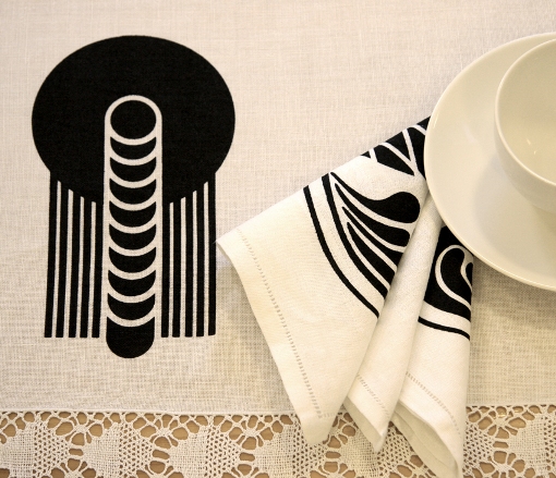
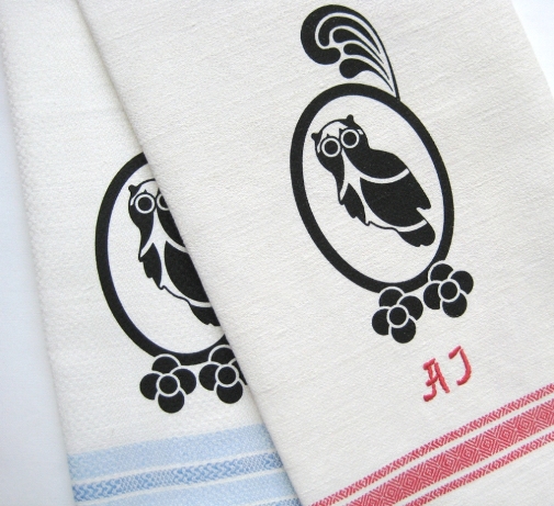
Hello, I think I'm in love. Ummm, I'm talking the pieces you see below - Vintage linens found and re-worked by Helsinki-based designer Elizabeth Salonen of Mottoform. Elizabeth scours vintage shops, antique stores and summertime outdoor fleamarkets in Helsinki and, when she's back in Canada, any pieces she can score here too. She then hand-prints each one-of-a-kind piece with designs inspired by hundreds of photographs of Art Nouveau architecture snapped around Helsinki and from research into the archives of the Finnish Architectural Museum. The collection, called Helsinki Remade, is available only through Design Forum Finland, though Elizabeth is currently looking into a few stores and online retailers too (fingers crossed for a Canadian retailer!). Lovely, no?


Bookmark and Share