All this sudden heat does slow things down rather deliciously. Makes me crave a chilled glass of rosé in the steamy outdoors, slowly sipping while watching the condensation speckle the wine glass and puddle on the table.
And, while things are busy, work currently has the consistency of molasses. Slow and sticky, but sweet if it ever gets there. How impossible is it to get anything done these days?
I discovered Populus Project through the bastion of cool and contemporary west coast design; Provide. The brainchild of Brian Lin, a Taiwanese-American product designer from Houston who now calls Vancouver home, Populus is the result of Lin pivoting from a career in fashion to create covetable objet for the home.
Just say yes to Lin’s stunningly simple yet utterly textural Silver Travertine trays - your keys and loose change will thank you. The trays also come in a heavily veined and totally g-g-g-gorgeous Italian Portoro marble . And I am totes in love with the polished brass Stack Burner designed to hold incense. Light it up and watch the smoky fragrance loop and curl through the pierced top.
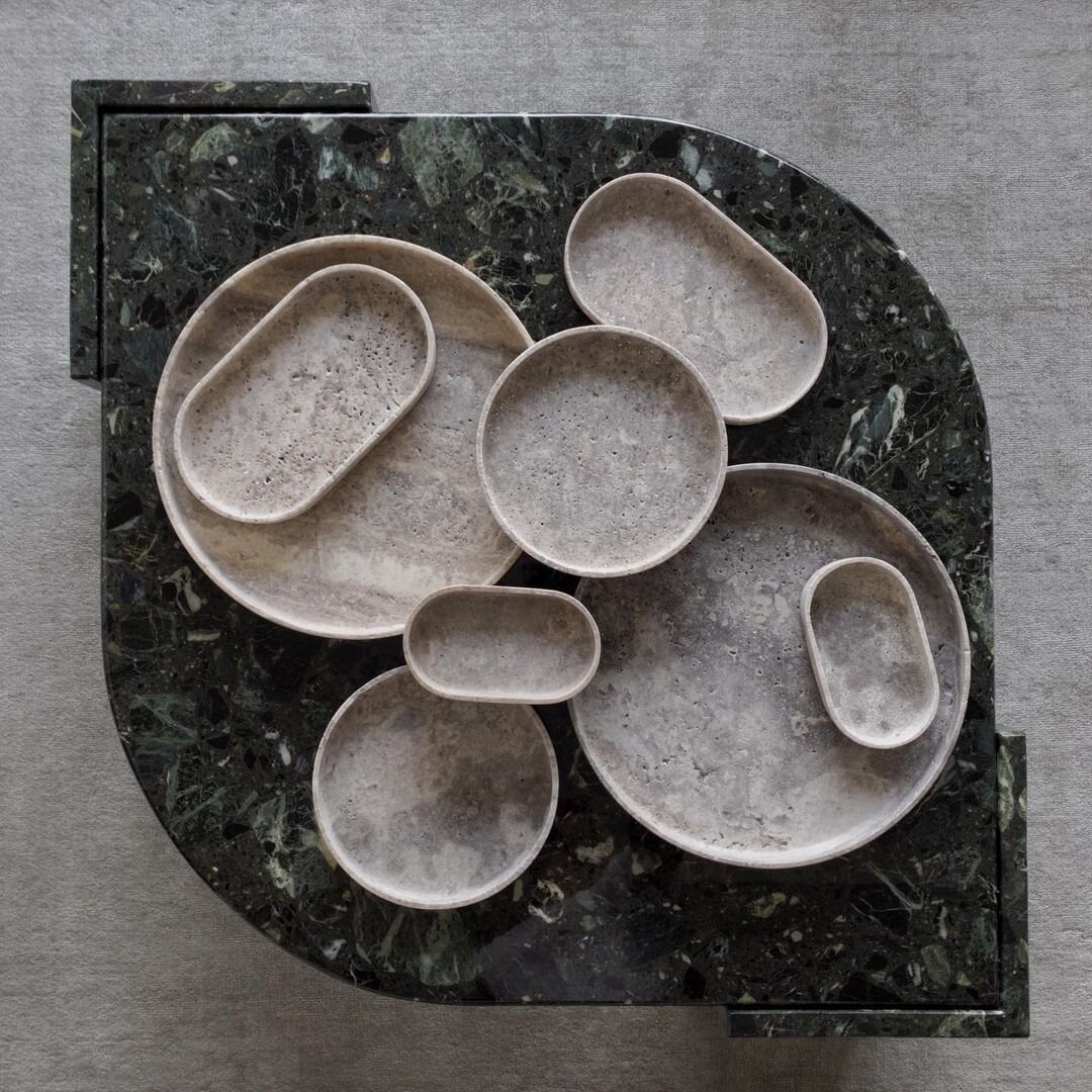
Round and oval trays in Silver Travertine. Populus Project

Stack Burner. Populus Project
I always wonder about too much pattern. Is that even a thing? Can there ever really be too much pattern in an interior? Listen, before I sound any more like Carrie in SATC, I know this lewk might not be popular with the Japandi-loving crowd, but aren’t these two examples of mural wallpapers just stop-you-in-your-tracks fab???
First up, we’re serving FLORAL in this space by interior stylist Agi, featuring the 'Fragment of wallpaper' mural from the V&A Museum collection at Surface View. The design is taken from a circa 1725-50 wallpaper panel from Eltham Lodge in Kent, scaled up to deliver a definite design moment.
Let’s follow up with this little number from Transylvania-based patterntastic firm Mindthegap, who’s maximalist ethos infuses everything they do. The Azure mural is part of a collection they’ve dubbed Sundance Villa, and includes 201 other patterns, in case the mood takes you.
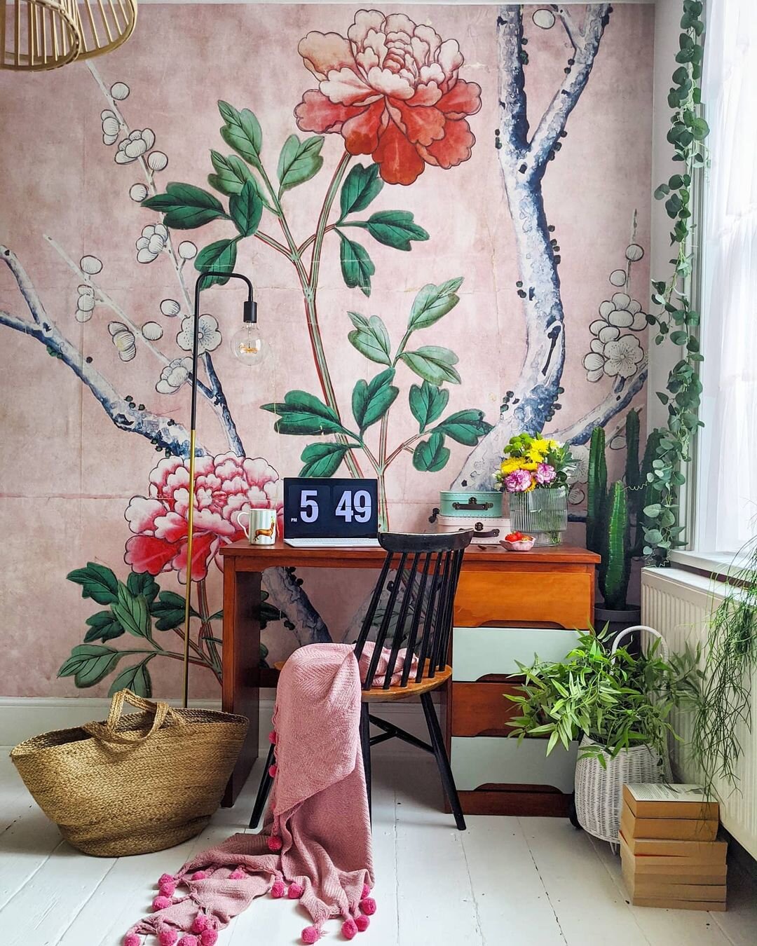
Surface View ‘Fragment of wallpaper’ mural. Interior design: Agi
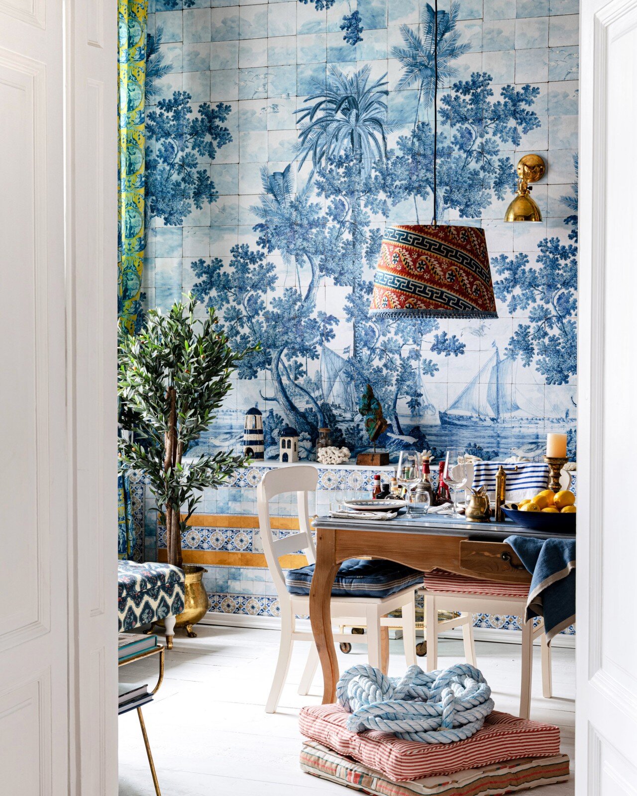
Azure mural. Mindthegap
Oh, hello high-contrast black and oak. The new Jamie Beckwith collab with Currey & Co is definitely pushing all my buttons, translating Beckwith’s mindbogglingly gorgeous patterned wood surfaces for floors and walls to a 10-piece collection of furniture and furnishings.
Of course!!! You’ll shout, when you realize you can actually match Beckwith’s Gio Ponti inspired Swoop surface in oak with his Swoop Cabinet. (shown below). I’m seeing a wall in the wood pattern fronted by the cabinet, and topped with a barmy vintage lamp like this, you?

Swoop cabinet and Arrow cocktail table. Jamie Beckwith for Currey & Co
More horn-tooting… A while back my talented sister co-founded Plum & Belle, a stylish online resource for sustainable home goods, fashion and apothecary. And, when I chat with her over Facetime on the daily, I’m always pumping her for info on the latest finds they’ve added to the shop.
While there’s always something I want to get my hands on (I’m talking to you, Shibori indigo dyed vintage French linen tote bag), a long time fave are the heirloom kilims by Ishkar. Woven by Afghani weavers in partnership with the Norwegian Refugee Council, they embody the handmade specialness of true craft. Read more of the story behind the blue Band-e Amir design or Anar in burnt umber, each handwoven in wool.

Ishkar Band-e Amir kilim. Plum & Belle

Ishkar Anar kilim. Plum & Belle