Time and Design

Well, despite everything, things have been a little busy. Dealing with a couple of design projects, including our own main floor bathroom (half bath, or powder room, depending on what part of the world you’re in), as well as launching the Spring/Summer ‘21 collection for Casa Cubista and the imminent launch of my new collab with Hudson’s Bay that’s a super-fun collection for bed, bath and beach.

Honestly though, I’m just thankful that Spring feels like it’s just around the corner, and warmer weather is on the way.

What’s been going on with you guys?


The promise of sunny days always makes me think of jute and seagrass rugs underfoot. I’m such a fan of their relaxed vibe and how they can really take the edge off a modern space. In fact, I just sourced an ace striped jute rug for a project that will see the light of day in the next couple of months.

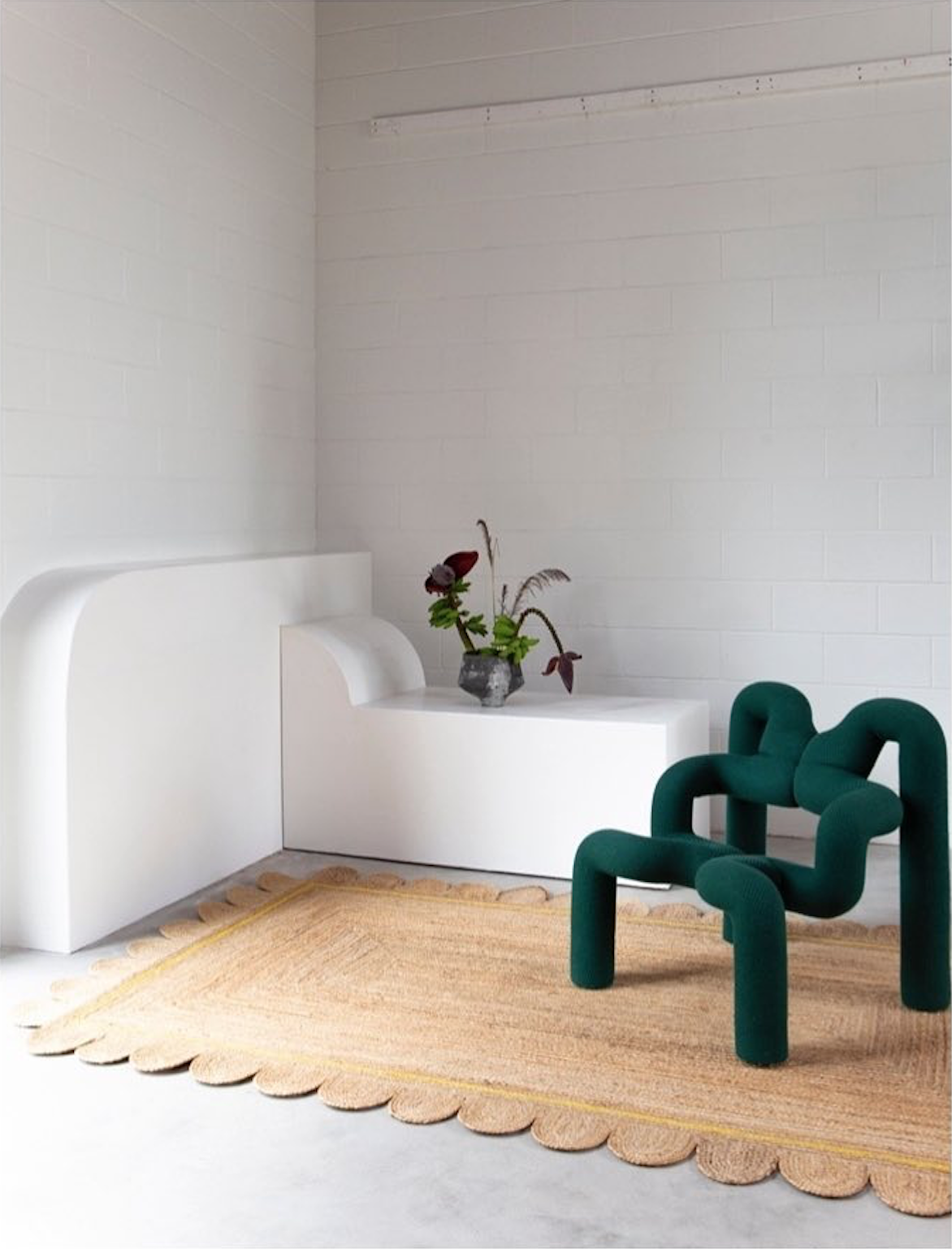
But, GAH, if only I’d seen the fab scalloped jute rugs from Tigmi Trading sooner. Hello, yes, you read that right, SCALLOPED! That added detail just amps it all up that bit more, no? Anyhoo, Tigmi’s jute selection comes in both rectangular and round versions, in plain as well as with a single line of colour. Who’s gonna say no to that?

Okay, yes, Tigmi Trading is based in Australia, but thankfully they do ship worldwide. Oh, and to make you go even more bug-eyed, they just opened a stunner of a new showroom in Byron Bay that’s definitely worth your attention. Check it out here on The Design Files.

Photo: Scalloped jute rug with yellow detail at the Tigmi Trading showroom in Byron Bay.

Photo: Scalloped jute rug with yellow detail at the Tigmi Trading showroom in Byron Bay.


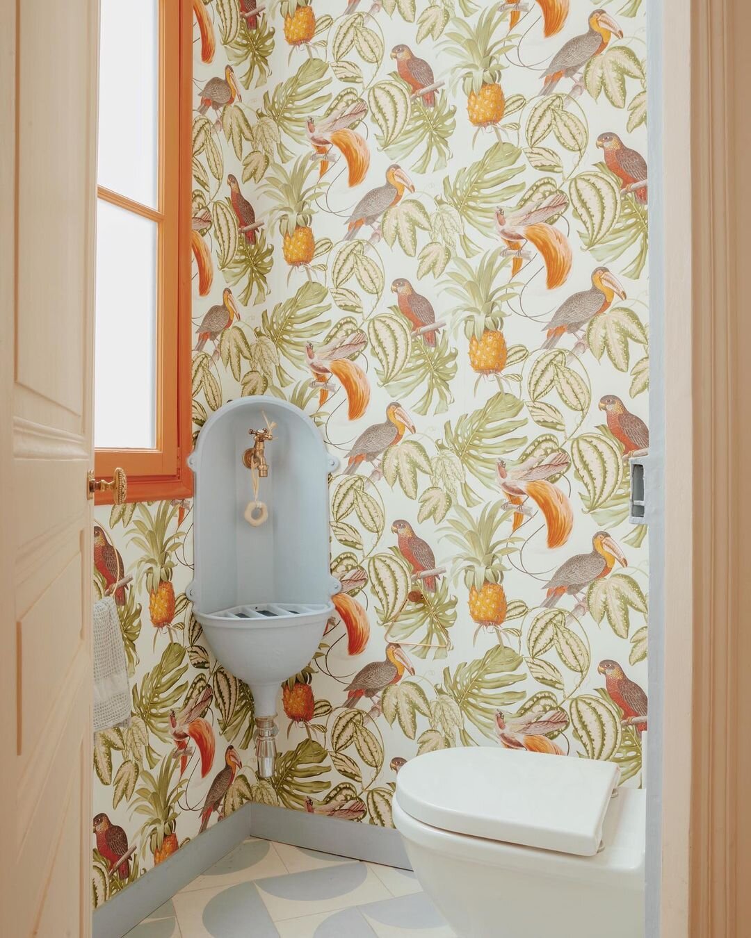
The struggle is real when it comes to sourcing a small-scale corner mount sink that doesn’t eat up the entire room. In the end, I managed to find something for our space that both fit the bill, and the budget, on Wayfair. That’s all well and good, but how about finding something that completely hits a home run, from a design perspective?

I spotted this charmant petite toilette from GCG Architectes on Insta, and just fell in love with the sink they’d scored. How perfect for the space, with it’s eclectic mix of colour and pattern (the wallpaper is from Erismann, the tiles from Popham). But where is the sink from??? If anyone can let me know, please do, since I’m envisioning someone lugging it all the way home from a Parisian fleamarket.

UPDATE: GCG Architectes kindly dropped me a line to say that the fab sink was actually in the apartment, and that they were able to save it!


I adore a singular vision when it comes to interiors, and a full-on commitment to style. British photographer Rachel Smith shot Kentaro Poteliakhoff at home in his Hackney townhouse - the gloriously dubbed Villa des Narcisses - for the Observer Magazine, and I am living for it. What, your home doesn’t have a name? You better get on that…

Poteliakhoff is the owner of ROOMS, an interiors store and veritable treasure trove of kitsch, mid-mod and antiques, and I definitely admire his take-no-prisoners maximalist style. Beige is so, well, yesterday.

Photo: Rachel Smith

Photo: Rachel Smith
Way Down South

Australia is amazing. And stylish. And cool. And I have never been.

A visit is definitely on my ever growing bucket list. Until that happens, I thought I’d share some brand new faves from that part of the world.

Cheers, Arren


I’ll never not say no to art with a strong, graphic point of view, so the work of artist Emma Lipscombe is right up my alley.

I love how restrained each piece is, yet bright and playful at the same time. Each is painted in oil on timber board, and sized a diminutive 31cm square, they’re a snap to sneak into a gallery wall.

The shot below, styled by Natalie Johnson and Lisa Burden for Real Living mag, shows how fab Lipscombe’s work looks layered into a contemporary space. Not your thing, perhaps? Well, they can also look equally at home somewhere more relaxed, rumpled and deshabille. Get the vibe here.

Photo: Dave Wheeler

Photo: Dave Wheeler

Photo: You Can’t Take It With You #14

Photo: You Can’t Take It With You #14


While the redoubtable Patsy Stone believes you can never have enough hats, shoes and gloves, I’m of the same mind when it comes to occasional tables. In our living room, we currently have 3 that get dragged hither and yon, just so a cocktail can perch within arm’s reach.

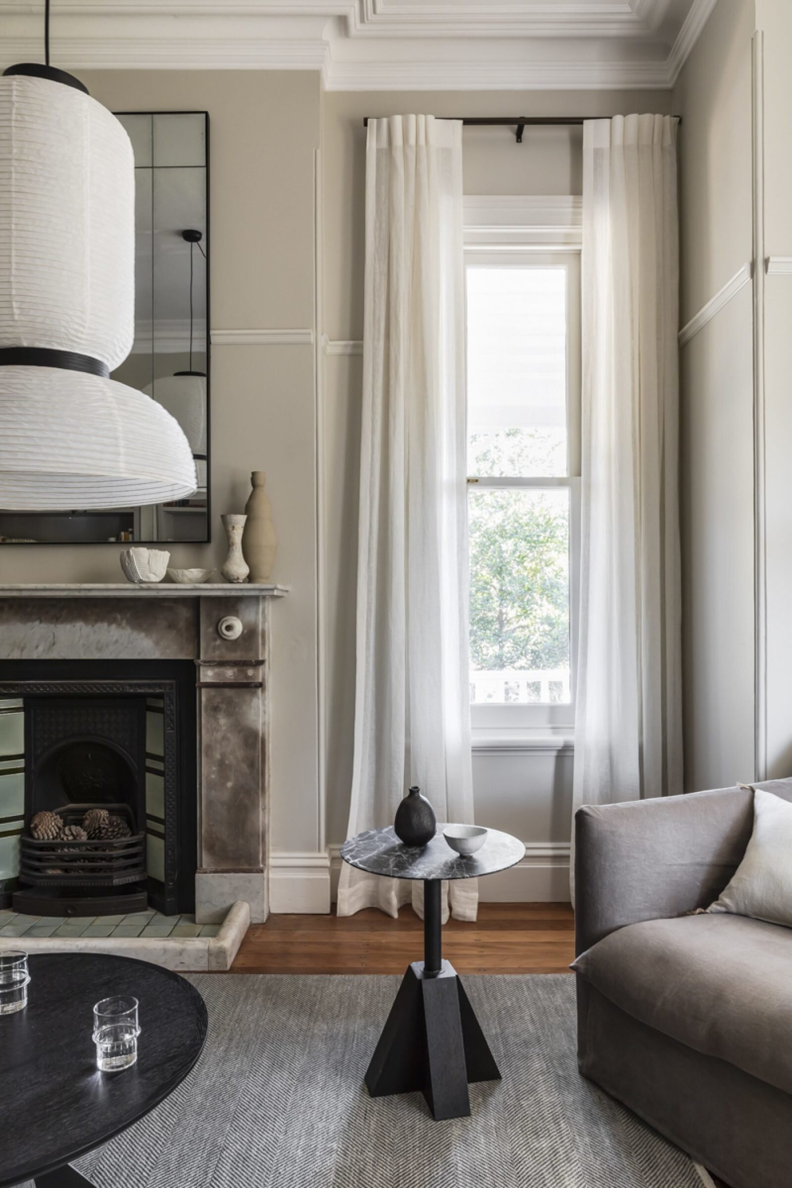
Here’s a perfect little number from architect and interior designer Daniel Boddam. His M-Side Table - part of a series inspired by architectural forms - is both stylish and sturdy, set just-so in this interior he designed in Hunter’s Hill.

I love this look, and how well the table works with Jaime Hayon’s rice paper pendant light for &Tradition. It’s so simple and chic against all of the room’s trad details.

Photo: Pablo Veiga

Photo: Pablo Veiga


I am a longtime fan of Popham Design’s contemporary concrete tiles, made the old fashioned way in Marrakech. The patterns are always spot on, giving a designer just enough leeway to mix it up and create something special.

So, it’s their Squarish On Four tile that drew me to this swish guest bathroom designed by Studio Parker. That off-kilter mod pattern, paired with brushed brass fixtures and a chunky built-in vanity is making it all happen. Yes, to all of it!

Photo: Jacqui Turk

Photo: Jacqui Turk

Guest blog / Jenn Hannotte: The bath equation

Jenn Hannotte: My bathroom renovation began about three months ago, and we're still working on some finishing touches before we can present the BIG REVEAL. But until then (soon, I promise!), I thought I'd recount the story thus far. Trouble is, it's not terribly interesting. Nothing scary jumped out from the walls, there was no layer of black mold ready to poison my children, no hiccups with the contractors or materials. The only reason why it's taken as long as it has is because I had to go and choose things that you can't grab from your local big- box store.

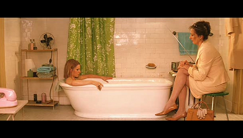
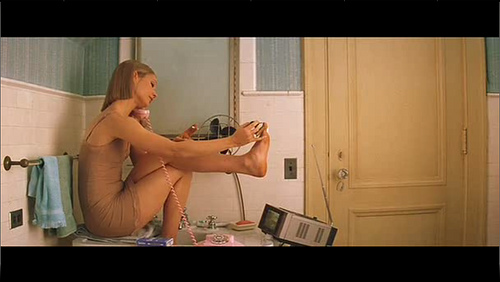
You might recall that my main source of inspiration was the bathroom featured in the film, The Royal Tenenbaums. To get there, we used a lot of classic materials that really fell architecturally into line with the aesthetic of the rest of the house. Always-right and inexpensive Daltile white subway tiles placed 3/4 of the way up the wall from Home Depot, capped with a classic chair rail profile found at Pollock's on Roncesvalles, just down the street from me. For the floors, it was again Home Depot's Daltile in the 'Octagon and Dot' pattern. I sourced a cast-iron clawfoot tub from Craigslist for a steal at $150 including the faucet, shower head and tub surround. The toilet is from Kohler and it's amazing to not be terrified every time we flush like we were with the old one! My favorite piece is the sink - the Brockway from Kohler. It was this baby that we had to wait for a long time to arrive, but it was worth it once installed. 

Without giving too much else away, I found this amazing wallpaper from Ferm Living that looks pretty   much identical to the shower curtain you see behind Margot Tenenbaum that really sets off the entire space. So the question is, class, can this equation be solved?  


Wash and brush up, Italian style

Phew. This has been quite the barmy few weeks, wrangling everything from styling gigs for romance novel covers, to working on super cool celeb filled projects for the Toronto International Film Festival. So, let's make it a quick one the, shall we?

I first saw Falper at the Cersaie bathroom-a-palooza trade show last year in Bologna, Italy, and totally fell for their whole look. So, once I got my hot little hands on their catalogue I thought I should definitely share a few fave shots. These just happen to be all black and white interiors - though as you know I have nothing against colour - and everything, right down to that last styling detail, is mah-vellous!

Guest blog / Jenn Hannotte: The royal treatment

Jenn Hannotte: Ahh, the sweet, suffocating smell of plaster dust! We're knee-deep in it over here, tackling the family bathroom. When we bought this house, we thought we could live with it for a while. We thought that we could clean it up, and it would be OK. We thought maybe some new towels would help. We thought WRONG. The 'before' picture provides some visual evidence, but the real issue here was the smell. And the strange textures that stained every surface. I won't elaborate, but suffice it to say we are very happy to have it all GONE! It was demo- day here today, and the folks from Cera Stone (who I also used to renovate the main floor of the last house) knocked it out efficiently as ever.

Finding inspiration for the bathroom wasn't a problem. It seemed everything I saw, I loved. Especially anything dark and vintage, with an industrial twist. Like Jenna Lyon's en-suite, or this gorgeous bathroom from House & Home by Connie Braemar. But, I wasn't quite sold on the idea of going to the dark side - something wasn't quite grabbing me. And then, as I do a couple times a year, I was watching The Royal Tenenbaums and there it was, my future bathroom. Nothing dark about it, but oozing original vintage charm with a fresh colour scheme and those great set details found in all of Wes Anderson's films. How close the final product will be to the bathroom Margot Tennenbaum spends  "six hours a day locked up in...watching television and soaking in the tub" remains to be seen, but the hunt is on! [Image 2 via Habitually Chic. Image 3 by Virginia Macdonald]

For more of Jenn's take on style, as well as to see the beginnings of her own reno project, click here.

Commiting to Patricia's style

I must have bathrooms on the brain today. You can catch a tour of mine here on House & Home Online TV, and then these rather gorgeous images appeared in my in-box, touting the arrival in North America in early 2011 of Axor's new collection created with a fave designer of mine, Patricia Urquiola. I totally get her commitment to a rather kooky sense of modern style, plus her love of craft, and the way everything is tossed together in a rather un-matched yet glorious way that all adds up to make the bathroom feel almost like a living room. Love. It. All.

IDS10: The storm before the storm

Nope, that title isn't a typo. While that single snap below doesn't give too much away (and makes it all look rather calm), things have been a little on the crazy side as the clock ticks down to the IDS10 Gala opening. Today all the Graham & Brown wallpaper made it up (after a slight meltdown on my part since we were trying to avoid mudding the seams between the plywood wall panels - and yes, of course we couldn't avoid it), all the Kohler fixtures were set in place and all the furniture and accessories were loaded in (thanks for the hand Meg!) and everything was covered in drop cloths to avoid a mammoth dust job early tomorrow. Ah yes, and talking of tomorrow there is still a ton of spit and polish before the space is done. Maybe cloning actually works? I'll have to look into it...

Bathroom-a-palooza

Here we go, in one fell swoop, oodles of bathroom inspiration from the Kohler Design Centre. I wandered around and snapped away since the place is filled with bathrooms by quite the laundry list of top-line designers that include Clodagh, Laura Kirar and Tristan Butterfield (he's in charge of all of the interiors in Kohler's ads). Anyhoo, scroll down and take a look. I love the tiled walls on the dressing area of the Laura Kirar space, and all the panelling detail in tones of cloudy pink in the the secretive and romantic interior by Tristan Butterfield.