Well, here we are. The grey days have given up and we’ve slid deliciously into lovely lilac season, which sidestepped briefly into wisteria hysteria and will soon shift into peony pandemonium.
As flowers bloom and the temps rise, so it feels like we’re stepping finally out of the dark and returning slowly - and carefully - to ‘normal’. Personally, I can’t wait to get my second shot and may start randomly hugging people on the street. You have been warned…
Large and in charge, chunky yet funky. While I might be paraphrasing Latrice Royale’s description of herself, this is exactly what popped into my tiny mind when I spotted these fab bar stools from Only Good Things.
To me, the Sir Burly stool hits the nail on the head from a style perspective. Cool and modern, yet functional, with just the right amount of wit. Designed by Dowel Jones, a firm fave of mine, these hefty little loves come in both counter and bar height, and a range of white/black/natural oak combos. I’ll take two, please.
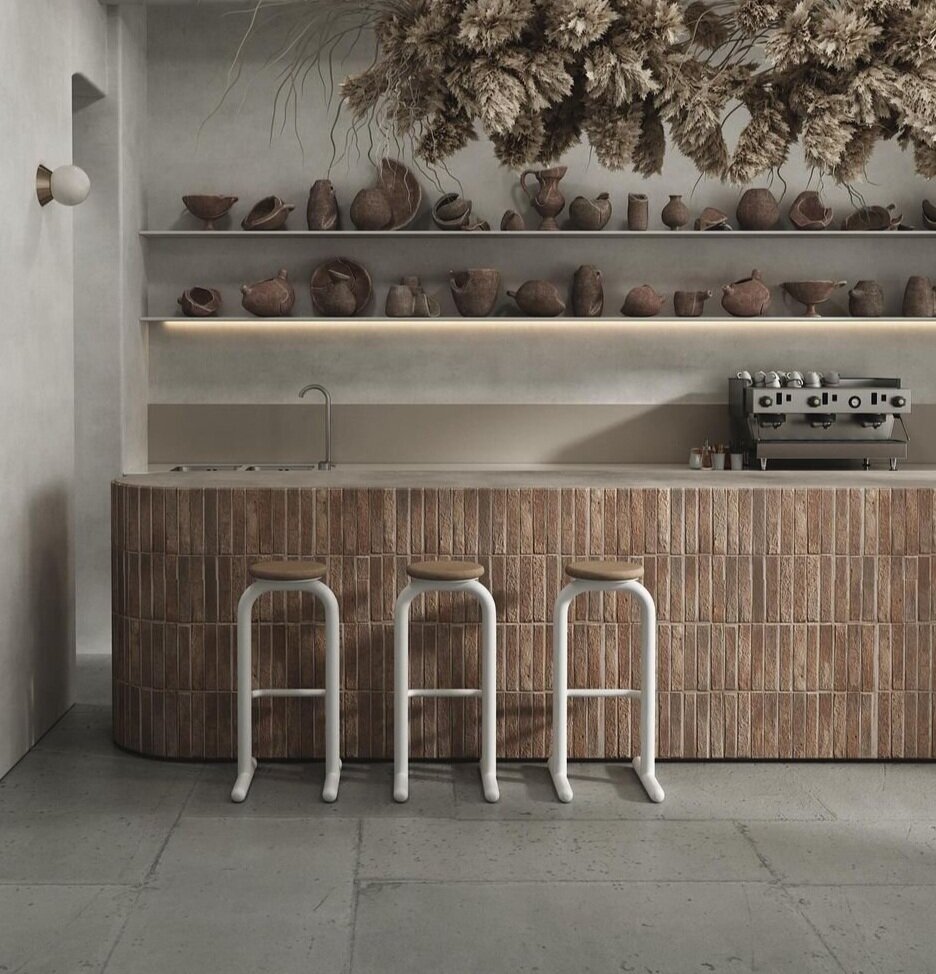
Sir Burly in white/natural oak seat. Interior design: Artem Rechitsky

Sir Burly in black/black oak seat. Dowel Jones for Only Good Things
By any marker, Frank Lloyd Wright’s Ennis House in LA is an architectural marvel. Built in 1924 of 30,000 concrete blocks it’s quite the Mayan Art Deco Moderne fantasy, and is the largest of four FLW ‘textile block’ homes built in California. And yep, you might recognize it, from appearances in everything from 50’s B-movie horrors to classics like Blade Runner and, more recently, Westworld.
So, of course it’s super cool to hear that Eso Surfaces has announced a partnership with the Frank Lloyd Wright Foundation to reproduce a series of four designs inspired by the houses, This is all of course fuelling my dreams of cladding a fireplace in the Ennis 3D tile or building a pierced concrete block wall in the futuristic Albin design. Check out all the designs here.

Ennis House. Photo: Sarah Trainor
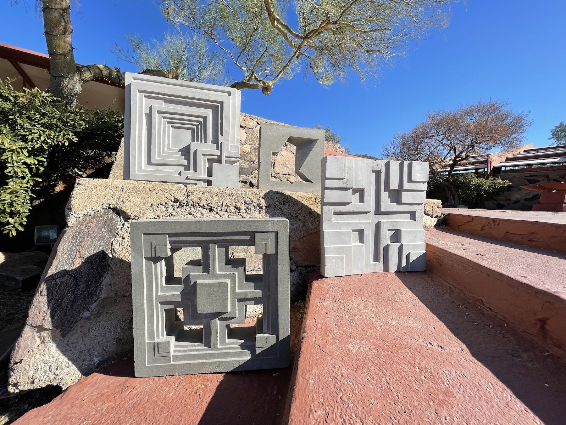
Ennis and Millard tiles, Storer and Ablin blocks. Eso Surfaces
While the gorgeous My Home in Porto - both designed and run by our talented friend Juan de Mayoralgo - is now sadly closed, its memory and influence live on. This shot below is a particular fave, especially the perfectly imperfect two-tone hexagon floor tiles, and the memory of our stay there came flooding back when I spotted a particular rug the other day.
With it’s similar colourway and bold tiled design the Coronado rug, designed by artist John Zabawa for EQ3, feels just about perfect for an interior that needs a major hit of pattern (don’t they all?). And it’s one of those designs that could as easily slide into a modern space, as one with trad details, like My Home in Porto. Definitely one to bookmark!
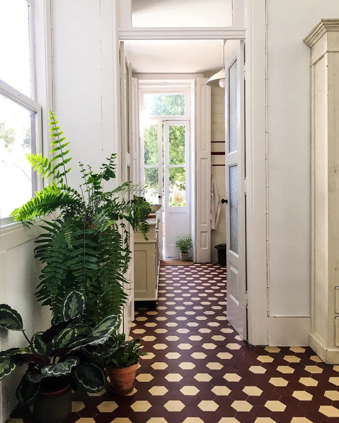
My Home in Porto, Juan de Mayoralgo
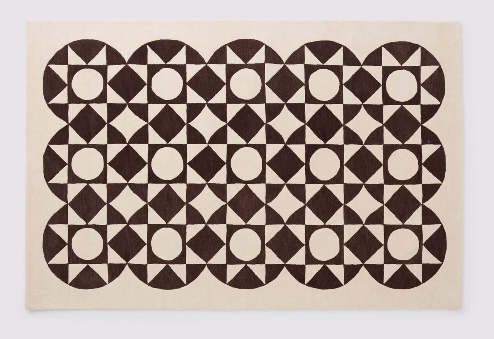
Coronado rug in Cream. EQ3

Coronado rug in Cream, EQ3
Finally, if you’ll permit me a bit of horn tooting, I’m extra-happy to say that my latest project, a bed, bath and beach collection for Hudson’s Bay, recently launched. We first started working on it back in early 2020, with the plan to come up with something bright, patterned and optimistic, and I think we really hit the nail on the head. The inspo came from favourite high-points in design and, as I truly believe, “Living with colour and pattern is definitely where it’s at!”
There are 3 patterns, and I love ‘em all, but Ponti is a definite standout. Find it in yellow and beige for the bedroom (see below), and then turquoise and blue for the bathroom and beach. Plus the intense shades of the Portuguese matelassé coverlets and toss cushions are to die for. You can check out the whole shebang here, and I couldn’t be prouder.
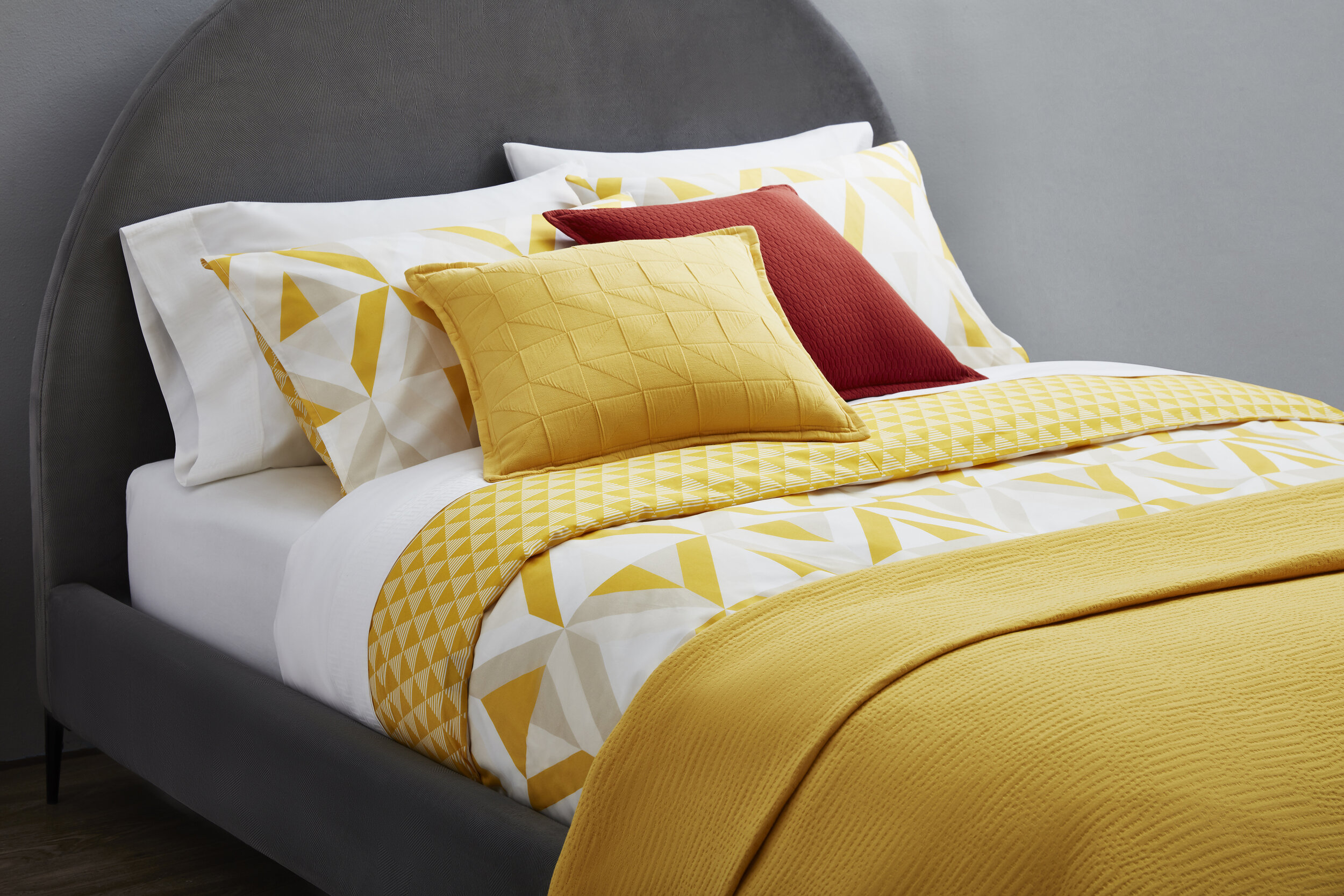
Ponti duvet set, Texta coverlet, Trig and Miel toss cushions, Skye bed. Hudson’s Bay