My mood today is definitely the colour green.
Hopeful and optimistic, with all the promise of Spring and warmer weather just down the road.
Cheers, Arren
Riotous colour and barmy prints! Thank heavens for architect Josef Frank, whose textile and furniture designs for storied Swedish design retailer Svenskt Tenn are an antidote to a grey day, if ever I saw one.
His perfectly curvy and very on trend sofa 968 was actually designed in the late 1930’s, and that gobsmacking fabric? It’s Vegetable Tree, a print Frank designed in the 1950’s inspired by the classic Tree of Life motif.
If you’re looking for something just as stylish, if a little more contemporary, then the cool cats at Svenskt Tenn have collaborated with Swedish architecture firm TAF on their first ever non-Frank designed sofa. Just as curvy as the 968 but with a fresh perspective, the Famna 2020 looks as swish in Frank’s wild 1940’s Hawaii print as it does in plush persimmon velvet. See that stunner here.

Photo: sofa 968, Svenskt Tenn
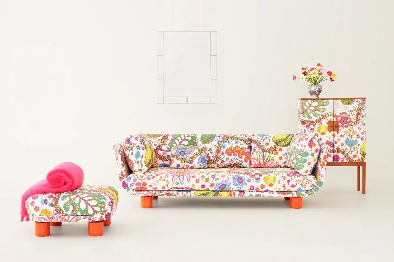
Photo: Famna 2020 sofa and stool, TAF for Svenskt Tenn
I love commitment to colour. So when I see the same minty-meets-chalky shade of green popping up in two entirely different rooms, in completely different styles, I’m sold. One, the creative home in Ghent of design duo Muller Van Severen (see more here). The other, a maisonette in Fulham by British interior designers Barlow & Barlow.
That green is a classic Muller Van Severen shade. Spot it in metal frames for lamps and furniture, as well as in Match, a line of Ikea kitchen cabinet doors made of waxily touchable polyethylene for Reform. Ever creative, there’s even a special Music for Kitchens playlist curated by the duo on Spotify.
Colour is key in this Barlow & Barlow interior too, adding oodles of style on a slim budget. For this peppy living room, Farrow & Ball’s Arsenic is the shade in question. The look is amped up further with a chair upholstered in Lasso by Pierre Frey. It’s a fave from their capsule collection with designer Vincent Darré. Yum!

Photo: Alex Profit

Photo: Barlow & Barlow
Norwegian paint brand Jotun Lady is def where it’s at for modern colour and styling inspo. Exhale, one of their hot picks for 2020 is the soft and misty shade of green in this interior styled by Kråkvik/D'Orazio. And yes, that is a Muller Van Severen Standing Lamp No. 1 in the shot. Couldn’t you just slink right in and never leave?
Check out the rest of Jotun Lady’s totally on the money colour trends for 2020 here.

Photo: Line Klein


