Well, despite everything, things have been a little busy. Dealing with a couple of design projects, including our own main floor bathroom (half bath, or powder room, depending on what part of the world you’re in), as well as launching the Spring/Summer ‘21 collection for Casa Cubista and the imminent launch of my new collab with Hudson’s Bay that’s a super-fun collection for bed, bath and beach.
Honestly though, I’m just thankful that Spring feels like it’s just around the corner, and warmer weather is on the way.
What’s been going on with you guys?
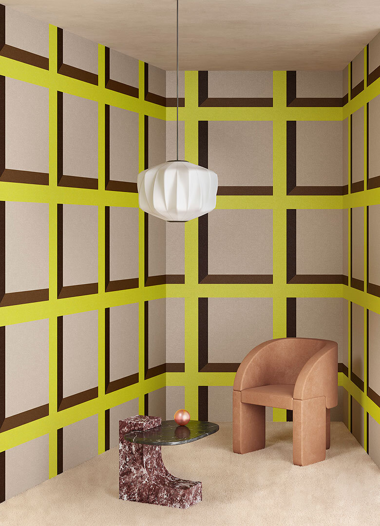
The promise of sunny days always makes me think of jute and seagrass rugs underfoot. I’m such a fan of their relaxed vibe and how they can really take the edge off a modern space. In fact, I just sourced an ace striped jute rug for a project that will see the light of day in the next couple of months.
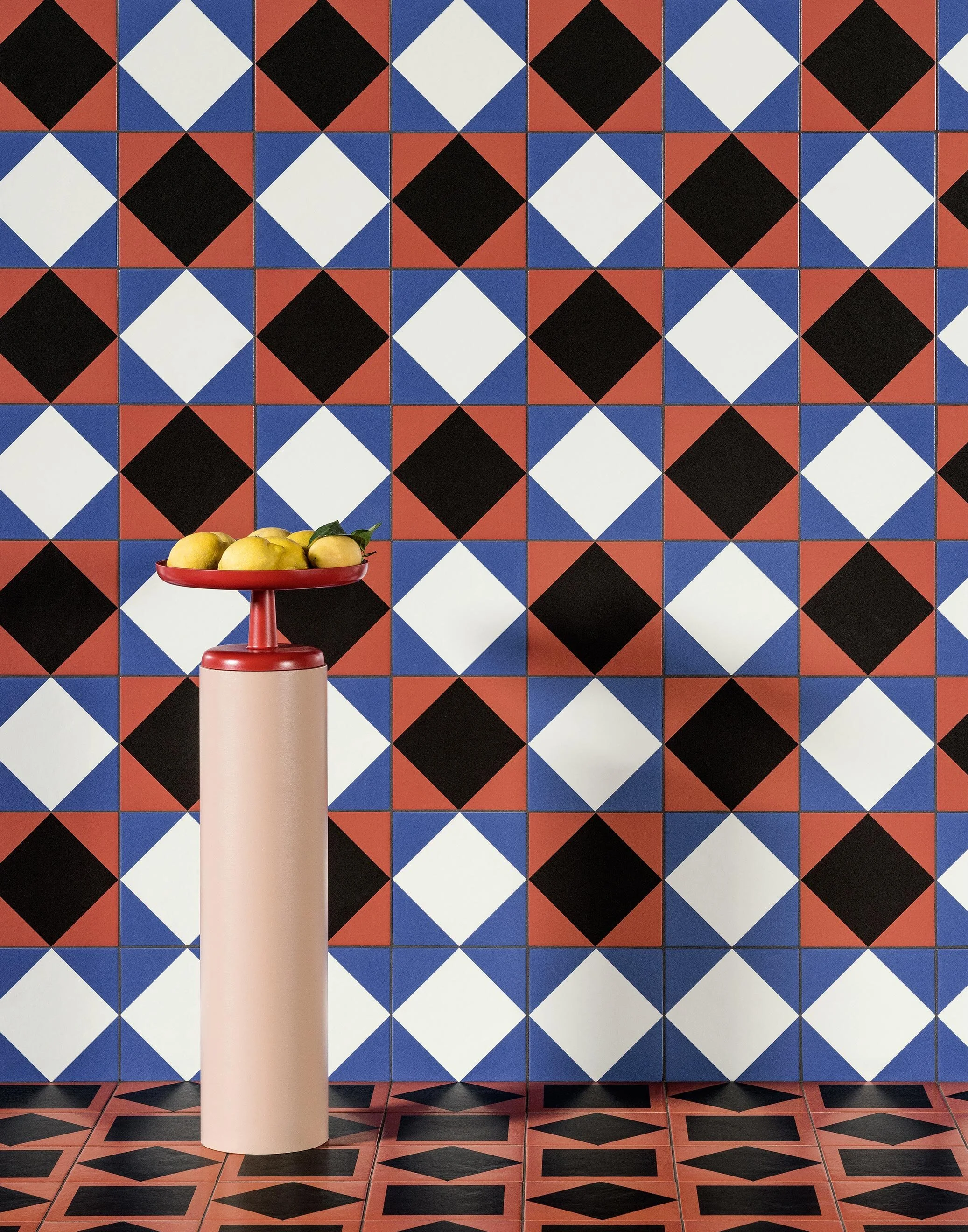
But, GAH, if only I’d seen the fab scalloped jute rugs from Tigmi Trading sooner. Hello, yes, you read that right, SCALLOPED! That added detail just amps it all up that bit more, no? Anyhoo, Tigmi’s jute selection comes in both rectangular and round versions, in plain as well as with a single line of colour. Who’s gonna say no to that?
Okay, yes, Tigmi Trading is based in Australia, but thankfully they do ship worldwide. Oh, and to make you go even more bug-eyed, they just opened a stunner of a new showroom in Byron Bay that’s definitely worth your attention. Check it out here on The Design Files.
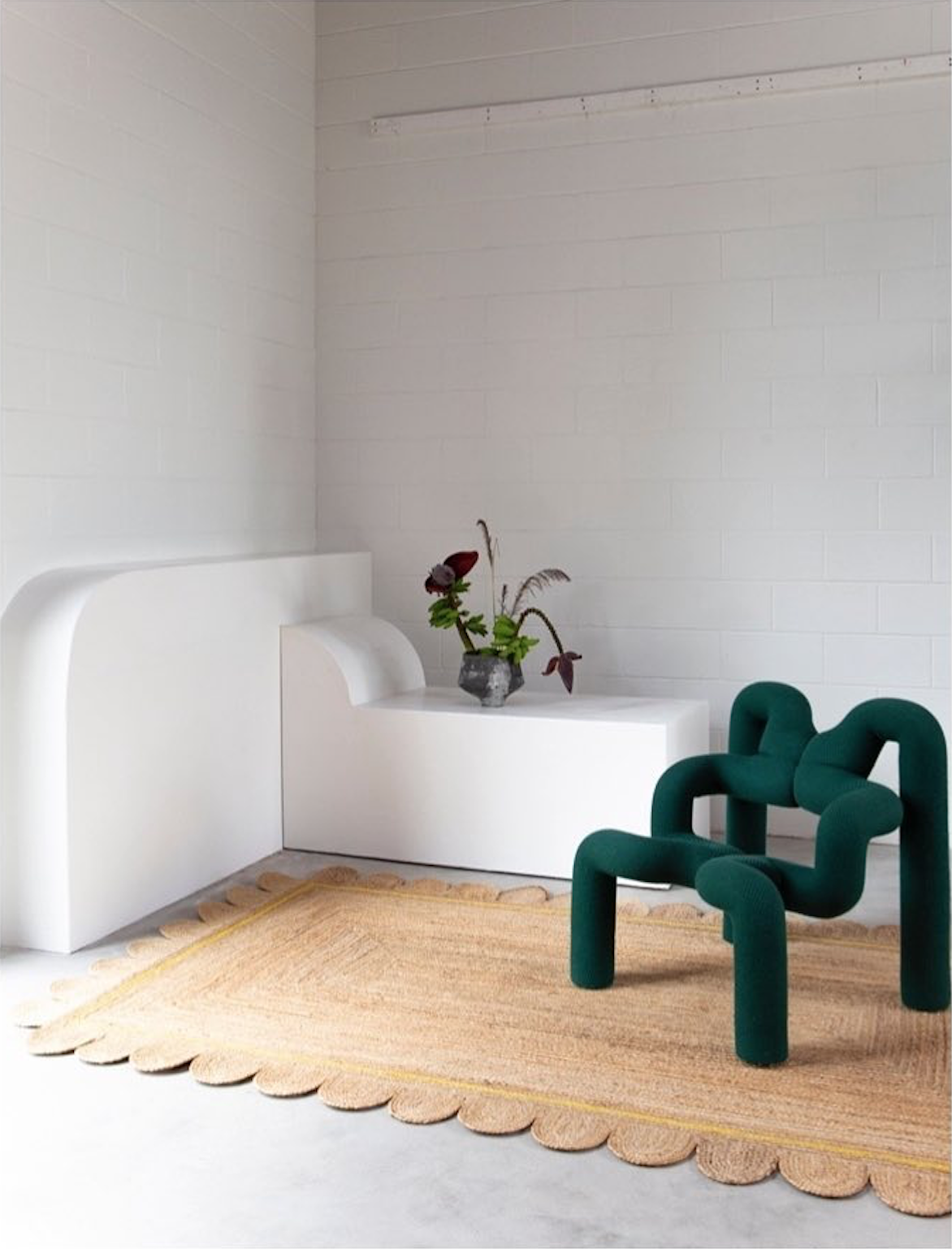
Photo: Scalloped jute rug with yellow detail at the Tigmi Trading showroom in Byron Bay.
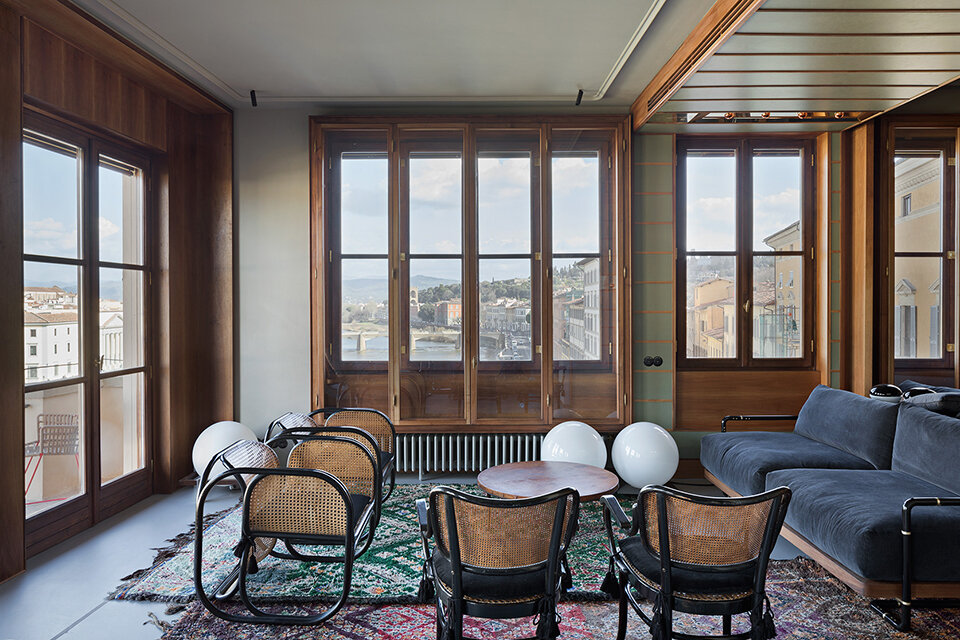
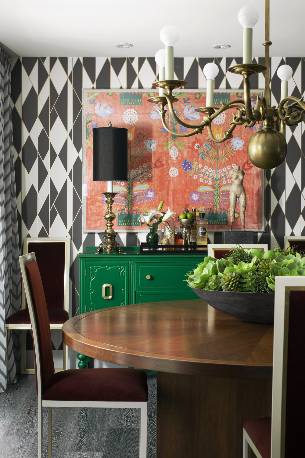
The struggle is real when it comes to sourcing a small-scale corner mount sink that doesn’t eat up the entire room. In the end, I managed to find something for our space that both fit the bill, and the budget, on Wayfair. That’s all well and good, but how about finding something that completely hits a home run, from a design perspective?
I spotted this charmant petite toilette from GCG Architectes on Insta, and just fell in love with the sink they’d scored. How perfect for the space, with it’s eclectic mix of colour and pattern (the wallpaper is from Erismann, the tiles from Popham). But where is the sink from??? If anyone can let me know, please do, since I’m envisioning someone lugging it all the way home from a Parisian fleamarket.
UPDATE: GCG Architectes kindly dropped me a line to say that the fab sink was actually in the apartment, and that they were able to save it!
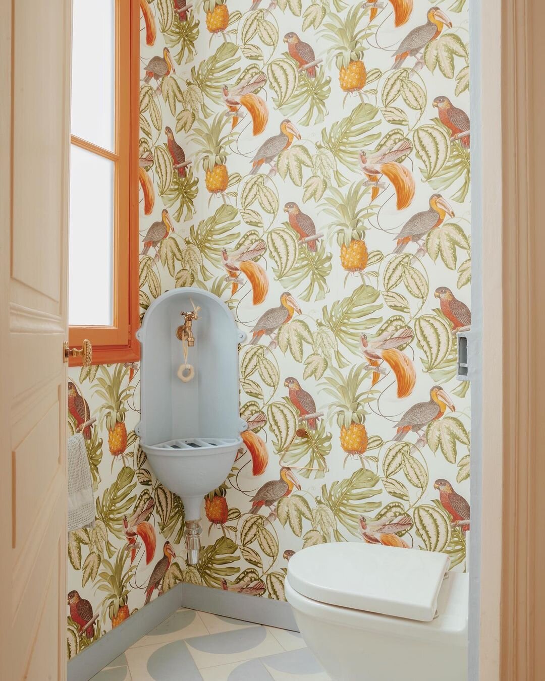
Photo: Benjamin Colombel
I adore a singular vision when it comes to interiors, and a full-on commitment to style. British photographer Rachel Smith shot Kentaro Poteliakhoff at home in his Hackney townhouse - the gloriously dubbed Villa des Narcisses - for the Observer Magazine, and I am living for it. What, your home doesn’t have a name? You better get on that…
Poteliakhoff is the owner of ROOMS, an interiors store and veritable treasure trove of kitsch, mid-mod and antiques, and I definitely admire his take-no-prisoners maximalist style. Beige is so, well, yesterday.
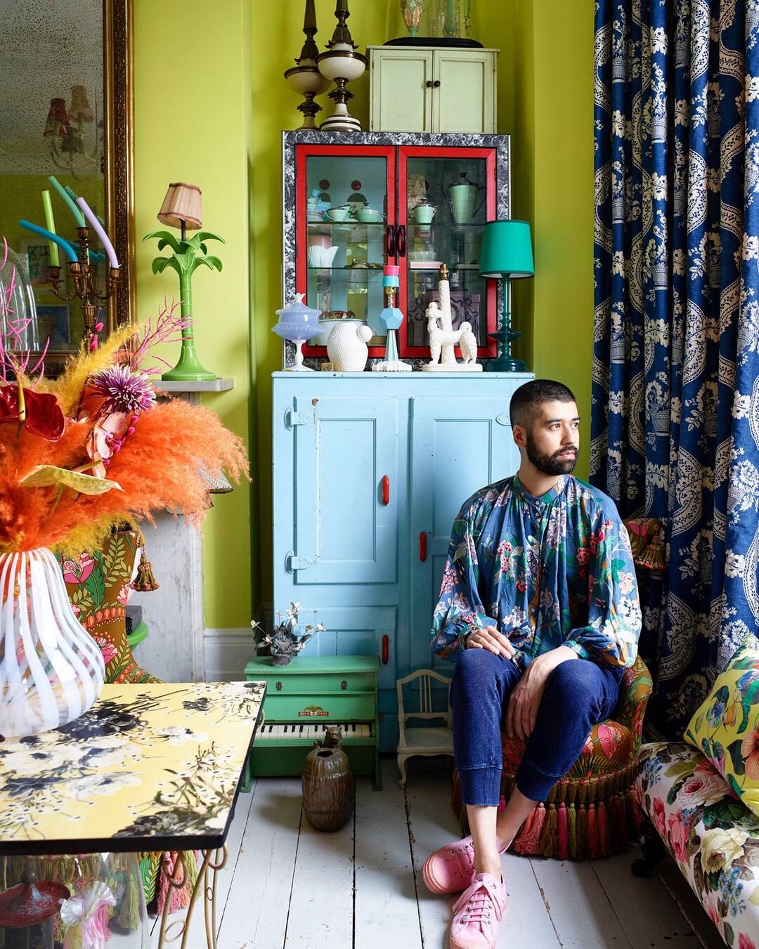
Photo: Rachel Smith