Well, hello! Even though we’ve packed up and decamped to the basement while undergoing a renovation at home, I’m still on the hunt for a few stylish bits and bobs that have caught my eye.
Cheers, Arren
Fashion designer turned ceramicist Harvey Bouterse knows how to turn a look. His enigmatic Insta catalogues his latest creations, with a Tumblr that expands on that point of view, letting you tumble down a very stylish rabbit hole with a look into both his work and other design inspirations.
The hand-built ceramic pieces, each with their individually applied decoration and patterns, play into Bouterse’s love of primitive forms and Brutalism. The result is sculpturally biomorphic shapes finished in hefty textural mid-century glazes that add even more character to his vases, lamps, candleholders and creatures. Quite the menagerie indeed, which - under the Wouter Harvey umbrella - is currently on show in the historic Perignem ceramic workshop in Beernem, Belgium, alongside the work of Wouter Hoste and Katleen Vinck.

Spring 2020 vase

Sketches of the Spring 2020 collection
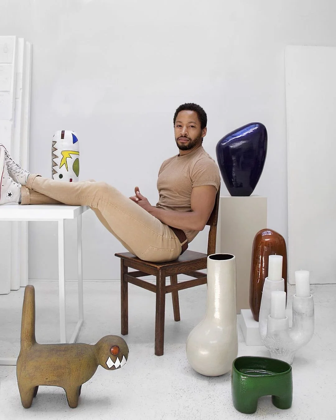
Bouterse in his atelier in Antwerp
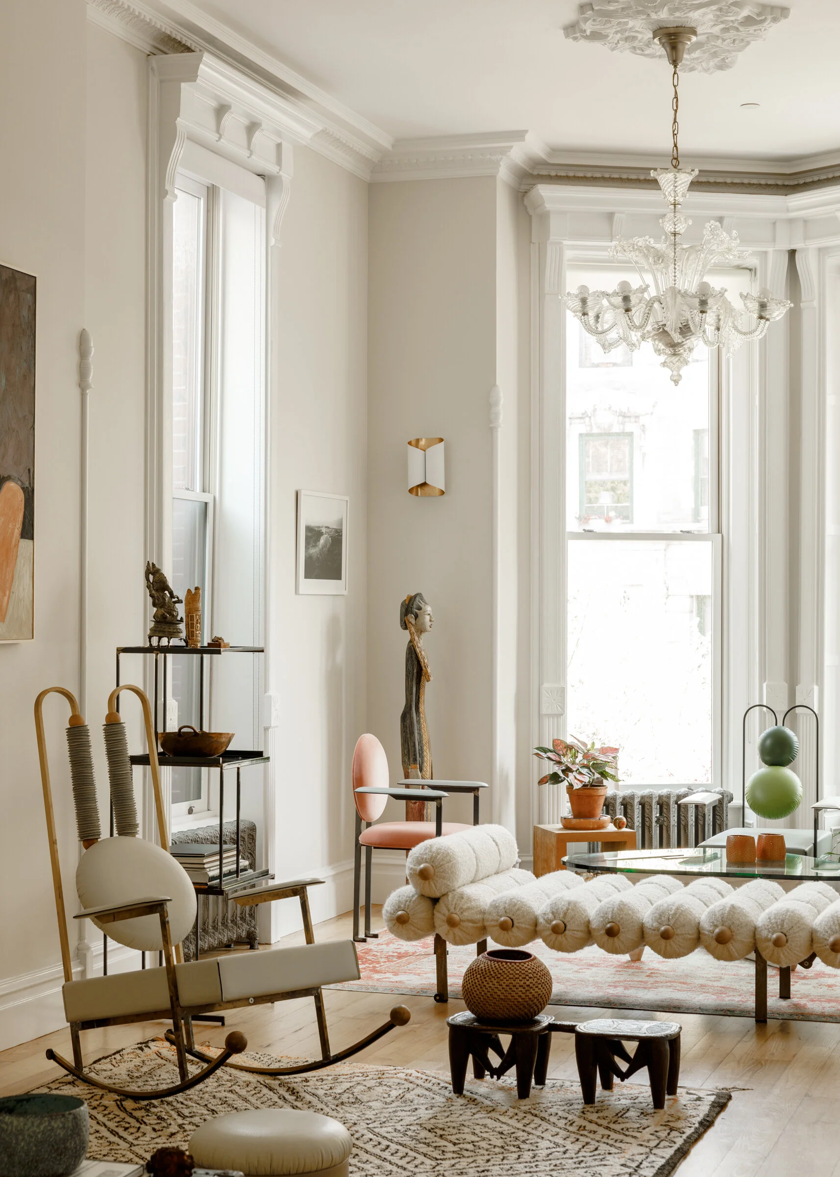
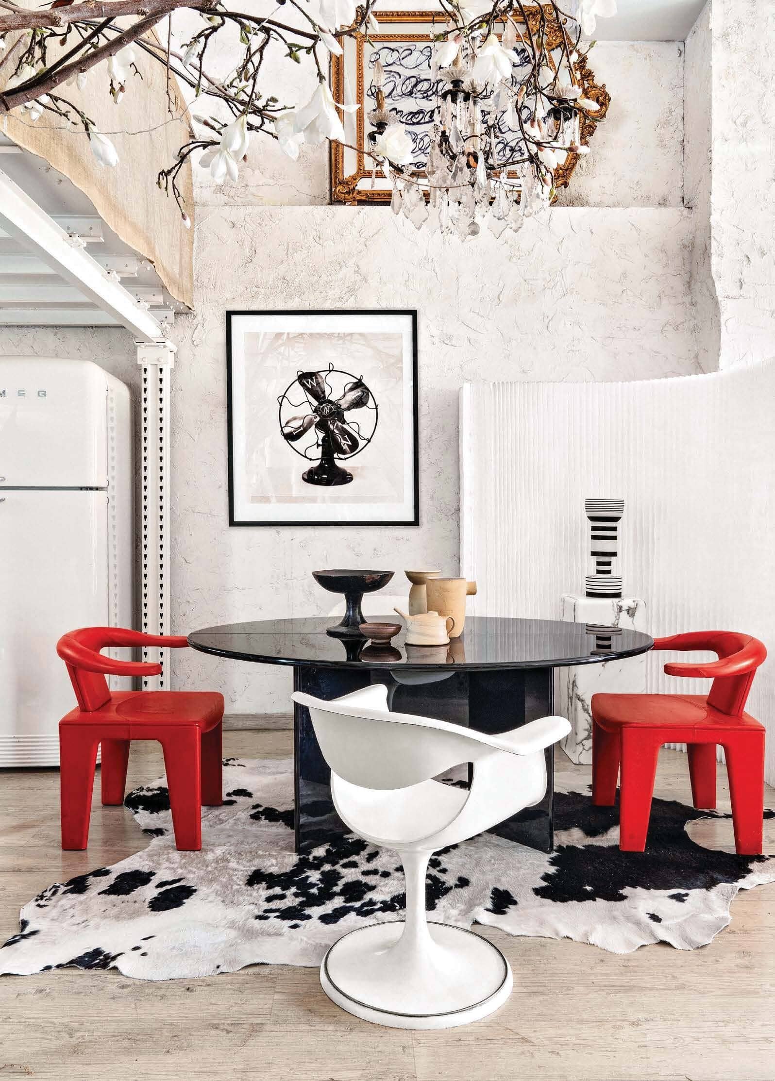
The home of stylist Erena Te Paa is a stunner, filled with earthy organic pieces that manage to feel both stylishly on-trend and effortlessly collected. The angular open space is a mix of naturals and neutrals, making it easy on the eye, though she’s always on the lookout for something new to add. The latest is a vintage stool turned side table that fits perfectly into the tone-on-tone space - See is sliding around the room in a fun stop-go-animation here.
And, once we’re all travelling again, you might want to check out Te Paa’s cool little holiday rental - Akito Studio - kitted out in her inimitable style. Yet another reason to add New Zealand to your must-see list…

The living room of Erena Te Paa
I’m loving London-based artist and photographer Max Siedentopf’s kooky and fun #accidentalinfluencer campaign for Gucci, where everyday people accidentally match their interiors. While the shots are ostensibly all about the updated Gucci Tennis 1977 sneaker, my fave is the stripe action happening in this shot, where the t-shirt matches the mugs. Though, if you’re a weirdo design geek like me, you’ll recognize that those aren’t just any old striped mug, they’re classic British Cornishware mugs from T.G. Green.
Cornishware started its striped life in 1924 in a simple blue and white combo, but have expanded over the years into 11 different hand-painted colour options, including this zingy Adder Green shade. In sizes up to a whopping 15oz, the mugs can handle an ocean of tea (or coffee, if you’re so inclined), and can even be personalized. Check out the full collection here.

Max Siedentopf for Gucci

10oz Cornishware mug, Adder Green