Pass the s and p

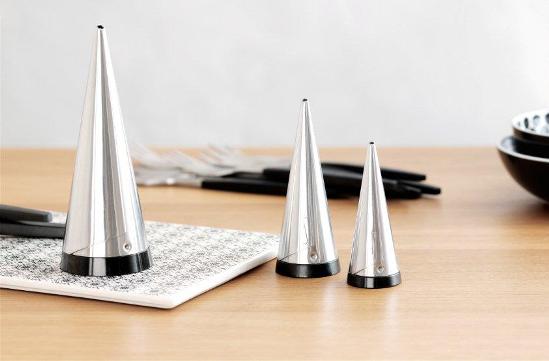
I have a great set of Dansk cutlery, Parallel Diamond to be exact, but it doesn't stop me from jonesing for other tabletop loveliness. Take the Scandi firm Gense as a case in point, who've been creating flatware and other essentials for the past 150 years. Their Focus de Luxe line of cutlery first hit the table in 1955, when it was launched at the H55 exhibition in Sweden (and where it was snapped up by the likes of Grace Kelly). Don't you think it would make slapping together a PBJ sandwich a fancy affair? The latest from Gense is the re-introduction of their Shakers, designed by Pierre Forssell and first debuted back in '55 too. Seriously. I doubt you'll find a chic-er way to chuck some s and p over french fries or tip sugar into your coffee.

Black and white and orange and yellow and sweet

I have obviously missed my calling - I should be a Sweet Stylist, just like brilliant NYC event planner (and dessert table designer extraordinaire) Amy Atlas. Though, if you know me, you know I have such a rotten sweet tooth for baked goods. One week doing stuff like this and I'd be have to enroll in my local chapter of Cake Eaters Anonymous.

Anyhoo, Atlas's work is chic and beautifully styled, with a controlled use of colour and a lovely sense of wit. Click here to check out her whole portfolio, and here for her blog. I'll be checking out that Jan issue of Town & Country that she just posted about and, oh, I stumbled across the work of Atlas on another blog that's totally worth a boo - Liberty Post. So play nice and make sure you check that site out too. And, if anyone is inspired enough to throw a dessert party, I'll expect an invite.


A pitcher is worth...

I'm thinking calm thoughts - We are having painting issues. One bedroom is totally sorted, thanks to Zinsser Bulls-Eye 1-2-3 from Home Depot. We'd suspected we were dealing with oil-paint and wanted to play it safe (it's a transforming primer). For the second bedroom, in a wildly bad idea, we switched to a regular latex primer. Yeh, no. As soon as we started slapping it up the walls started to bubble and flake - somewhere underneath that old latex is a layer of oil paint that's causing nasty problems... We're going back to the house tonight to sand the walls and seal everything up with the Zinsser. Lesson learnt, lol.

So, in an effort to get to my 'happy place' here's a quick look at an instant collection that I'd love to make room for - Pitchers. The first is modern with a trad blue stripe, from the Chophouse line by Terence Conran for Royal Doulton. The second is an Ikea classic, Dryckjom, that has the look of a hand-thrown piece at a smidge of the price. The third has muscular minimalist lines; Cove from Crate & Barrel. The fourth, called Kooky Feathers, is all hand-painted and witty from Anthropologie (where else?). The fifth is a major splurge - the pretty Still Life Water Pitcher by Job Smeets from that temple of design; Moss.


Top style from down under

Ummm, hello? Why aren't we all living in Australia? Amazing weather, amazing style, and the food - mmmm. And, while it's hovering around minus I-don't-know-what here, down there they're wandering around in flipflops enjoying sizzling temperatures. How fair is that?

Back to Australian style - I recently stumbled across the Deborah Bibby's blog (take a look here), editor of Real Living magazine, and was totally wowed by the pages she's been posting from her mag. Ultra stylish, bright, fresh and fearlessly colourful they totally spoke to me (and hopefully they'll do the same to you!). Take a boo at some of my fave shots below from their Jan/Feb /09 and Nov /08 issues - I want every single one of the lamps...

And major kudos to Poppytalk and Desire to Inspire for getting picked as part of Real Living's '14 websites that will change the way you live'!


It's all going O.K.

It's official, Orla Kiely has ruined my weekend - We're heading off for a bit of cross-border fun and of course will be hitting Target, who have just released the fact that they'll be launching an Orla Kiely line of housewares that'll hit shelves Feb 1st. Ummm, I'll be there this weekend, not February!

The line of tableware, storage and even swanky aprons is all happily patterned with her trademark look (yes, the de-lovely pear print makes an appearance) and will most probably sell out within minutes. C'est la vie is all I can say...

Not content with cornering the housewares side of things, Ms. Kiely's line of mid-Century inspired furniture, for Heal's in the UK, has also set hearts a flutter. The rich walnut collection is peppered with Orla's patterns and warm colours, and has a classic style that echoes vintage Brit and Swedish furniture. The Lusk Sofa, as well as the Rowan dining table and chairs (all below) are some of my fave's. And, just to confirm that she obviously plans to take over the world, Bewley's Tea in Ireland recently released a Kiely designed tea caddy for their Gold Blend, which has already been spotted on eBay.


Orla Kiely for Target via sfgirlbybay 

Iffy on the table, but the chairs are a go

While the kitchen at our new house is well on it's way to getting completed (yay!) my mind has been wandering to the dining area and how it might get sorted. We'll have a skinny slice of a long table (that at least has been decided, and there isn't room for anything else) but, while I've been saying that wood might be nice, I've been rolling around the idea of something slick and white instead. For dining chairs we'll be doing an eclectic mash-up of painted charity shop specials, that's for sure (I can't abide the red leather dining chair I'm sitting on right now...) but still, I'm in need of inspiration.

Here are a few shots that caught my attention; bits and pieces of which are floating in jig-saw puzzle pieces around my brain, trying to fit together. The first shot is the latest from Marimekko for Spring /09 (more to come on that delicious front), and I'm loving all the colour and pattern. The second feels eclectic with Bruno chairs paired with a white farmhouse table. The third is the freshest gear from e15, who're on their way to show at IMM Cologne, and I'm all about those old Thonet chairs with their blocky white table (and don't even get me started on that great herringbone floor...). In the fourth that rustic table totally works, paired with lots of white and very barmy lighting. And finally, an 'in my dreams' white painted industrial space that rocks out with a Tulip table and chairs. [ Image 2, 4 Mai Linh, 5, Bertrand Limbour. Via Marie Claire Maison]


What's new? Lots!

Getting a sneak peek at what some of my favourite retailers will be intro-ing for '09 is always super exciting and always gets the decorating part of my brain all happy. Take a boo at what's coming -

West Elm plunks for low-slung sofas and hits of lemon yellow, olive green, burnt orange and turquoise, and has totally upped their well-travelled vibe with Moroccan-ish tray tables, poufs in suede and cotton dhurrie, and ceramic camels and elephants - very Modern Souk.

CB2 (yes, they do ship to Canada) takes a more urban approach with a mix of modern and ethnic touches, orange, yellow and lime and on-trend touches of tie-dye (really!). I loved the rustic South American feel of this set of vases.

Zara Home slaps pattern on pattern in turquoise, sandy gold, cream and amethyst (all v. Moroccan again but with more of a layered flea-market twist) to make quite the chic impression - that striped gold glassware is just fab.


Taking it one shot at a time

Lawdy - Making it through this time of year without major stress-related meltdowns or pulling the blankets over your head takes one thing - a good espresso. It's the kick in the pants to get my day going and then again at 3pm when I'm fading and need another jolt (I'm rocking a shot of Nespresso Mandarin as I type).

Funnily enough I got on the caffeine train rather late; I started drinking it when researching a coffee segment for Citytv's CityLine and haven't looked back since. I found our current coffee and espresso cups at Zellers (suprisingly chic and modern glass numbers) but passing time and the fact that they break at the drop of a hat means I'm on the hunt for new options.

Here's what's on offer across the board - #1 A smart and simple heatproof glass from Williams Sonoma. #2 Mod and off kilter cups from the Cuisine line at Crate & Barrel. #3 Comfortably squished and sculptural Supple cups from Alessi. #4 A glam and gold sparkler from Zara Home. #5 Taika by Iittala feels cool and a bit chintzy in black and white. #6 Handmade and a touch 50's feeling by EmmaLitten of White Doll Arts on Etsy. #7 Nobody does pretty granny chic like Anthropologie with their Amelia cup and saucer. #8 Illy's latest from the Art Collection is a set designed by artist William Kentridge.


Philippe and Kelly go shopping on the cheap

This was honestly too good not to share. The LA Times took top interior designer Kelly Wearstler shopping at Cost Plus World Market (a cheapy/cool Pier1-esque decor retailer) and and dragged one of France's most iconic designers, Philippe Starck, to a Big Lots (a massive brand name closeout store) and let him loose. From her big box sojourn Kelly came up with a concept for a rustic glam beach party, while Philippe looked for authenticity in design and constructed a black and white table setting for just a few bucks. Read about Kelly's adventure here and check in on Philippe's purchases here. [images: Al Selb / Los Angeles Times]


I'm not in London but I would like a teapot

I do like it when trad companies like Wedgwood get a little subversive. In place of all the lovely gear they normally do with folks like Martha Stewart and Barbara Barry they've taken an edgy side-step to collaborate with illustrator Will Broome on a line destined for Flash - a swanky yet short lived pop-up restaurant that has appeared in London, at The Royal Academy of Arts Burlington Gardens, as part of the Academy's GSK Contemporary Season. The restaurant closes for good on Jan 19th (click here if your heading to the UK and want to try and get a table), but the Will Broome collection, limited to 1000 pieces in each style, will continue to sell through Wedgwood until they've all found a good home.


No milk, just cool gear

I've had a soft spot for the Drake Hotel in Toronto ever since we held my 40th birthday there a couple of years back (it was a raucous, well-attended affair with a hot playlist from DJ D Parie, all jammed in the Underground bar). Now, apart from all the regular goings on at the Drake too numerous to mention, they've taken it upon themselves to open the Drake Hotel General Store in a vacant storefront next door.

The space is so fresh they haven't even had an opening party yet - that happens tonight - but fear not, they're already packed to the gills and the paint has dried. It's kind of a corner store / art installation / quirky design gallery all mashed into one with vintage shop fixtures that look they were grabbed from Goodwill and given a quick wipedown before being pressed into service.

Theirs is quite the kooky selection of goods, from ultra saucy x-rated colouring books to lollipops, clothing and accessories. My quick faves are below - The rhino, grizzly bear and moose shot glasses in goth black glass, the gnome dishware (yes, there's more than the pitcher) and mini wind-up music boxes that play 'Singing in the Rain' and 'Stairway to Heaven'. In other words, while you won't be popping in for a carton of milk, the shelves are stocked with the kind of cool finds that you didn't know you needed, but really, really do. [Images 2 and 3 by Justin Adam]


Gallery (s)hopping

Last night was the official opening 'do' for the AGO's Shop, so I headed down for a peek at what's on the shelves. I know, I should really have arrived early and toured the whole AGO, and I will - promise - I'm not quite as crass as infamous PR flack Edina Monsoon (of Ab Fab fame), who firmly believed that museums would be so much better if everything was on sale...

The store has quite the selection of fab stuff - I loved all the Frank Gehry pieces on show as well as the witty/cool references to all the Douglas Fir used in his design of the gallery, like the curly-whirly trivet below, and let's not forget the slew of artist designed limited edition t-shirts either (put me down for one of those) as well as tons of pre-framed art and a whole section with creative gear for the kiddies too. (Exterior image courtesy of the AGO)


Shopping and dancing

Not sure whether you've made it to LIV by Au Lit yet to check out all the fashion and home deliciousness they have on offer, but on Nov 8th and 9th you really must. Joanna Goodman and her team are hosting a Holiday Shopping Event that will satisfy you deal hunters with a 20% discount on, well, just about everything in store. Throw in hot chocolate, loot bags for the first 50 shoppers, a DJ spinning while you shop and the chance to win a luxe swag bag and you've just about reached shopping nirvana.

Joanna's well edited collections are always on-point for style, and this season is no exception. This is what she's loving right now -

Tartan: Great trad pattern for the home, and when given a bit of a contemporary edge it becomes very current and fashionable.

Grey: Hottest colour this season. We've seen this colour trend in pretty much all products and textures this season from wool couches to silk party dresses, tweeds, knits and even dishes and accessories.

Cashmere: Always a classic choice for both home & fashion! 


Swing that poodle

Scouting for Canadian House & Home's Trendwatch page is my version of a snap-happy wild goose chase. It's fun, never the less, and I always enjoy hitting a bunch of stores across the city to see what's going on.

Yesterday, while I was hunting for a bit of ____ (I can't give it away, honestly I'd be hung, drawn and quartered), I popped into AT Design's newly opened space on Huron Street, a few steps north of Dupont. It's a change for sure - the original AT on MacPherson is chic-ly stuffed to the gills with hardly enough space to swing a poodle, while this spot is a way larger.

Have a look below for a feel of the place. This season Arminé and Therese are mixing up hi-gloss lacquer, lots of white, gold and silver, organic influences, Mondrian, Fornasseti and Michael Aram. Lovely! 

It's a print thing

I have a total thing for Marimekko. It's the intense colours and graphic punch of their designs that just manages to make me hot under the collar, no matter whether it's one of their latest designs (like the beyond gorgeous leopard print below) or one of their classic 60's patterns. It's all good.

So, I'm extra peeved that Canada's first Marimekko Concept Store hit land in Vancouver which, unfortunately, is way off track for me (I'm in Toronto). How mean?!? Well, at least it's a little better on my bank balance this way, lol. For those of you that don't live out on the beautiful West Coast (though luckily they'll ship across the country), some of Marimekko's gear can be found in stores like Ministry of the Interior as well as Crate & Barrel.

Take a peek below at a few of their current offerings that grabbed me. Both of the fabrics, Kumiseva and Kaiku, would make brilliant wall art. Sininen Gepardi is that leopard print, available as fabric as well as the quite affordable dishware, and both the Tuuli bed linen and Fokus apron hit the nail on the head with their on-trend black and white combo.


Clearly chic

How small is your kitchen? If you're in a condo or even a standard Victorian row house then you've gotta think smart when it comes to everything that you pick up, so anything that stacks or nests is a major bonus. I picked out these glasses for their sheer style as well as for their smart stackability, take a look -

High: The Alpha set of 5 stacking tumblers, and a bowl with lid, in mouth-blown crystal by Lobmeyr from the NYC temple of design - Moss.

Medium: Joe Colombo's sculptural 5 in Uno set of glasses from the nice folks at Design Within Reach.

Low: The Rigi is a stacking double-walled thermo glass that'll keep a latte hot and won't singe your digits, from Bodum.


An apple a day

Just got my sticky mitts on the October issue of Canadian Family and thought I'd share. I was the prop stylist on the food feature 'How do you like them apples?' and, I have to say, I'm inordinately proud of the results. The shots are dark, rich and perfectly Fall, with tons of texture and a wonderful vintagey feel. It's always rewarding to dig out a worn printed napkin that I've had for years and then see it fit perfectly into a shot. I got to work with such a fab team on this one - Photographer, Yvonne Duivenvoorden (make sure to check out her gorgeous portfolio), food stylist Claire Stubbs and Canadian Family's art director Jeff Hannaford.

Take a look below, then pick up the magazine for all the delish recipes.

Pretty clear

Well, fortunately/unfortunately we made it back from Palm Springs - Oh, to be stuck there for just a few more days, lol. I'll be posting more pics and info on PS soon.

I wanted to whet your appetite a little, as we lurch into the post-Labour Day headlong rush into Fall and then (brrrr!) Winter, so here are a couple of very pretty food shots that I propped for art director Jason Kang and photographer Felix Wedgwood. Unfortunately the (obviously) v. fab food stylist who worked on these luminous shots has slipped my mind and so I'll have to get back to you on that - apologies!!! This was a 'creative' - a project dreamed up by Jason to showcase what we can do (when left to our own devices).


Rich and woodsy

I know, the rich and woodsy shots below aren't exactly seasonal, but there's a good chance that you haven't seen them before so I thought it would be fun to share. I totally enjoy doing tabletop styling for food shoots, it's such a welcome change from working on big unwieldy room sets. I love shopping for props too, and have quite the collection of vintage and new bits and pieces, picked up whenever we're travelling and snagged at spots like Value Village. Keep an eye out for shoots I did with Canadian Family, coming up later this year.

Art Director and friend, Jason Kang, kindly sent these shots through. I've asked Jason to check since we all worked on this quite a while back, but I'm remembering these were all shot by the same crew - Top photographer, George Whiteside, and lucious food styling by Lasha Andrushko. And, have you guessed who these were shot for? Well, I suppose I'll let the cat out of the bag - Kraft.