Matt Carr, Umbra's Design Director, is a difficult guy to pin down. When I first e-mailed him he was somewhere in China, Shanghai I think, so I'm amazed that he was finally able to spend time and answer a few questions. As Matt mentions below, he's participating in the Pecha Kucha presentation at the Interior Design Show today - I'm moderating the presentation, which should be a laugh. Hopefully it will be fun and fast paced; Pecha Kucha is Japanese for chit-chat, each presenter gets 20 slides and 20 seconds per slide to speak to the theme of 'Inspiration'. So if you're at the show today, make sure to stop by. In case that wasn't enough, he and his girlfriend, Joyce Lo, have also designed one of the spaces at Come Up To My Room at the Gladstone Hotel - A v. cool exhibit that runs until Sunday, Feb 8th.
I asked Matt to pick out a few of his favourite pieces that he's designed for Umbra. From the top: The Mixalabra, my current fav candleholder. The Rolly Desk, check out the rest of the Rolly line too. The Teatime Clock, love all those vintage teacups. And finally the Biblioteca bookcase, snapped in Matt's own living space. Click here to check out more 5 Quick Question interviews.
Arren Williams: Can you describe your style?
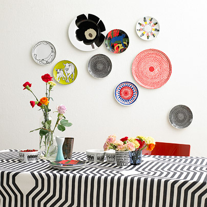
Matt Carr: Style is always evolving. Lately I have been really into industrial vintage antiques with a touch of folk and a little glam. Ransacking through the aisles of the St. Lawrence antique market has become somewhat of a Sunday morning tradition. I am not a huge fan of slick contemporary as I love blemishes and inconsistencies…the little things that give pieces character and a story. Neither contemporary nor traditional, my home is a complete mixed bag of pieces that work together to make a comfortable informal living space.
AW: What's really got you excited in the world of design?
MC: Technology continues to change the face of design. From new materials and processes that I was just checking out in factories in Asia to how we develop product in our Toronto design studio. We have been using a 3D printer to generate exact models from our computer renderings. It is such an amazing tool to explore and understand forms, surfaces, and ergonomics. It’s kinda like our little design oven.
AW: What's the next thing you'll be buying for your place?
MC: Moving from a loft to a house meant a lot more furniture to acquire. The to do list for the house is still long, but I think the next investment piece will be a great armoire to hide the TV and unsightly electronics that go with it.
AW: Anything, décor wise, that you totally hate and think should be banned?
MC: Ha! Hate is a strong word but when I visit Mimi’s, my fave Pho restaurant on Gerrard Street I cannot get over the peach coloured sponge job they went for. Almost so bad it’s good…
AW: What's next for you?
MC: The last month has been a busy one. Just got back from a trip to Hong Kong and China then headed to NYC for the NYIGF. My girlfriend and I are just putting the finishing touches on our “In My Heart” installation for this weekend's COME UP TO MY ROOM event. We were inspired by the experiences people share in hotel rooms. Whether it be a honeymoon or a torrid affair, hotel rooms have a long association with love and lovers. Using light, holograms and typography, In My Heart is an installation that explores these relationships. Also presenting a Pecha Kucha speech during IDS focusing on how we are constantly surrounded by inspiration…even in the most mundane everyday experiences.


Update on 2009-02-10 12:29 by Arren
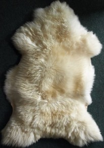
Okay, for the smartypants that e-mailed me - Yes, well spotted, that's a Bev Hisey rug in Matt's place, as well as a Random Light by Moooi, and the little piggy is indeed the Bank in the Form of a Pig by Harry Allen for Areaware.