Kitchen Confidential

Can I say how much I love, love, love the way this kitchen for Canadian Family turned out? I had the pleasure of working on the project with Jen Reynolds, CF's editor-in-chief, and the results were shot by the always sassy Michael Alberstat (make sure to check out his portfolio).

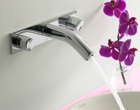
Jen's drab old kitchen didn't reflect her century home's feel or her eclectic sense of style (it was as dull as dishwater) so we spent time layering charm back into the space; making sure it worked for her family and had all the bells and whistles Jen had always wanted (like those smashing fridge drawers from GE Monogram). Here's a quick rundown - The kitchen was planned and installed by Home Depot, the antiqued painted cabinetry is by Kraftmaid, those new windows are from Jeld-Wen, the sink and faucets (including the pot filler above the cooktop) are Kohler. As well as the fridges, the oven and cooktop are from GE Monogram (the SmartDispense dishwasher is GE Profile). And finally, that gorgeous Persian rug was lugged back years ago from Iran by Jen's husband Neil!

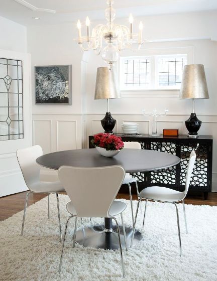
You'll have to grab the Winter '09 issue for the inside scoop on the whole project, but I wanted to share a few of the shots below.


Vintage bananas

You might have guessed from reading the blog, and if you've seen me working the aisles at charity shops hither and yon, that I am seriously bananas about vintage furniture and accessories. It's an innate thing for me, having been dragged happily along to antique markets and church rummage sales from a v. young age (I started collecting Art Deco at the age of 12). So you probably won't be surprised to hear that I used to live above a vintage store - Zig Zag - in Toronto's Leslieville. The apartment was ridiculously cheap; freezing cold in the winter, boiling in the summer, with only a dribble of water pressure and a crack house for neighbours. Needlesss to say I spent lots of time downstairs in Zig Zag, hanging out with Joe, the owner.

Joe recently closed his last store and moved Zig-Zag a block or so west where he re-opened this past weekend at 985 Queen Street East. He has such a great eye, which is why I was drooling over a pair of swanky mirrored end tables that would look fab in my new place. Joe, can you put them on hold for me? lol. Take a boo below at some of the gear on offer.

The beams, the beams

This was a big week for the reno; the steel beams arrived, a mondo 700lb one and two smaller ones. Why? You might ask. Well, we had the madcap idea to remove all the walls on the main floor, to open the space up, and need the beams to support the upper level of the house.

Getting that main beam in was no mean feat, it took 8 guys to heft it through the front door and then winch it into place. And, since it has to be such a tight fit, they had to punch through the exterior wall to finally set it in place. Phew. It was a total step-by-step process that took time and patience - As walls were removed temporary supports were installed and will stay up until everything is complete. Thank the lawd for our on-the-ball contractors, Cera Stone. And, to catch up with the story so far on the renovation click here.


Honey, my key won't work

I've featured some pretty amazing interiors in Flare Magazine, but the one below is a total favourite. In fact, when I first scouted it, I accidentally let slip that I might move in and change the locks, lol. This gem of a house, hidden away in a Toronto suburb, is owned by photographer John Cullen and his talented wife, Martine Blackhurst, who's a stylist and vintage shopper extraordinaire.

Of course John shot the place, capturing beautifully all the light and colour that fills each room. Martine is responsible for the wit and style of the interiors; she snagged much of the furniture and accessories from thrift stores, eBay and antique markets, lugging stuff home from as far afield as Mexico. The house has great architectural bones, and luckily most of the bells and whistles hadn't been ripped out or mucked up over the years - like that skylight-topped teak coffered ceiling in the living room, and the old-school glam mirror tiled wall in the dining room (there's another skylight in there too, sigh...).

Click here to take a look at the rest of John's portfolio - his shots of India are mah-vellous. And y'know what? I still might move in...

5 quick questions - India Hicks

Heads up people. Get ready to set your VCRs - Top Design debuts on HGTV Canada on January 3rd at 8pm. This season the show is hosted by India Hicks, who I've waxed lyrical about in the past (see here - she's the talented and stylish daughter of designer David Hicks). An oppurtunity came up to interview her, which I jumped at, so here's the result.

Take a boo below to get a taste of India's personal style; a relaxed and inspiring slipcovered-and-sandy take on Colonial as seen in her book Island Life (photography by David Loftus). I love all the tones of white, the worn bleached finishes and dark antiqued wood and, that unexpected sorbet-y colour in the outdoor dining room... sigh... is just smashing. The continuing collection she's worked on with Crabtree & Evelyn - India Hicks Island Living- was recently updated with Island Night; scented from memories of a moonlit tropical garden (the eau de toilette and fragrance diffuser are shown below). Click here to check out more 5 Quick Questions interviews.

Arren Williams: What's inspiring you right now?

India Hicks: Everything I learnt from Top Design - How important it is to keep your manners despite appalling stresses and strains. How you can create something from nothing. How a sense of colour and pattern can enrich the world around us, influencing even in a small way everyone's environment.

AW: Is there anything that can make you shudder when you walk into a room?

IH: Bad lighting.

AW: What's the next thing you have your eye on for your own place?

IH: Irish linen tablecloths for Christmas entertaining.

AW: How do you define your personal style?

IH: Modern classic, in all aspects of my life: childrearing, interiors, fashion, and beauty. You can see real aspects of this in the two collections I have with Crabtree & Evelyn, Island Living and Island Night. Both are on trend but not at all trendy and offer women naturally based body care and classic fragrances with a modern twist.

AW: What's next?

IH: I just returned from fashion week in Brazil and now am off to London to launch my newest collection with Crabtree & Evelyn, India Hicks Island Night, to European press. After that, I'll be happy to have my entire family together for the holidays.


Just too luvverly

Designer show houses in New York are a legendary affair. The spaces are always mah-vellous, and so inspiring to tour, and the groups involved always raise bucketloads of cash for deserving charities. One must see for me is the annual Kips Bay Decorator Show House, which luckily happens while I'm usually in NYC for work, hunting for fresh and cool gear at the ICFF for Flare Magazine.

This past weekend there was a glam show house event called Designer Visions at The Laurel that benefited the Worldwide Orphans Foundation. The spaces were each designed for a magazine (and will be featured on their glossy pages shortly) and were just too luvverly not to share. From the top - The first was for House Beautiful, and was designed by Susan ferrier McAlpine for McAlpine, Booth & Ferrier Interiors (I'm jonesing for that coffee table). The second was for O at Home, and was designed by Darryl Carter. The third was by Stephen Miller Siegel for Town&Country. And the fourth and final space was designed by Charlotte Moss for Veranda. (If anyone knows the photographer(s) for the spaces, please do let me know so that they can be credited).

Via Luxist

Walls need style

Am I out to wallpaper the world, one wall at a time? Maybe, lol. I'm always happy when more of the good stuff is available so news that Graham & Brown is debuting a collection of papers at Lowes made me perk up my ears. Fashion for Walls is a collection of highlights from G&B's Superfresco Easy, Umbra and Monsoon. Patterns are fashion forward, styles are in-stock and application is a snap (all are Paste The Wall products).

Check out one of my faves below, Colada from Canadian design firm Umbra - love the black and white modern mash up of that historical motif. Get shopping!

Shopping and dancing

Not sure whether you've made it to LIV by Au Lit yet to check out all the fashion and home deliciousness they have on offer, but on Nov 8th and 9th you really must. Joanna Goodman and her team are hosting a Holiday Shopping Event that will satisfy you deal hunters with a 20% discount on, well, just about everything in store. Throw in hot chocolate, loot bags for the first 50 shoppers, a DJ spinning while you shop and the chance to win a luxe swag bag and you've just about reached shopping nirvana.

Joanna's well edited collections are always on-point for style, and this season is no exception. This is what she's loving right now -

Tartan: Great trad pattern for the home, and when given a bit of a contemporary edge it becomes very current and fashionable.

Grey: Hottest colour this season. We've seen this colour trend in pretty much all products and textures this season from wool couches to silk party dresses, tweeds, knits and even dishes and accessories.

Cashmere: Always a classic choice for both home & fashion! 


Swing that poodle

Scouting for Canadian House & Home's Trendwatch page is my version of a snap-happy wild goose chase. It's fun, never the less, and I always enjoy hitting a bunch of stores across the city to see what's going on.

Yesterday, while I was hunting for a bit of ____ (I can't give it away, honestly I'd be hung, drawn and quartered), I popped into AT Design's newly opened space on Huron Street, a few steps north of Dupont. It's a change for sure - the original AT on MacPherson is chic-ly stuffed to the gills with hardly enough space to swing a poodle, while this spot is a way larger.

Have a look below for a feel of the place. This season Arminé and Therese are mixing up hi-gloss lacquer, lots of white, gold and silver, organic influences, Mondrian, Fornasseti and Michael Aram. Lovely! 

On the tiles

While we've been waiting for that steel beam to arrive for the main floor work has been happening on the master bathroom. Yay! A step or two closer to actually getting finished and moving in; I can't tell you how exciting that actually is!!! Yep, definitely a 3 exclamation mark moment.

I'd worked on the design and picked out the finishes and fixtures a while back (they're all special order from Home Depot) - 

The tiles are all Daltile; the large rectangular ones are for the main bathroom floor, while the mosaic is for the shower area. Mantova, that's the name of the swanky hi-gloss Carrera marble look tiles, will go from floor to ceiling.

Ummm, is it weird to get excited about a toilet? Oh, the joys of home ownership, lol. Kohler's Purist Hatbox toilet is the bee's knees, add in their Oblo wall-mount faucet and the WaterTile ceiling-mount shower fixture for the walk-in shower (there'll also be a Purist hand shower in there) and, well, I may never leave...  

Blanc space

What's the right white? Well, everyone has their favourites. From Benjamin Moore the obvious pick is Cloud White; it's the go-to choice for most designers. I'm v. partial to Ralph Lauren Paint's Mother of Pearl which has a touch of grey warmth to it, and then there's the always lovely Farrow & Ball. I love their well edited collection of hues and will happily plunk for All White if I'm in need of a modern gallery white, or Pointing, if something warmer is just the ticket.

The darling house below is in Benjamin Moore's Decorator's White. The place was shot in all it's pale glory by Janet Bailey and first appeared in Flare magazine in March of this year. Its the touches of black and bright hits of colour that make this place work against all that white, that and some very dramatic choices. Take a look at the space below, and make sure to check out Janet Bailey's portfolio here.


Boxing day

Storage is on my mind - I've been noodling around different ideas to keep everything organized in the office at the new place as well as the media room, let alone what I'm going to do with all the collectibles that, ahem, keep on appearing. This popped up on my screen the other day and struck me as smart, simple and - since it's customizable - just about the coolest option I've seen in a while.

Stacked, designed by Julien de Smedt Architects for Muuto, is a series of white open cubes that simply clip together to form any number of storage solutions. I can totally see it looking chic filled with books and white pottery against a snazzy wallpapered wall. In Toronto look for the Muuto line at Bergo.

Dark and light

Chiaroscuro - The interplay of dark and light. There's a $10 word; drilled into me at a tender age by my Art History teacher who's Scottish brogue sauced every word she carefully pronounced (I've never heard 'r's rolled better). It popped into my head as I was scrolling through the beautiful work of photographer Annie Schlechter who, I discovered, has shot for both Jonathan Adler and Kelly Wearstler as well as quite the laundry list of top design and decor mags.

Take a look below at a brief selection of images that hit me as fabulous - interesting interiors shot with an eye to style, colour and texture - and be sure to click here to check out the rest of Annie's portfolio. Oh, and don't be stealing that ochre and concrete colour combo from the first shot; I have my eye on it for our new place.


With the grain

While I was waffling on about wood grain the other day I was remembering one of my favourite faux bois pieces; the Plynyl Woodgrain Floormats from Chilewich. These mats hit the floor late last year and are a cool modern take on the faux bois trend, add in the fact that the super durable woven vinyl surface is bonded to a comercial grade slip-proof backing and you've got something that'll survive a game of tag or a pitcher of grape juice.

The mats are available in 3 colours - dogwood, driftwood and pecan - and 4 sizes. Click here for the full list of Canadian retailers.


Prints charming

Never say never, but I shudder to think that faux-finishing might make a comeback. I can just about deal with faux woodgraining (even Martha gave that a go) but I'll dig in my heels if ever anyone suggests bagging, dragging, ragging or marbling. Stencils, on the other hand, feel quite right with all this print and pattern that's been going on and British firm The Stencil Library have oodles to choose from. Their range covers off Chinoiserie, Regency, Deco and Mod with just about every pattern imaginable (from peacocks and trellis to tractors and camouflage). One of their latest endeavours is a re-dux of an 18th Century idea, when grand houses dedicated a room to prints and pictures that were pasted directly on the wall - kind of like large scale scrapbooking for the Pride and Prejudice set.

Take a boo below at a few of the different styles, I think they're rather fun; and yes, they ship to Canada.


In the light

Smile. Chin up. Left shoulder back. Lean forward. This week I was in the odd position of being in front of a camera, being shot by the always charming Virginia Macdonald for a story in an upcoming Canadian House & Home. I asked Virginia if I could share some of her work on the blog and here's the result, even though it's a bit of a Sophie's Choice question - asking a photographer to pick a few shots that he or she loves invariably results in a look of worry and concern.

The shots below are gorgeous and show quite the range of interiors, but do look at how wonderfully natural light is used in each (image #4 is from the Nov issue of House & Home, so flip open the mag to see the rest of the story) and, of course, make sure to take a peek at the rest of Virginia's portfolio here.


5 quick questions - Kelly Wearstler

With a polished yet edgy take on uptown chic, and a very fashion-forward view on style, Kelly Wearstler rocks the glossy world of interior design. Her signature look is a high-tone mix of vintage and new, the odd and unusual, and often features elements that take a keen sense and educated eye to actually pull off - Almost like a design version of a circus high-wire act. She's been featured in Vogue, on the cover of Domino and, I've raved about her on the blog before (take a look here). Kelly has lots on the go, no surprise there, so I can't tell you how happy I am that she found time to answer 5 quick questions!

Below you'll see quite the glam Bauble Box from KW's collection for Bergdorf Goodman, as well as a couple of shots of the Tides South Beach (photography, Annie Schlechter). Kelly was shot by Mark Edward Harris.

Arren Williams: What's inspiring you right now? 

Kelly Wearstler: I derive inspiration from everywhere - travel, nature, fashion, art, architecture, modern technology... everywhere. 

AW: Is there anything you'd like to see banished from interiors? 

KW: A drab, visually uninspiring space is never in style. 

AW: What's the next thing you have your eye on for your own place?

KW: I'm still in the process of designing my current home, so I'm looking for so much at the moment, especially amazing art for my house. 

AW: How would you describe your current style and how has it changed over the years?

KW: My style is always evolving so it's impossible to pinpoint it exactly. I'm a Modernist at heart, and, of course, I love all colours. Since I began my career as an interior designer I've learnt to educate and train my eye, leading me to become more confident, and sassy in my work.

AW: What's next for you?

KW: So much! This past year I opened my boutique at Bergdorf Goodman, where I have a line of decorative accessories and introduce about 20 new pieces every season. I also created my first collection with The Rug Company. Most recently, this Fall, I created a 150-piece collection of fabrics and trimmings with Groundworks at Lee Jofa. Up next is a line of bedding, table linens, decorative pillows and throws. I'm also working on several hotels - including Vicerory Miami and Anguilla, set to open in the first half of 2009 - as well as residential projects. 


In bed with Style

I snuck into the Style at Home Show on Friday morning for a quick runaround before my crazy day started. The Dream Master Bedroom Suite was quite the stunner, created by senior design editor Margot Austin and her talented crew, so I took a few snaps in between setups while the suite being shot for CityLine (congrats on CityLine's new host being announced btw - Tracy Moore!). I'm totally digging the wallpaper and all the touches of gold, and I do believe that's the Lulu DK Matouk bedding from Elte that I posted about here - Enjoy!

Sneak peek - West Elm

Phew, the time has whizzed by in a total whirlwind, so mucho apologies for going awol and not posting quite as regularly as I might like. The last two days have seen me zipping around town in a truck for a setup at a chef's competition and then having a proptastic time dressing a set for tv. Ummm, where is my glass of wine???

Okay, lets hit rewind to Wednesday night and the simply wonderful opening of West Elm in Liberty Village. I was in 7th heaven wandering round since the store is so much my vibe right now - Modern-ish with a warmer edge and a touch of wit; in other words design that doesn't take itself too seriously. The store is huuuge, way larger than their Chelsea store in NYC, and the loft space really works for all the room sets, wall of chairs and wall of occasional tables as well as (sorry, it's so soon) quite the bombastic selection of Christmas decorations. Who knew I needed a jumbo glass ball covered in crocheted lace? Well, let me tell you, I really, really do...

Here are a few fave picks from the night as well as some shots to give you a taste of what the store is all about.

#1 Copper Table Lamp - This made me go weak at the knees. Hammered Copper with a metallic lined black shade. Mmm, irresistible. $229

#2 Ice Crystal Pillow Cover - A swish silk cover (one of tons) that I fell for. Love the faceted pattern and the colour combo. $29

#3 Narrative Squirrel - How cute, and there's a rabbit and turtle to round out the menagerie and sit pretty on your mantle. $18


5 quick questions - Jonathan Adler

Okay, this is just marvy - Jonathan Adler kindly said yes to being interviewed for the blog, so here we go!

Just to recap; he's one of my top design heroes who initially started as a potter and then, when his look caught the eye of stylish types, sauntered with an impressive amount of verve and wit into almost every aspect of the home (y'know, I can't think of anyone else who'd think of launching a scented candle with the name of Hashish!). When he's not overseeing his mini empire you'll catch him on Bravo TV, in his role as head judge on Top Design, and recently Jonathan tied the knot with his other half Simon Doonan, writer and sassy creative director of Barneys New York - So major congrats!

Below you'll see snaps of Ojai, his fab new line of dinnerware, as well as a peek at a glam interior project in NY (photography, Annie Shlechter). And click here for more on Adler's 'Happy Chic' style.

Arren Williams: What's inspiring you right now?

Jonathan Adler: I'm kinda' feeling rustic these days. My bloke and I are building a new country house and we're feeling very earthy and natural. After all, I am first and foremost a potter.

AW: What will drive you bananas when you walk into a room?

JA: Excessive technology on display. I hate those newfangled lighting systems that never work and require teams of engineers and repairmen and all those weird-ass television remote situations that are incomprehensible. I like my technology simple and intuitive.

AW: What's the next thing you have your eye on for your own place?

JA: I'm waiting for our new OJAI dinnerware to arrive chez nous. I love it. It's bold and poppy but rustic and crafty--everything that I love.

AW: Is style inherent?

JA: I grapple with this issue all the time and go back and forth. I think anyone can have passable style, but great style is innate.

AW: What's next on your agenda?

JA: I'm opening a couple of new stores, one on the Upper West Side and one in Santa Monica. And, I'm always doing squillions of decorating gigs and making new furniture and trying to find time to work in my pottery studio. I'm very, very lucky. When I first started my career as a potter, my dream was to never have a proper job again and to find an audience for my work. At the time, my idea of success would have been a life of hawking my wares at rain-soaked craft fairs if it meant I could earn a living making pots. The creative opportunities and experiences I have now are totally unexpected and thoroughly appreciated and I never take any of it for granted. So, next on my agenda is more design and more fun!