Little eccentricities

You'd think the Brits were eccentrics, sitting on a deckchair in gale force winds, desperately trying to enjoy a hint of warmer weather. And you'd definitely be right, lol. Luckily that quirky attitude also makes it's way into lovely collections of prints and patterns by folks like Thornback & Peel. Theirs is a world where Victorian jelly moulds and pigeons happily scatter across wallpapers and fabrics and rabbits and cabbages frolic on a cushion. Love their new deckchairs (they have teatowels and t-shirts too) - I could totally see myself sitting in one and enjoying an ice lolly or a '99' by the seaside...


Pretty clean

Jerry was the last worker to sand anything in the house which (yay!) means the reno is finally complete and we can get onto the 'pretty' stuff. We've had a painter quote on the trim work and my absolutely great wallpaper guy, Rod Dunn, came by to look at all the papering that'll be happening in the house. In the meantime, we set about with a top-to-bottom clean of the house tryng to rid it of any remaining bits of construction dust that might be floating about. Of course drywall dust is the death knell for any vacuum cleaner so a microfiber duster and good all purpose cleaner will definitely do the trick. One of the latest cleaners we've been trying out is the J.R. Watkins natural plant-based All Purpose Cleaner. It not only does the trick it looks pretty doing it, plus I loved reading on their website about all the ingredients it doesn't have in it (lol). Have a boo below at some of the products in the line.


Just a square or two more...

Well, here's the rest of the interiors shots of the Hershey's Milk Chocolate Suite, including the rather nasty before snaps of the bedroom and living room (as you can see it was all a bit tired looking). I think Karen Sealy and I managed to pull off quite the miraculous makeover in just a couple of days - she took on the living room and my challenge was the bedroom - and I wanted to send a major shout out to everyone who helped make it happen. First off, thanks to Hershey's for the oppurtunity (and all the delicious inspiration!). Mucho thanks to Elte for all the gorgeous furniture and linens, inVU Drapery Co. for the luxe vanilla velvet drapes, linen sheers and fun toss pillows, Carpet One for finding the perfect carpet to replace that stained old wall-to-wall, Graham & Brown for the stunning paintable wallpaper and Para for the perfect paint, Teatro Verde for yummy accessories and flowers so breathtaking that no-one could believe were real, photographer Angus Fergusson for shooting the three chocolate bar prints above the dresser and illustrator Paul Dotey for designing that fab I Heart Hershey's poster, all framed in Ikea's great Ribba frames! If there's anything you'd like the deets on that I've forgotten just drop me a line... [Photography: Stefano Barbera]


A taste of chocolate

Okay, here we go; here's one of the shots from my Hershey's Milk Chocolate inspired bedroom. I know, it doesn't give much away (lol), but I wanted to give you a taste of the room before I post all the pics early next week. Photographer Stefano Barbera took the shot, and yes, I can promise you he and I ate the chocolate once we were finished! Waste not, want not, as my Mum always says...

Going with Vandyke in the bedroom

The last few days have been nailbitingly bananas. I've basically been living on Hershey's new Milk Chocolate, and let me just say there's been plenty to go around, lol. This is all, of course, for the chocolate inspired hotel suite I've been working on with Karen Sealy.

After the carpet was ripped out Sunday night, and the bedroom was wallpapered with this Graham & Brown paintable paper, the painters stepped in early Monday morning and lickety-split primed the old vinyl wallcovering in the living room and then painted throughout (I went with Para's Steamy Hot Chocolate for the bedroom, which is absolutely perfect in so many ways!). Then it was time for the carpet to show up and I get a phonecall saying the truck has broken down - aaagh - though Carpet One was beyond brilliant in dispatching another truck to rescue the stranded wall-to-wall and keep us on schedule.

Tuesday was the the everything else day; a whack load of furniture from Elte, carts filled with frames and accessories from Ikea, and both myself and Karen showed up with cars packed to the gills with bits and bobs. A few crazy hours later of non-stop lugging, unpacking, tidying , installation of drapes (thanks inVU!) and ironing of bedding - one of my least favourite things - my room was done and looking, imho, pretty darned peppy. Both spaces were shot this morning, so I'll be posting the snaps soon, but in the meantime I wanted to spill part of the beans and show the furniture line I picked for the bedroom. I love its handsome modern lines, great proprtions and on-trend brushed brass detailing; though my fave surprise is when you pull open a drawer and discover it's painted a zingy tomato red inside. The Vandyke line by Mitchell Gold+ Bob Williams is available at Elte. And oh, you just have gotta try the Hershey's Black Cherry and Almond bar (it totally rocks out).


A little sketchy

In a case of oh, that reminds me of... here's a recycled cardboard play house by Magis (btw, since I'm a Brit I'd call it a Wendy house) and a slipcovered sofa by Established & Sons. The Villa Julia play house, designed by Javier Mariscal, is made for your little sprogs to have a go at with markers and crayons; though it does look awfully nice in pristine black and white. That sofa, aptly named Brick & Mortar by designers Richard Woods and Sebastian Wrong, looks fab in a high-contrast b&w brick pattern, though for purists it's also available in red brick too (though I am a fan of white painted brick, lol). What do you think - Will we be seeing more products that have a sketchy black-lined colouring book feel?


He who ho-hums loses out

10 lighting and furniture stores later I am still nowhere nearer finding the table lamps for my Hershey's Milk Chocolate inspired bedroom. I had the perfect ones withing my grasp, ho-hummed a bit and when I popped back to grab them - Sold! Serves me right. Anyhoo, of course I have a plan B (and C and D too if need be), but those lamps I saw at Flick & Co were just perfect; mismatched creamy white crackle glazed ginger jar-ish bases with matching dark turquoise drum shades. There's a slim chance that a new pair might arrive in time, so fingers crossed.

In the meantime the snap below, from Living Etc magazine (one of my firm faves) is my version of a Tylenol after all that fruitless lamp shopping. That, a square or two of chocolate, a shot of espresso and suddenly everything is copacetic again.

Gray matters

Luckily the weather has been grand, so bombing around town with the windows down and the stereo blaring the Black Kids has hardly been a chore over the last two very busy days. I taped a CityLine yesterday with Jeanette Hlinka and Karen Kayne that will air next Tuesday, have sorted out a Style Scout feature for this Saturday's National Post, as well as nailed down an upcoming Trendwatch for House & Home and worked on the Hershey's Milk Chocolate space. Phew.

Last night I spent an inspiring time at the Fall /09 womenswear preview at Holt Renfrew that included a capsule show by designer Joseph Altuzarra. I love hearing Holt's Fashion Director Barbara Atkins' presentation since she always puts everything clearly into perspective for the season, hitting on trends and high notes across all the lines that they carry (80's, big shoulders, statement necklaces, silver sequins, lots of leather and boots higher than you can imagine). But, if there's one thing in fashion that will definitely be having an effect on interiors, it's the prevalence of grays in every shade. I've waffled on about gray before here but wanted to share a bit more since we'll obviously be living with it for quite a while. In fact, I've picked Ralph Lauren Paint's dark and stormy Palais Royal for our media room.

The snap below shows a cool image by artist Damien Blottiere for Intelligent Life and is their pick of the perfect gray (Slate III by Paint & Paper Libray), which they contend can rub shoulders with any look, period or style you might pick for a space. What do you think?

Chocolate and pretty paper

Sheesh, no rest for the wicked; I've been running around all over the place. No complaints though, since I've got a slew of cool projects on the go. The main one I'm completely jonesing over right now is designing a one bedroom suite inspired by Hershey's chocolatiest Milk Chocolate ever! Yes, I've tried the chocolate (delish!!!) - I had to, all part of the inspiration process, lol. Today myself and Karen Sealy hooked up to start the ball rolling on pulling everything together. Karen is doing the living room and I plunked on the bedroom and we've been wrangling drapes at inVU, sourcing furniture at Elte and wall-to-wall carpet from Carpet One, picking out wallpaper (I've found an absolutely brill paintable one from Graham & Brown) and deciding on a colour palette. The clock is ticking...

In the meantime, I wanted to share the great snap below. That wallpaper, though it looks quite stunningly modern, was first designed back in Ingram Taylor in 1897. It's called Arboretum and is available from Charles Rupert Designs; a smashing Canadian resource for historically accurate papers and fabrics. Be sure to check out the rest of their new Garden Collection, which is all eco-friendly and printed in the UK.

What's a Hoogovens?

Last weekend we played around with a new toy - a GPS - and plugged in the addresses of a bunch of Goodwills and Value Villages far and wide. We ended up hitting Barrie, Orillia and Newmarket zigzagging all over the place. The haul at the end of the day was quite impressive; a nine-drawer teak dresser, a dining chair, two barstools, three pieces of artwork and a dozen records. How much did we splurge? Ummm, the princely sum of $50 on the lot.

One of the pieces of artwork, a signed and numbered print snagged for $5 in Barrie, really caught my eye (I love the industrial look of it). We brought it home, snapped off the water damaged frame and Googled the artist; Michael John Hunt. Well, la-di-da, we found him and sent off an e-mail asking if they could decipher the name of the piece and give us any background on it. A day or two later Rosemary Hunt e-mailed us back - "The etching was commissioned by the Hoogovens Steel Group which was a Dutch based steel manufacturer. The commission was placed during the 1980's through the Pieter Breughel Gallery in Amsterdam, with whom Michael had an association for 30 years since 1976. We are racking our brains to try and remember why the etching was commissioned - we think to celebrate something, but we can't remember what!" How cool.
Art or glass or art glass?

Jaime Hayon is one of the most interesting and inspiring designers working today. He definitely marches to his own drum, taking on projects and ideas that have a bizarre, dreamy and surreal quality and working his influence on historic old firms like Lladro and Baccarat. He shakes things up, that's for sure, whether he's designing sneakers for Camper (yes, I still love them) or coming up with a new collection of glass vases that are about to launch at Design Miami/Basel in June. Alongside these borosilicate glass lovelies (the same glass used for science beakers) is a snap of Hayon's sketchbook, and an interesting peek inside the creative process (click here to read a Designboom interview with Hayon). The vases, as well as work by Studio Job and Atelier van Lieshout, will be presented by VIVID Rotterdam.


Thonet-ish and Thonet-redux

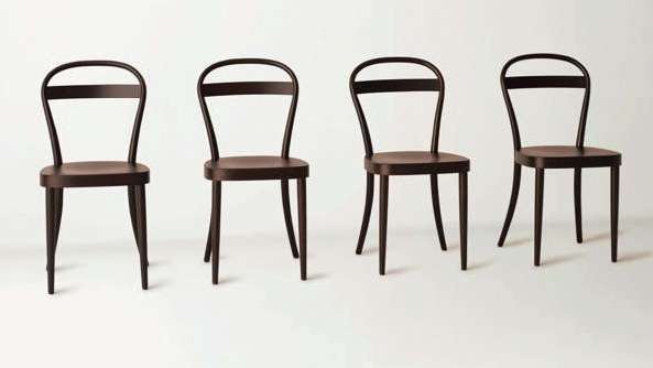
This is turning into a bit of a slow slog looking for dining chairs... We need eight in all and have found three so far that fit the bill. Check out the first shot below of the miscreants in question. I'm now constantly on the hunt for chairs (we found one this weekend, yay), but of course I've added a degree of difficulty. The look I want is a mix-and-mash of bistro/diner/cafe style chairs that don't, to my eyes at least, have a hint or country about them. They'll possibly end up getting sprayed white and upholstered in perhaps a silvery gray; all the better to contrast with our rustic scaffold plank dining table.

Thonet chairs would be the total ideal since they're workable, durable and still feel classic, even though they first hit the floor more than a century ago. To drive me entirely bonkers Thonet has gotten together with Japanese retailer Muji and created a chic and simple Thonet for the 21st century, influenced by one of Thonet's original releases; the No. 14 chair. Check out the second snap below, and to read more on the project click here. They'll be available at Muji stores worldwide this Spring, so when we're in London I'll be trying to squeeze one or three of them in the suitcase.


Drag bars, dining rooms and stairwells

That chandelier below - now happily hanging in our stairwell - was such an amazing find, so good in fact that I told friends about them and... It is vintage, but funnily enough, the store has carried stock of them for the last 30+ years. While it was sitting in a box waiting for the electricians to hang it a friend spied it and asked me to grab one for her dining room (it looks fab in her all fuschia space), and then an interior designer friend saw it and decided to snag one to add a bit of sparkle to the stairwell of a nightclub he was working on; a Latino drag bar called El Convento Rico. Needless to stay, I don't think the store has very many left, lol.


Marcel in the kitchen

Let's end the week with a bit of kitchen inspiration. The space below is a slice of one of the condo suites at the Mondrian South Beach designed by Marcel Wanders. The hotel/condo is quite the fantasy world, designed to resemble an up to date take on Sleeping Beauty's castle with lots of trademark Wanders witty excess. The kitchen really caught my eye since it feels modern, yet uses those blue and white Delft tiles in a wraparound to stunning effect, all set against white, tangerine and black. Though to keep things running in that Miami vein the tiles picture lifeguards, sharks and bikini clad girls, rather than windmills and tulips, lol. To see more of the over-the-top interiors from the hotel check out travel website Mr & Mrs Smith, and to see Wanders describe his design direction in video click here. It's all quite barmy really, but you have to admire Wanders guts and very singular vision.

Chandeliers have legs

When, oh when, will the chandelier go away? If you ask me they won't, at least for quite a while, since they've definitely snuck into our design vernacular. The fixtures below would definitely fall into the Showstopper lighting category, and are my current faves if you're on the hunt for something unusual that has lashes of character. The first two are new from Currey & Co, and have a bizarre Victorian Goth vibe (yes, they're black painted shell, and yes, there's a beyond fabulous matching console and mirror too). The second two are from Oly and are the definition of modern romance - pretty but not too frothy - and come in clear, blush, amber, plum, and of course white. Oly is available at South Hill Home, and contact Currey & Co here to check in on Canadian retailers.


Have knife, will travel

The Swiss Army knife, y'know, the one with the tool that'll get boy scouts out of horse's hooves, is turning 125 and as part of the celebration has hooked up with Airstream. They'll only be making 125 of their Victorinox Special Edition 19ft trailers which, if you take a look below, are pretty sweet. The interior is hooked up with polished surfaces, custom bedding and more Swiss Army tools than you can shake a stick at (though I might ixnay those red dishes...). I've always fancied an Airstream, not only for a road trip, but how fab would it be to park one at home for when the inlaws show up for a few days? And, if the Swiss Army trailer isn't to your taste, then take a boo at Airstream's 16ft DWR model, which comes kitted out with bits and bobs by George Nelson, Tom Dixon and Objekto.


Techno 80's

It seems to me we're travelling backwards and forwards at the same time. Technology is moving miles ahead, yet fashion is dragging us back to the Eighties. And yes, interior trends are following along in kind with a big injection of lots of white, bright fluoro colour and hi-contrast pattern. Luckily it's way more sophisticated than living in a Wham video, lol, and much more on the Italian design group Memphis side of things. The snaps below are extra juicy and bright (loving the colour combos) and are all about the new Bluetooth headsets from Jawbone, which were initially designed by Yves Behar and have now been refreshed in these stunning shades. Following along, and for a bit more of that inspirational 80's vibe, is the crazy/cool Bulletproof video from Brit electro-pop duo, La Roux (currently on heavy rotation in our house). As I said, travelling backwards and forwards at the same time...


High heels and dining tables

I really think you should be able to walk into a space and get a sense of who lives there, almost a peek into their style and their personailty. And the best interiors that have that kind of feel don't get put together in a weekend, nope, they take time and are carefully filled with pieces that each have their own history. Take a look at the dining room below, and take a wild guess at who might own it. The title of this post is a gi-normous clue, and the fact that it's taken from a glossy design book from Taschen - New Paris Interiors Volume 2 - should go a long way to helping you too. Okay, I'm letting the cat (or le chat, lol) out of the bag. This snap is from the home of Christian Louboutin, shoeware designer extraordinaire. If that doesn't ring any bells, then he's the guy who's trademark red soled heels make some folks go weak at the knees (watch Sex and The City and you'll definitely spy a pair or two). Anyhoo, I love the space, and while that buttery yellow isn't quite my cup of tea I think it really works with all the vintage furnishings (I'll bet he stops in regularly at my fave flea market; Porte de Vanves).


No acid wash, but...

I blogged about Successful Living From Diesel, Diesel Jean's new furniture line with Italian manufacturer Moroso, over on Posted Homes the other day (take a read here). At the time there was talk about the lighting side of the collection, designed by Diesel and manufactured by Foscarini, but no snaps had surfaced. So, after a bit of noodling online I've discovered enough worth sharing. The lighting has the same vibe as the furniture - young, laid back and edgy - just check out the sweet lightning bolt pull on the Graf table lamp in the first shot below. Picking up from the furniture's rock and roll direction you'll see the Cage pendant and table lamps (that look like mics), images of mixing boards and amps on the Graf lamp shade, punky metal on the Studs lamp base, and crunched facets on the Rock pendant. Oh, and of course Diesel hooked up a music video to launch the line... lol. Click here for a list of Canadian dealers for Foscarini.


Bookmark and Share

Two floors of fabulous

Okay, it's gush time. This morning I took a wander around the yet-to-open new 9,000 sq ft Teatro Verde store in Toronto and jeez louise, is it ever jammed to the gills with the most gorgeous gear. Teatro's owners, Shawn Gibson and Michael Pellegrino, and their stellar staff (hello John!) have been working night and day and have definitely outdone themselves. The 2-floor store features everything for the home (there is some absolutely standout lighting) as well as mini boutiques that showcase gear for kids and pets, not to mention a whole section dedicated to yummy Assouline books and - as always - Teatro's lovely fresh flowers. Take a look at the snaps below to get a feel of the place, I'll definitely be popping in again soon, since I spied a mini white ceramic cactus that I could definitely find a good home for (lol). The store opens this Friday at 100 Yorkville Avenue and, if you need any more reason to go, Donna Hay will be on hand to sign her new book No Time To Cook between noon and 1pm.


Bookmark and Share