Light and composition

The last time I saw photographer Michael Graydon was just before Christmas, in the grip of a pretty evil snowstorm, when we worked on this feature for Report on Business Magazine. I always enjoy working with him (he has such a calm and thoughtful point of view, and a beautiful way with light and composition) so I thought it would be fun to post some of his work. The five shots below represent just a smidge of what he's done, so make sure to check out more from his portfolio here; in fact, I'm happy to say that some of the work we've done together over the years is there.

The first four shots were seen in Canadian House & Home (that's ceramic artist, Jennifer Graham pictured in #4), and the last - but by no means least - is from Canadian Family.


Bookmark and Share

Ummm, is it art?

David said the magic words this weekend, "Lets go vintage shopping." So we headed off with an empty car and, in a couple of hours, managed to hit three Goodwills, two Value Villages, two pretty dodgy fleamarkets and a Talize. Alack and alas, the vintage gods weren't with us. I have a specific shopping list in mind for the house - a long dresser, ceiling fixtures and dining chairs - and managed to come up empty handed except, ummm, for the clown pictured below.

Yep, it's a Paint by Numbers, and at $4.99 I totally couldn't pass it up. Does it creep you out? People either love or hate clowns (and Paint by Numbers, lol, though they're becoming increasingly collectible). The clown is pictured with a framed needlepoint, another cheapy-yet-cool recent find from my fave local Goodwill. Both will eventually find themselves hanging on a gallery wall that we're planning, but really, I have to get back on track with the gear we actually need!

Bookmark and Share

On yer bike

Alexander Girard (1907-1993) is a real design icon for me - His work is playful and colourful; taking craft inspired patterns and giving them a modern twist. Maximo is now the official firm given the task of looking after his legacy and working with companies like Columbia Forest Products on their PLYprints, Flor (a total fave of mine) on the La Fonda del Sol carpet tiles and Vitra with the re-issue of his 1963 designed Wooden Dolls. And now, Girard patterns are funking up bikes!

Electra Bicycle Company created these two sweet rides, based on their Amsterdam bike, and dressed up all pretty with Girard's Madonna and Tree of Life designs. To hook yourself up with one in Canada click here for a full listing of retailers across the country, or check in at your local bike shop.


Bookmark and Share

Trading in plywood for Corian

Okay, the last time you saw the kitchen it looked like this, and now take a look! The Corian countertop arrived today from Home Depot in two mondo pieces, one so large it took four guys to heft it into place. The installer's attached the two pieces together (there's now an invisible seam behind the cooktop) and set the brushed nickel adjustable-height legs from Richelieu in place for the bar. The wait was definitely worth it (we've been living with chunks of plywood and a temporary sink for a while). We'd picked Silver Birch for the surface, since it had a lovely terrazo feel, and chose a clean and modern profile with an eased edge. The sink is Corian too, in Pearl Gray, and was fit seamlessly into the countertop before the whole shebang was installed.

All the appliances are happily ensconced into the kitchen now too. They're from Jenn-Air in a stainless steel finish and are absolutely boffo with the hi-gloss white Venicia cabinetry. The fridge is a sleek counter-depth unit with a bottom-drawer freezer, the dishwasher is one of the best Energy Star rated units on the market and the dual-fuel slide-in range, well, I love the fact it has a downdraft (so no need for a rangehood!) while David, my baking-obsessed other half, loves that one of the burners has a melt setting for when he makes brownies.

The cherry on the cake is Kohler's swish Karbon articulating faucet; this one is a deck-mount, but it's just been released as a wall mount too. It's currently just there for show; the plumber is popping in tomorrow to hook it up, and the backsplash tiles happen the day after that. I swear, we're almost done! 


Bookmark and Share

Paper play

Last week I happened to get a sneak peek at the latest Shand Kydd wallpaper collection, and meet the British designer behind the line; John Wilman. This will be the third book released under the Shand Kydd marque by Blue Mountain Wallcoverings (it's expected to hit stores in August), and each book has been a mix of strong patterns, directional colours and designs that you can really sink your teeth into.

Below I wanted to give you a look at a few of my favs from the current collection; Shand Kydd II. The great thing about the line is that John takes inspiration from historical remnants in Blue Mountain's extensive archive and then plays with scale, colour and finish (there's always a fab mix between matte finishes and metallics). Chelsea is a sketchy '40's floral that looks smashing in this intense purple, let alone pairing it with a painted floor and Eames Wire-Base table. Bamboozled hits, for me at least, a swanky 70's vibe. Kew is an over the top riot of flowers in Technicolor. Bloomsbury is painterly and loose with florals and zig-zags. And finally, Chelsea makes a calmer appearance in black printed on a cream ground. You'll find Shand Kydd available by special order at Home Depot, and through specialty paint and wallpaper retailers across the country.


Bookmark and Share

Clock this

Q: What do Montreal, Eindhoven and Melbourne have in common? A: The answer is Puur, a new young design firm that's based in those three cities, with manufacturing happening - for the most part - here in Canada. Their line is defintely on the modern side, but the couple of items I picked below that are brand new for '09 have a slightly more accidental vibe that I find really appealing.

The large-scale Earthquaked clock, designed by Frank van de Ven, messes around with our ideas of time and fear of natural disasters. While Blaas, a multi-functional bookshelf by Dripta Roy and Frank van de Ven, is a cartoon-y shape of a face and a thought bubble finished in a glossy black that's ready to hold all sorts of bits and pieces. To see more from Puur make sure to download their portfolio here.

via tkleslie and mmcgovern on Twitter 

Bananas and doozies

Just a quick note this morning, since I have a bananas kind of day - This dropped into my e-mail last night and, since I love the store and all the drool-worthy stuff they carry, I thought it was worth passing along. So, Klaus by Nienkamper is having a doozie of a sale, with clearance items discounted a minimum of 50% including sofas, accessories, lighting and desk chairs. And with Klaus promising "Major deals!" and edgy and interesting gear from both Moooi and Tom Dixon on the list, well, it's definitely worth checking out!

Kid colour

Wednesday is brought to you by the colour yellow, and the letters 'C' and 'F'. The CF stands for Canadian Family, I'm on set with them today, working on a shoot with lots of lovely sunny yellows for Spring. And, I wanted to share a snap from a super juicy colour feature I did with them that just popped up in the current issue. Jeff, the mag's Art Director, did a stellar job on the layout, and I had a laugh tracking down all the cool colour saturated gear. To get more info on all the products, and to see the rest of the colourful finds, click here.

A nice little before and after

Taking some mucky old thing and giving it a new life it quite the most fun side of my job. I'd mentioned a while back here that I was working on a nursery for CityLine and we'd scored a great vintage teak rocking chair through Kijiji (that involved a late night drive to someone's garage in the 'burbs, and it was a steal...). Well, the project is almost finished - the baby is due in 3 weeks! - so I'd popped in to pick up the chair at the upholsterer's, Mieda Design, and I hafta say; I do love how it turned out! The fabric we picked is definitely on the fun side, but remember people; it's for a nursery.

I heard from a few folks that the rocker might be by Georg Jensen, though we didn't find any labels when it was pulled apart. Dan from Mieda was super impressed with the construction; only four screws hold it together and the seat is counter-weighted with poured concrete (!). So who knows... But if you'd like one for yourself there's one on 1stbids currently up for sale here (if anyone has an account, could they let me know what they're asking?). Anyhoo, here are the shots!


Gaga in LA

I am always guaranteed to go gaga over a good showhouse, no matter whether it's my style or not, so when interior designer Timothy Mather was waxing rhapsodical about one that Veranda magazine had put together at Greystone Mansion in Beverly Hills I knew I had to check it out. Yep, while most of the spaces are entirely - and I mean really entirely - not quite my cup of tea they all have a complete point of view that just can't be denied, and an attention to detail that is simply marvellous.

Take a boo below at three of the spaces that seemed particularly fresh and hip; click here to read more on the showhouse at Stylebeat (a great blog!) and here for Veranda's slideshow of all the spaces. From the top we have the Salon de Thé by Ames Ingham with gorgeous wallpaper by Madison & Grow. Next up, the Guest Sitting Room by Lucas Studio that has walls upholstered in a fabric by Ferrick Mason. And finally, the Card Room by Waldo Fernandez with wicker furniture upholstered in a Marimekko print. [Image 1, Peter Vitale. 2, Samuel Frost]


via Stylebeat

Melbourne beckons

I'm thinking about Australia again today, and it's not just because we somehow ended up with yet another dump of snow yesterday (ugh). Nope, snow besides, it was because an e-mail popped up from Andrew Maynard Architects, whose Tattoo House I'd researched for Canadian House & Home's Trendwatch page. The firm's latest project, the Vader House, is an extension on a Victorain terraced home in Fitzroy; a boho neighbourhood in Melbourne - and - it's pretty darned fabulous.

Take a look below of the space and let me know what you think (I know I could move right in). There's obviously a good reason why Dwell called him "One of Australia's most exciting young architects." For more background on the Vader House read the Architect's Statement here, and click here to check out other projects. [Images: Peter Bennetts]


Seeing the light

When I interviewed designer Christophe Delcourt recently for the National Post (click here to read it) he was talking passionately about craftsmanship and the beauty of handmade objects. His words popped into my head when I saw this fresh new line of lamps that Industrial Storm will be carrying by ceramicist Lesley Anton. Take a look below to get a feel for the collection, they have a sculptural rough and ready modern vibe to them that recalls mid-century studio pottery. I love 'em! And, as is currently de rigeur in lamps; they have personality for days as well as quite the eco cred (Lesley carefully reduces waste, saving clay and water as much as possible, and uses organic fabrics for the shades). To see Lesley at work throwing and slip casting the lamps, click here.

In other news - Yesterday was yet another bad day in magazine world - Canadian Home & Country sadly just announced that it will be closing it's doors.

Will they or won't they

I spied these second-hand chairs last night at one of my fav charity shops (Goodwill) and had a bit of an aha moment. They could be perfect for the living room - kind of my version of a Bergere chair - but I didn't snap them up right away. I need to re-think what they'll be upholstered in, since I had a crazy African Wax Print fabric (like this) in mind for the chairs that will sit opposite the sofa, but now, with these chairs at least, I'm iffy on that decision.

I know, will they still be there today? I've obviously left it to fate to decide (I'll be there as the doors open this morning). In any case, the aluminum frames will clean up nicely with a bit of steel wool, and they're worth waaaay more than their $14.99 pricetag. I just hope no-one else swiped them...

You wash, I'll...

To quote Liz Lemon from 30 Rock - Blurgh! Just when I thought I'd gotten the teatowel collecting monkey off my back (I have, ummm, lots) I find a whole website dedicated to selling the darned things with oodles of fab ones to choose from, not to mention, my sister-in-law has just arrived back from the UK with a cute towel for me that celebrates the beauty of Tunbridge Wells. Maybe I can find a Teatowels Anonymous chapter to join. Oy, read more about my 'problem' and see more teatowels here...

Anyhoo, below are a few of my favs from ToDryFor. I've always have a thing for the firm People Will Always Need Plates, and now I know they do teatowels too, well, we're solid (they're the top 2, Kensal Green and Trellick Tower). And a new line totally worth checking is Mr PS (the bottom 2, Big Breakfast and Cafe Culture) who are way into vintage British caff signage (looove the towel that extoles the joys of a fried breakfast!). ToDryFor happily ships worldwide, just in case you need a teatowel fix as much as I do (lol).


Happy Monday

It's a holiday today in our neck of the woods - Family Day - so that means much lounging about and not returning any phonecalls and e-mails (yay). This weekend we started the hunt for a sofa for the basement media room (we already have the vintage sofa picked for the living room, take a boo here). So we're thinking cushy and comfortable, we're thinking slate grey and we're thinking sectional, and so far we've been entirely underwhelmed by what's on offer.

Below you'll see the totally Crayola-cool Eclat Sofas by Philippe Bouix for Roche Bobois. The primary colours of the leather and the matching laquer frames, the simple tuxedo style and - ahem - the beyond stunning space where they're placed really caught my eye. Unfortunately Roche Bobois, while totally fabulous, is waaaay beyond our snack bracket, lol. More sofa hunting to come...

Have a heart

Happy Val's day one and all! Below you'll see a shot of the ultra swish Alexander Girard design Love Heart's by Columbia Forest Products. The Plyprints line is printed on formaldehyde-free maple-faced plywood and includes 6 classic Girard designs. For more info, click here.

In more Valentine's news, Holly at Decor8 turned me on to the great line of free Kate Spade Valentine's e-cards (I've already sent a few out!). Check them out here. And, Holly kindly just added my blog to Decor8 as her 'weekly blog' pick. Thanks Holly!

In bed with art

Here are a couple of shots that I wanted to share that appeared recently in Report on Business magazine. I had great fun styling this gig and working with photographer Michael Graydon, as well as with the fab folks at RoB (Hi, Clare and David!). The concept was to create bedrooms inspired by some incredible artwork and, I have to say, I do love the results.

It might look all calm and restful, but we shot in the midst of a snowstorm just before everything shut down for the Christmas Hols. Yes, it's a real Edward Burtynsky in the second shot; 'Nickel Tailings No. 36' to be exact. Clare managed to borrow the piece for a couple of hours for the shoot, and it was very gingerly hung on the studio wall. Strangely, we couldn't get our hands on the real 'Pic Island' by Lawren Harris (lol) since it's hanging in the McMichael Canadian Art Collection. For more info, and to check out all the sources on the shoot, click here.


5 quick questions - White Webb

Recently I had the chance to put together a Style Scout feature for the National Post that covered cool and unusual gear made of clear acrylic, and one of my fav products (apart from an eye-wateringly pricey wall sconce by the legendary William Haines) was the super cute Akbar table from the US interior design team of White Webb. When I dug a little deeper through their website, I realized I'd admired the work of Matthew White and Frank Webb before - At the Kips Bay Decorator Show House last year, where they 'papered' the walls with tin can lids with very glam results. Nope, you did read that last sentence correctly...

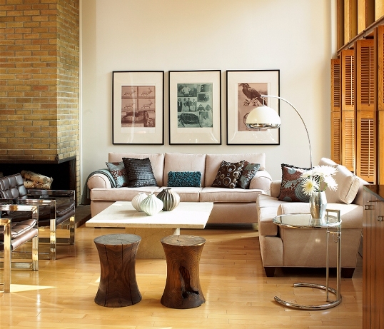
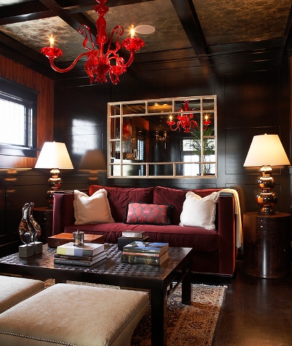
Matthew and Frank kindly agreed to take a few minutes to answer '5 quick questions', and to share more shots from their portfolio (they are definitely talented mixmasters in their choice of furnishings). Below you'll see the Akbar and Double Alexander tables; part of their Clearly Classic Collection, followed by a shot from Kips Bay (who'd ever think tin cans could look so good?). Next we have a recent interior in California that's quite the fabulous space and finally, two shots from a smart New York apartment (that persimmon media room is something else!). To check out more '5 quick questions' click here. [Images: 1, Bjorn Wallander. 2,3, Steven Nilsson. 4, Matthew White. 5,6, 7, Art Gray]

Arren Williams: What’s inspiring you right now?

White Webb: America’s new President is a huge inspiration. Following his lead, we want to use our talents to improve our community. We know that a beautiful surrounding lifts spirits and has the potential to change behavior. Whether that means helping clean parks or painting community centers, we plan on doing something.

AW: Is there anything that makes you shudder when you walk into a room?

WW: Sensory overload. We love dramatic gestures and bold strokes, but you have to be careful not to create a visual assault.

AW: What’s the next thing you have your eye on for your place?

Matthew: The time to enjoy it!
Frank: A dreamily abstract, hand-blocked wallpaper from Alpha Workshops.

AW: How do you define your personal style?

WW: We try to embrace the best of old and new to create something that feels rooted in history, but thoroughly of today. When you have a classicist (Matthew) and a modernist (Frank) sitting down at the table together, you’d expect the potential for a fair amount of conflict, but it really doesn’t work that way with us. We begin by taking our cues from the architecture, but then it’s a real give and take as we let our very different imaginations fly.

AW: What’s next?

WW: Because of the wonderful response to our acrylic tables, we will be expanding the Clearly Classic Collection. Also percolating are book ideas, a new (very glam) furniture line, and surprising happenings on the Internet. We feel 2009 will be a truly exciting year! 


The orange and the pink

One of my favourite finds at this year's IDS was this fantabulous orange and pink rug wool by Ikea (it's the Stockholm Figur); I just couldn't get that take-no-prisoners colour combo out of my head. So I was happily surprised when I saw this marvy Helix Ribbon pillow by Dransfield & Ross (available through the lovely folks at Teatro Verde) in a similar colour. It's not only the colour - I love that they're both rocking a modernized version of marquetry patterning, tipping towards a retro digital calculator vibe on the Ikea rug.  

Hello doll

I saw the work of Rich, Brilliant, Willing at last year's International Contemporary Furniture Fair in NYC and, other than their hilariously unforgettable name*, I remember being impressed. It's thoughtful and edgy, but still has a simple elegance about it, so, when I saw this table this morning (I'm on the hunt for tables for a project) it elicited an 'oooh' even before I knew who'd made it.

The Russian Doll Table Wood - yes, they have a Russian Doll Table Metal too, and no it doesn't look the same - comes in an ultra pale grey, a lemony yellow and a toasty red and is topped with glass. It's my new favourite occasional table, and fingers crossed someone will be carrying it in Canada soon...

* Here's the deelio on their name: The three guys behind Rich, Brilliant, Willing are Richardson (RICH), Brill (BRILLIANT) and Williams (WILLING).