Joining the Hansen family

Nope, it's not a cult, not unless there is a Scandinavian furniture cult. Umm, is there? I discovered The Hansen Family - art director and designer Gesa Hansen's modern furniture firm - on a very cool UK design blog called Bright.Bazaar (bookmark it, you won't be sorry!) and immediately fell for the whole collection. Each piece is handcrafted in oak, and I love the touches of colour in the desk cubbies and dividers in the sideboard (which made it into the March issue of Monocle). Oh, and if The Hansen Family tote bags ever end up on sale, sign me up!  

Guest blog / Jenn Hannotte: Things are piling up

Jenn Hannotte: I've been noticing the floor getting a lot of attention by stylists recently. From piling magazines and books straight off the ground to create side tables, to using the surface to display art and objects. 

It's a fast and dirty way to update a corner or a whole room, and likely won't cost you a penny. Now, I'm not a designer in any professional capacity; I'm a mother of two who usually writes these wearing a house coat and drinking coffee while the baby naps! But I do love design and I think there are a lot of you out there like me, so take a look at my inspiration shots below and how I styled it up in my own home in that last shot. I have a soon-to-be mobile baby, Beatrix, and an off-the- wall 5 year-old, Willa, so it wasn't practical to have things directly on the floor for safety reasons. Instead, I've taken a vintage low coffee table, stuck it in an awkward corner and used books and mags to give the lamp and other objects some practical height, but it also conveys that sort of super-relaxed, eclectic aesthetic that we see in those delicious inspiration shots. [Image 1: Dos Family. Image 2: Andrea Ferrari. Image 3: Manolo Yllera]

For more of Jenn's take on style click here.

3 for the framers

I could totally blow the bank on artwork, and have fortunately/unfortunately found someone new on Etsy to jones over. I don't know much about Hocus, except she has a bit of a thing for vintage Danish pottery, and that she (?) is a designer/illustrator based in Toronto. Her work is sweet, but not too sugary, and I love all the textures and detail in each piece. Below you'll find all three of her limited edition, signed and numbered prints - Key Finder, Feathers and Snyder Goes For Walkies. For my money I think they'd all look brill in simple white gallery frames, hmmm, now to find a spare wall to hang them...

Yes to letters, no to pom poms

I was oohing and aahing over the graphic fairground lettering on Emily Peacock's needlepoint tapestry Hug and Kiss pillows the other day - all very cool since the do-it-youself kits are available here on Etsy - and then I realized that the finished product had pom poms. That's a slight problem. Spot, our handsome 9-month old Whippet, has a bit of a thing for pom poms. In fact the little so-and-so has already managed to gnaw off something like 7 of them from our Home Sweet Home pillow from The Rug Company. Anyways, I thought I'd share a great snap of the Hug pillow, and also the Home Sweet Home wall hanging, which we might have to consider if Spot takes any more of a liking to that Rug Co pillow, lol.

Guest blog / Julia Black: It's in the grain

Julia Black: John Ross might as well win a gold medal at the 2010 Vancouver Olympics. Truth be told he might not exactly be an athlete, though he is a supreme representative of the Canadian way. With his overwhelming compassion for nature, his creative brilliance, and his oh-so stylish designs, what more can you ask for? As logger for nearly 15 years in British Columbia, John decided to channel his passion into high-end one-of-a kind pieces crafted from cast-off wood. You might have caught his work in Oprah Magazine and Canadian House & Home, and to actually get your hands on his furniture and lighting you can pop into one of my fave Vancouver shops, The Cross. John currently resides on Vancouver Island, so those of you lucky enough to be on the West coast right now be sure to check him out! Who knows, maybe you’ll come away with an extraordinary, and very Canadian, piece of furniture.

To read more posts from Julia click here, and to check out her cool blog click here.


What's Spanish for wallpaper?

One of the most recent wallpaper launches to make a splash is the Vital collection for Barcelona-based wallpaper firm Coordonné. Okay, what's so special about that? Well, it's the first foray into wallpaper by illustrator Jordi Labanda, and the first of Coordonné's new artist-designed series. The capsule collection shows all of Labanda's trademark fashionable wit, and includes papers wrapped around themes of make-up, 50's fashion plates, Damask silhouettes, and wild 70's inspired patterns. Yum.

A modest veil in Vancouver

Yes, the Winter Olympics in Vancouver are pretty inescapable right now, and yes, I'm not exactly a sporty type (to say the least). One thing that has caught my eye, and just about everyone else's in Vancouver, is the gorgeous facade of the Vancouver Art Gallery. The piece, titled A Modest Veil, is by artist Michael Lin and was commisioned as part of the Vancouver 2010 Cultural Olympiad. I've seen shots of it turn up on Twitter (thanks to Flare Mag's Lisa Tant), and on Facebook (courtesy of designer William MacDonald) as well as all over Flickr, so wanted to see what else I could dig up.

Lin is known for his monumantal murals which reference trad Taiwanese fabrics, with their intense colours and stylized floral patterns. In the past his work has shown up on the floor and walls of places like P.S.1 in New York and the Musee d'Art Moderne de la Ville de Paris, though by size alone A Modest Veil was a massive task; each panel was hand-painted and then mounted on a huge framework to cover the museum's Goergia Street frontage. If you fancy, you can snag a piece of Michael Lin for your own place, since he designed a carpet called Formosa for Nanimarquina (though I'd love to know what's gonna happen to the Vancouver piece once it comes down). For fun, I've also added in a Youtube interview with the man himself. [Image 1: Cara_Rouge on Flickr. Image 2: CityCaucus.com on Flickr] 


Jack is back

Just got an e-mail from designer Tom Dixon's office this morning, detailing all of the lovely stuff they'll be showing at Milan Design Week in April, and was excited to see Jack making a comeback. The Jack, described as a sitting, stacking, lighting thing, first debuted in 1997. Back then I wanted one - and considered eating cereal for a month or two to save up - and now I think I really fancy one all over again! You can now get your hands on them in either black or white (my money's on the black). Another big deal will be Dixon's collaboration with Philips on Flat Lamp, a collection of OLED lightbulbs. Exciting, since OLED is expected to be the next gen technology that will replace low energy, incandescent and conventional LED bulbs over the next few years. In Canada, check out Klaus by Nienkamper for the full Tom Dixon line.

A swift little before and after

While I was running around like a chicken with my head cut off rustling up pieces for my space at IDS10 I realized that I needed a chair. Not just any chair, but one that felt vintage and cool, yet was bathroom appropriate. So, I headed to Mieda Design - the upholstery shop I always use - and talked my friend Dan into swiftly re-doing one of his own chairs for the space. That grubby old orange chair below had been sitting looking sorry for itself on the shelf for oh, nearly 10 years, and Dan had never gotten around to re-doing it. The original foam upholstery had totally died (and was turning to dust), so it was high time for a makeover. I needed vinyl to make the chair feel like a fit for the bathroom space, so we plunked for a Maxwell Fabrics number in a glossy and slightly crinkled antiqued metallic silver. Dan sprayed out the teak base in a basic black (yes, horror-of-horrors, lol, but if you ask me, I think it looks great) and managed to get the chair redone in under a week. Anyways, take a look below at the before and after shots. And the chair? After its stint at IDS10 it's now sitting pretty in Dan's living room.

Guest blog / Julia Black: On the runway, in the garden

Julia Black: What do you get when superstar designers from the worlds of fashion and outdoor furniture collide? The answer: You get the latest collection of outdoor furniture from Andrew Richard Designs gussied up with fabrics inspired by Bustle, the renowned Canadian sportswear label designed by Shawn Hewson and Ruth Promislow. Bustle's Muskoka-ready collection first made it’s appearance at LG Fashion Week back in October '09, but the official launch of the outdoor fabrics was celebrated at IDS10. Having caught up with Andrew Bockner of ARD, he reminded me that even though we (at that point) were only in mid-January, there’s really no reason why we can’t start gearing up and getting excited for summertime fashions and oh-so-stylish outdoor furniture a-la Andrew Richard Designs. The Cottage Style line of outdoor fabrics brings a dose of preppy fashion to the outdoors with watery blues and coral-coloured plaids, polo-esque stripes, and sailor-blue solids. Okay, now where's the sun? [Image 1: George Pimentel]

To read more posts from Julia click here, and to check out her cool blog click here.

Guest blog / Jenn Hannotte: A tale of two tables

Jenn Hannotte: There are two types of Craigslist thrills: when you buy something for cheap and find out it's worth a lot more, and when you find something cheap and you make it worth a lot more - even if you only slap some paint on it. My front room has tried on a couple of coffee tables in the last few months that gave me both types of 'YES!' moments. 

My old coffee table was a $20 purchase that included two end tables. It's now sold since I try to follow a pretty strict 'something in, something out' regime. The shape was ornate and scalloped, and I thought that painting it with a matte finish and juxtaposing it with my otherwise modern furniture would look interesting. I used one of the end tables in my daughter's room as a side table and sold off the other at a garage sale. That's a lot of mileage out of $20! I was able to play with a trend without busting the bank, and that to me is what makes Craigslist and thrifting in general so worthwhile.

My latest find was an impulse buy - I saw it, loved it, and had to have it. I knew nothing about the coffee table, except at $150 was pretty cheap for the going rate of mid-century teak on Craigslist. Within a few hours of contacting the seller, I was on my way home with it, as well as armed with a new little bit of info: that it was manufactured by France and Son, Denmark. Off to Google and within minutes I realized I had a Peter Hvidt & Orla Mølgaard-Nielsen coffee table designed in 1955, and produced by France and Son for 2 years. Designers and manufacturer in hand - and more Googling - I discovered here that my little purchase was worth about $1000!! As you can imagine, I'm not likely to sell it any time soon - even if I could get that kind of return on my meager investment - it looks quite at home in my front room and knowing I won the 'Craigslist lottery' makes it that much more appealing!

You'll see the old scalloped coffee table and end table below, followed along by the shot from Craigslist that got me hot under the collar and, finally, the Danish table sitting pretty in the living room. 

For more of Jenn's take on style click here.


Champagne every day

Where did Tuesday go? Oh yes, it started off with me having fun talking about Graham & Brown wallpaper on ABC 7 News in Chicago, and then slid straight downhill with an 11 hour trip back to Toronto. It was the weather. Lovely. Though highlights of the trip home included picking up a bunch of Vosges Bacon Chocolate bars at O'Hare, and downing a v. good Gordon Biersch Hefweizen beer in Cleveland (which really did have hints of clove, bubble gum and banana).

I guess I'm slightly on an alcoholic roll with today's post - The Champagne Lamps designed by Sascha Kipferling, found over on fun Brit site Supermarket Sarah. Yes, they're pricey (though as SS explains, the shades are vintage and there are lovely finishing details like the fabric-covered cord), so you might want to have a go at one yourself with this kit, and an empty bottle of Veuve Clicquot.

Blue mondays

Is Monday your most favourite day of the week? Errr, possibly not. So, to get everyone through the gloom and chill of this particular Monday I thought we could totally do with some inspiring shots by photographer Tom Mannion. I don't even remember how I stumbled across his jaw-dropping work, but as soon as I'd had the chance to have a good rummage through his stunning portfolio I knew I wanted to post this series of shots. A quick e-mail and then Tom said yes. Cool!

Anyways, I love the mix of blues (turquoise is Pantone's colour of the year, btw) and the slightly surreal feel of the shots, all beautifully styled by the v. talented Faye Toogood for Elle Decoration. Time for some dotty paper lanterns, don't you think?

Julia Black: It's pronounced Hi-Me

One of the designers at the IDS that totally blew me away was Spanish artist-designer Jaime Hayon. He's a fave of Arren's (who got a chance to meet him) but it was Hayon's collection of playful and imaginative lighting for Metalarte that totally struck a chord with me. His design sensibility, stemming from his early experiences in the skateboard and graffiti culture, is remarkably bold, whimsical and thrilling. Hayon's creative passion drove his studies in industrial art both in Madrid and in Paris, which led to a quick climb to the head of the Design Department of Fabrica. He first broke out with a collection of designer toys, ceramics and furniture, and then expanded into interior design and installation, a collection for Lladro, and even designed this collection of sneakers for Camper. Hayon's ability to blur the lines between art, decoration and design, makes him - for me at least - a master of contemporary design.

Below you'll see Jaime Hayon himself (Jaime is pronounced Hi-Me, btw) riding a giant chicken rocking horse. Next, a couple of snaps of Hayon's work with Metalarte, and finally, that sexy black number is from a collaboration with Swarovski. Metalarte is available through Lightform in Canada. [Images: Courtesy Hayon Studio. Portrait Nienke Klunder]

Guest blog / Jenn Hannotte: 15 years in the pantry

Hi one and all, time to welcome a new contributor to the blog, Jenn Hannotte. Jenn has a great eye for style, and practically a black belt in the art of Craigslist, in fact you can see her place (and some sweet finds) in the Spring 2010 issue of Design Lines.

Julie Gibb and Christian Morrison started  Pantry Press by installing a letterpress - you guessed it -  in the pantry of their home in 1995. 

Now, 15 years on, they've retrofitted  the old stables in the backyard of their current home in Toronto's West End and are busy hand-crafting and printing custom wedding stationery, greeting cards, posters and - to use their words - 'all manner of ephemera.' To celebrate, they've opened an on-line emporium where you can buy this poster (among other things) because, hey, everyone can use a reminder. And, if you fancy reading more from the world of letterpress, be sure to check out their blog, dubbed Ink In Your Veins, here.

IDS finds

Well, it's one week later and I'm finally editing down my faves from the IDS. There was so much to see except, errr, I was kind of busy, so I literally begged off an hour on the last day of the show to run around and catch what I could. So, here's a few designs that really caught my eye, and yes, before anyone says anything, I totally realize I have a bit of a thing for lamps...

From the top: Mahabali welcome mats in natural coir by Cristina Covello. Intensely coloured turned wood lamps and mortar and pestles by Tahir Mahmood. Handmade silver on brass Egyptian pendant lights available at Snob. The Clown light, part of Jaime Hayon's hook up with Lladro (lawdy it's a stunner).

Dark and disconnected

Our hi-speed internet was down for a couple of days this week, and let me tell you dial-up just wasn't doing it for me. So yep, I was feeling a little disconnected, though no less crazy busy - Over the last couple of days I returned all the last bits of pieces from the IDS (had to drive a truck, blergh), worked on a couple of Trendwatches for House & Home, and shot a webinar for a fun upcoming project with Erica Ehm of YummyMummyClub and author Kathy Buckworth. I am so in need of a bit of rest and relaxation...

On the dark side of things, as in colour, I wanted to share a few snaps of my 700 sq ft IDS space - the Ultimate his and her's bathroom - shot by Stefano Barbera. I was asked "Why black?" a fair bit about my colour choices and well, don't you think we've seen enough white bathrooms? The first two shots show the more feminine side of things (yep, that's one of the vintage dressers I'd scored at the Sally Ann and had re-finished), then there's the black wood panelled men's side, and finally that standout polished steel chest from Kravet in the chillout space that connected the two bathrooms.

Having a flutter

Okay, I've been slightly awol due to the IDS 10 and the mega workload involved, let alone spending every day in the space too. One of the massive hits of my Ultimate space was definitely Bev Hisey's wool felt Butterfly Chairs. In fact, if I was giving out awards, her ultra-comfortable two-seaters (plus that cute wee ottoman) would definitely win 'Most Sat Upon' at the show. They were irresistible and quite a few people refused to move, lol. Check out the lovely shots below by Donna Griffith and imagine yourself sinking into them... And, because Bev is a creative genius/workaholic, she also contributed a carpet to Radiant Dark, the fab show organized by the cool folks at Made. Since I was kind of stuck at the IDS I didn't make it down, so to get more info - and to check out pics - head over and read what Kitka Design had to say about it.

5 quick questions: Jason MacIsaac

Stepping into Jason MacIsaac’s store Ministry of the Interior honestly gives me the urge to start shoplifting, mainly because I want just about everything. Though really, how do you hide a dining table under your coat? Apart from filling his shop with brilliant stuff, his design of Soft Citizen’s workspace recently popped up in v. cool Frame magazine. Oh, and did I mention, he’s also in on the IDS with possibly the most unusual of all of the Ultimate spaces (which involves lots of wood and some very precise calculations).

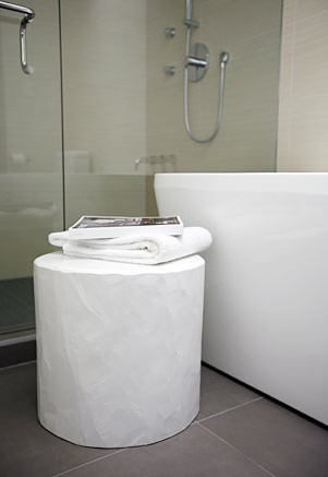
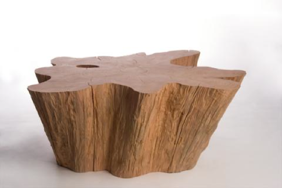
Here are Jason’s 5 quick questions, along with a few snaps that show the interior of MOTI, papier-mâché pieces by Debbie Wijskamp, the Oscar sofa by Matthew Hilton at SCP and one of the Raphael Garnier wallpaper’s from Tres Tintas (available at MOTI).

Arren Williams: What's inspiring you right now?

Jason MacIsaac: I'm always on the lookout for new stuff for MInistry of the Interior, so I constantly see new stuff I'm inspired by.... Nos Das blankets from SCP, Vivenne Westwood wallpaper from Cole & Son, Michael Johansson's artwork, Debbie Wijskamp's paper mache series of furniture.

AW: Is there anything that can drive you crazy when you walk into a space?

JM: Dated wood tones and obvious knock-off furniture.

AW: What's the next thing you have your eyes on for your own house?

JM: We desperately need a new sofa so I've placed an order for the Oscar sofa from SCP.  We also need a new stereo so I'm getting the walnut stereo system from Geneva, and I've promised my wife to wallpaper our bedroom for a while now, so I'm planning on using a new wallpaper from the collection by Raphael Garnier for Tres Tintas.

AW: How would you describe your style, and has it changed over the years?

JM: Freshness, colour, conceptual - I think my look is constantly changing and hopefully evolving.

AW: What's next on the horizon?

JM: I'm repurposing parts of my IDS Ultimate space for a film production company's offices in New York and have a few great residential projects.

IDS10: The storm before the storm

Nope, that title isn't a typo. While that single snap below doesn't give too much away (and makes it all look rather calm), things have been a little on the crazy side as the clock ticks down to the IDS10 Gala opening. Today all the Graham & Brown wallpaper made it up (after a slight meltdown on my part since we were trying to avoid mudding the seams between the plywood wall panels - and yes, of course we couldn't avoid it), all the Kohler fixtures were set in place and all the furniture and accessories were loaded in (thanks for the hand Meg!) and everything was covered in drop cloths to avoid a mammoth dust job early tomorrow. Ah yes, and talking of tomorrow there is still a ton of spit and polish before the space is done. Maybe cloning actually works? I'll have to look into it...